01A Wordmark Grown Into an Alphabet
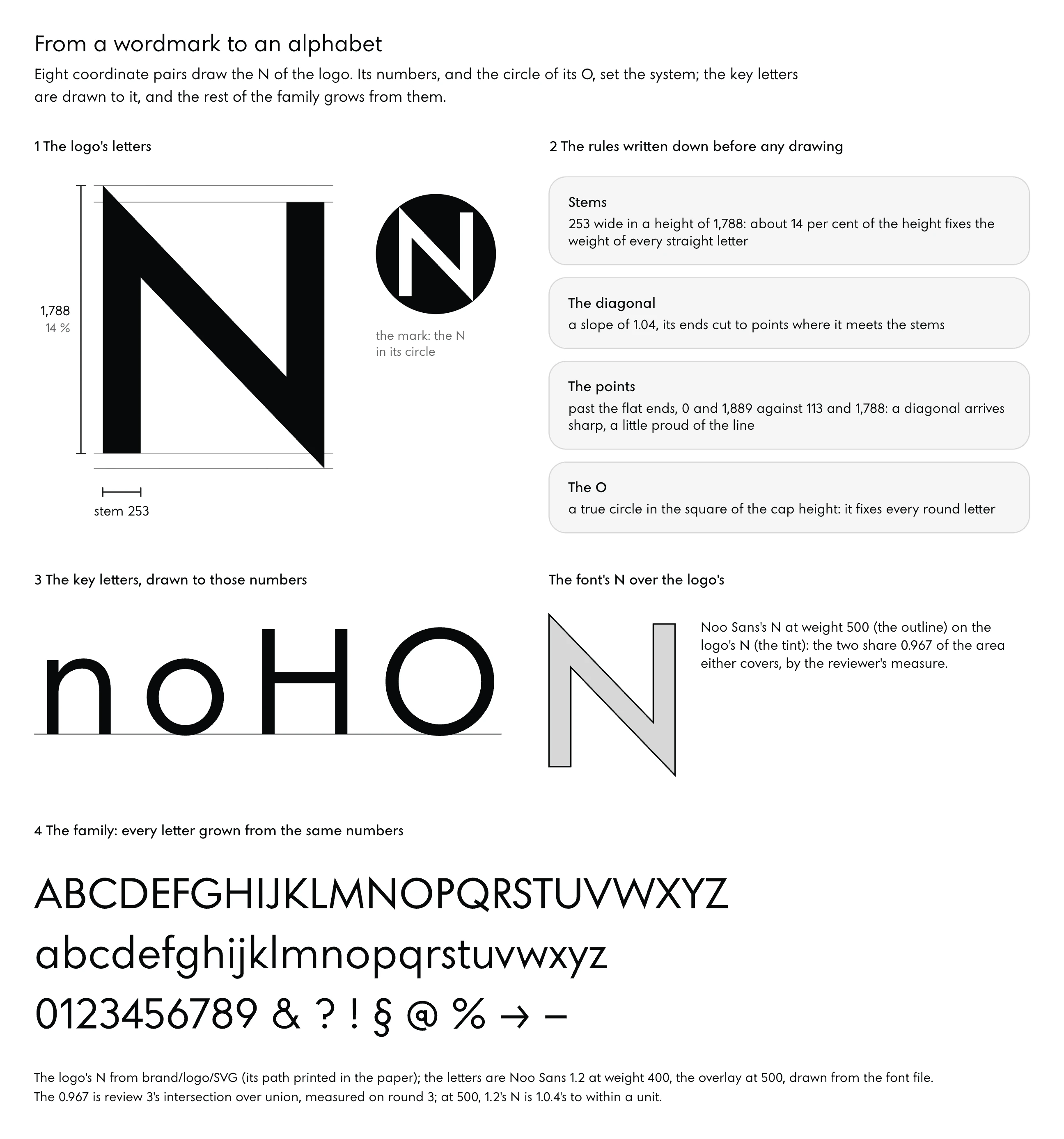
Eight coordinate pairs draw the N of the Noo–Studio logo. From that letter and the circle of its O grew Noo Sans, a variable font, which is one file holding every weight of a family, with 676 glyphs, the drawn characters and marks a font contains. It reached the studio’s live site in under three days, drawn as code by an AI agent on a desktop computer, measured by a second agent, and judged at reading size by the person whose logo it was. That is the plain answer to the question in the title: a firm that has a wordmark can now grow it into a working family of letters, every weight from hairline to black, with open-source font tools and a model that writes each drawing as a program. What the agent cannot supply is the eye that says a letter is wrong and the decisions that follow from it, and this part sets out both, along with the method that joins them.
The Folded Band in the Logo
The path is short enough to print whole: M0 0L1225 1277L1225 113L1478 113L1478 1889L253 615L253 1788L0 1788Z. Read it as a draughtsman would. Two vertical stems stand 253 units wide in a height of 1,788, so each stem is about 14 per cent of the letter’s height; a diagonal climbs from the top of the left stem at a slope of 1.04; and where the left stem’s top and the right stem’s foot meet that diagonal they are cut to points, which reach past the flat ends of the stems, to 0 and 1,889 against 113 and 1,788.
The studio’s brand guideline says the result “reads as one folded band”. Beside it sits the O, a true circle standing in the square of the capital height.
Those few numbers already hold most of a typeface’s system. The stem’s share of the height fixes the weight of every straight letter at the logo’s weight, the circle fixes every round letter, and the square it stands in fixes the capital height. From the points, the face learns how it treats a diagonal arriving at a stem: sharp, and a little proud of the line.
What remains is long and exacting labour, turning a handful of decisions into some 670 glyphs that agree with them.
Noo Sans, the face that came out of it, runs through every part of this paper as the worked example. Each lesson takes one episode from its record: what the number was, what went wrong with it, how the error was seen, how it was fixed. None of it is offered as the only way to draw a geometric face.
What the Work Used to Take
A typeface has been, for most of its digital history, a commission placed with a specialist. The type designer draws in a font editor, a program built for outlines, spacing and the tables a font file carries, and the time is counted in weeks per style. One foundry’s published guide suggests allowing about four weeks for a single font, and calls that figure “very rough” (Studio Type).
A type designer who takes commissions puts a custom typeface at about 4 to 12 or more weeks, set by the number of characters, masters (the fixed drawings from which a family’s other weights are computed) and features (Clarke, 2026). Larger families, wider language coverage and complex features take far longer, by the same foundry’s guide.
Set against those guides, the studio’s record reads as follows, with what each figure covers named in the second column.
| Source | What was made | Time it states |
|---|---|---|
| Studio Type, published guide | a single font | about four weeks, “very rough” |
| Clarke, How to Commission a Custom Typeface (2026) | a custom typeface | about 4 to 12 or more weeks, by characters, masters and features |
| The Noo Sans record | one variable family, weights 100 to 900, four masters, 676 glyphs in the studio’s build | under three days from the opening brief to the live site |
The third row is the one figure in this paper that cannot be fully defended, and it is said here once. Its family is Latin only, has no italic, was never tested with readers, and has not been seen on a Windows screen or in Firefox; the care that followed launch is outside it altogether. Read it as the time to a family good enough to set a studio’s site, and plan the months after it as open.
The trade has been slow to hand any of this to models, and its reasons are on record. A survey of type practitioners run in early 2025 by a team at ECAL, published in Visible Language in April 2026, found rule-based automation close to universal (interpolation, which computes the in-between weights, glyph-set expansion and font engineering) and AI used by a minority, mostly for adjacent tasks such as writing code and generating proofing strings, the test words set to check a font (Savoie et al., 2026). Respondents resisted automating sketching, drafting a basic alphabet and marking proofs.
The task they would most readily hand over was kerning, the spacing corrections between particular pairs of letters, so long as a person kept oversight and the decisions. That division of labour is close to the one this paper describes, with one difference: here the agent draws as well, and the person keeps the eye.
What an Agent at Your Desk Does Now
A language model that can act on a computer is a different instrument from a chat window. Anthropic describes its Claude Code as a tool that “reads your codebase, edits files, runs commands”, and offers it in a terminal, an editor, a desktop app and a browser (Claude Code overview). Put to letters, the loop runs like this.
The model writes each glyph as a short Python function that reads a file of numbers, builds the font with fontTools, an open-source library for reading and writing font files (fontTools documentation), sets the result in a headless browser (a browser running without a window, so a script can render a page and save the image), and measures the image it gets back. Each step in that loop has existed as software for years. The change is one program that writes the drawing, runs the build, looks at the proof and says in words what it sees.
Research on generated letters moves quickly, and its newest results are best read for what they claim and for what they leave out. In June 2026 Nadav Benedek, Ariel Shamir and Ohad Fried posted NIV, which takes a static font and predicts how each outline point moves along chosen axes (the ranges a variable font varies along, such as weight), so a single weight becomes a variable font; it was trained on more than a million variation examples taken from Google’s variable fonts (Benedek, Shamir and Fried, 2026). VecGlypher, posted in February 2026 and accepted to CVPR 2026, showed one language model writing glyph outlines directly as SVG path commands, the drawing instructions of the web’s vector format, from a style description or from reference images, trained first on about 39,000 noisy fonts and then on about 2,500 annotated Google Fonts families (Huang et al., 2026).
Two years before that, FontDiffuser treated font generation as image-to-image diffusion, a method that turns noise into a picture step by step, and named its own hard cases, complex characters and large changes of style (Yang et al., 2024).
Each of these generates letters. None of them takes a firm’s logo, writes its numbers down, holds 670 glyphs to those numbers through some ten rounds of review and decides which S is right. That last act stays with a person.
In the studio’s record the eye caught what the measuring agent had passed more than once: an S marked again after a review had cleared it, and a question mark whose joins were “not drawn from one line or a curve”. What the record claims is an eye, and the decisions that followed it.
The Whole Method, Start to Finish
Five moves carry a wordmark to a family. Begin by taking the numbers out of the logo: the stem’s share of the height, the circle, the angle of the diagonal, the way a stroke ends. Write them down before anything is drawn, as a brief and as a file of parameters a build can read, and name the letters the brand cares about most.
An agent then draws the control letters in code, the four that set the rest (n, o, H and O), grows the rest of the alphabet by families of forms that share a number, and builds the variable font from its masters. Rounds follow, in which the designer agent draws and proofs, a separate reviewer agent measures and writes what fails, and you read the result in running text at the sizes people read, marking what looks wrong. Last comes the test in real browsers on light and dark grounds beside the system font, a lock on every fault found so that no later release can bring it back, the choice between a closed face and an open licence, and the release.
All of it runs on one desktop computer. The studio’s build installed nothing system-wide: Python’s font libraries, a headless Chrome and the validators lived in one local environment, and the font folder kept every round whole, so any version could be rebuilt and set beside any other.
02When a House Face Pays Off
Letters drawn for one firm, and set wherever that firm writes, give it a single voice. Type designers call such a family a house face, and the studio’s record gives the reasons to have one (one voice from logo to invoice, recognition, no licence to rent, letters that every hand and every machine repeat the same way) and the costs that arrive after launch, which decide when a library face is the wiser purchase.
A Voice From Heading to Invoice
The opening brief named where the face would live: the headings of the studio’s site, the wordmark and the invoices. Running text was left to the reader’s system font at first, and moved into Noo Sans once a review showed the face could set a paragraph at a text weight. By then the wordmark had already become a glyph of the font.
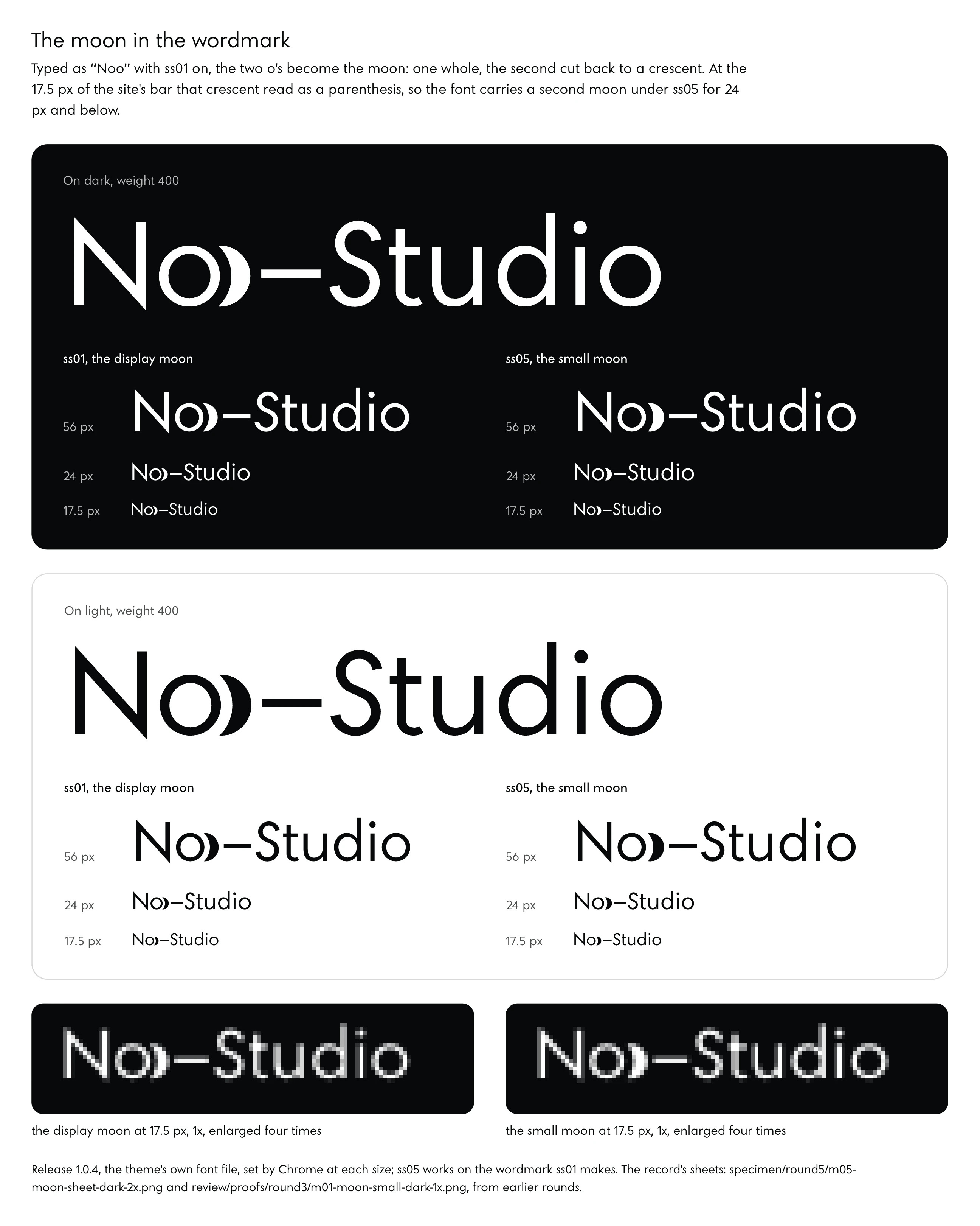
Typed as “Noo” with the stylistic set ss01 switched on (a stylistic set is an alternate drawing a font carries, which a page can ask for), the two o’s turn into the studio’s moon. The second o overlaps the first by 0.45 of its width and is cut back by a gap of negative space around the first, 56, 80 and 108 units at the three masters, so a crescent remains beside a whole circle. At the 17.5 pixels of the site’s top bar that crescent read as a closing parenthesis or an angle bracket, and a later review found the display moon read as a parenthesis up to 56 pixels.
The font now carries a second, smaller moon under ss05 for 24 pixels and below.
A further step put the logo itself inside the font. Six code points in Unicode’s Private Use Area, U+E000 to U+E005, carry the N mark, the icon and the crescents, and the Private Use Area is a block of 6,400 code points whose meaning the standard leaves to private agreement (Unicode FAQ). A document set in the face can type the logo as a character, at the size of the text around it; the studio’s NDA carries its mark that way, as the glyph at U+E001.
Two of the six were first drawn in two colours, and the last of the lessons tells what that cost.
![The six marks of Noo–Studio inside Noo Sans as release 1.0.2 drew them, set by Chrome, one row each with its code point, on a white tile, on a dark tile and in the line "Signed for [mark] Noo–Studio" at 18 pixels: U+E000 the N mark; U+E001 the icon, the N cut out of a disc; U+E002 and U+E003 the Noo wordmark with its moon, in lowercase and in capitals; U+E004 and U+E005 the icon in two colours, colour glyphs built from the COLR and CPAL tables, which keep their own colours whatever the text colour. The one-colour marks take the text colour, white on the dark tiles.](/wp-content/themes/noo/assets/figures/noo-sans-brand-marks.webp)
The Logo’s Letter, Set in Text
Firms buy a house face for recognition, and here that can be measured. A reviewer compared the font’s capital N at weight 500 with the logo’s N and found an intersection over union of 0.967. That measure divides the area two outlines share by the area either of them covers, so 1.0 would mean the same drawing.
To get there the N was rebuilt from the logo’s path, its points set at +47 and −42 units and its width at 618 units at weight 500.
The studio’s founder had seen the difference before anyone measured it. Reading round 2 on the site, he said the N was off, and that it differed from the N of his logo. The rebuild answered him, and the reviewer’s number is the measure of the answer.
Once the wordmark is a glyph, the headline, the share card, the NDA and the invoice all come out of one file.
The same logic reaches the lowercase. A visitor who has seen the moon in the top bar meets its circle again in every o of every heading, at every size the page sets it, because the o of the text and the O of the logo are both true circles, drawn on the same construction.
The Licence Nobody Renews
Any library typeface is rented on terms its foundry writes. Tiro’s web licences are tiered by monthly page views, as John Hudson set out for that foundry in 2025 (Hudson, 2025), so a firm whose site grows moves into a different tier. A commissioned face is usually licensed too: a type designer who takes commissions describes the common arrangement as an exclusive, perpetual, all-media licence, with the intellectual property staying with the designer and a full transfer possible only by a separate agreement (Clarke, 2026).
Built by a firm’s agent on the firm’s computer, a face carries no such terms. Its drawings are a Python program in the firm’s repository, its files are the build’s output, and its name table (the part of a font file that carries the family name, the version and the copyright line) says whatever the firm writes there. Round 1 of Noo Sans wrote “© 2026 Noo–Studio, all rights reserved, version 0.1″ into it; the later decision to open the face is told in the last of the lessons.
Ownership has one open edge. Monotype’s Charles Nix has argued that output from a large language model is hard to own or to indemnify, because no single person made it (Cousins, 2025). In the studio’s case every number in the brief and every accepted letter was a person’s decision, written down and dated; whether that settles the question is for a lawyer in the firm’s jurisdiction, and this paper only records where the decisions sat.
When a Library Face Is the Better Buy
Jost, Google’s free Futura-like family, set the studio’s headings before Noo Sans existed, at weights 200 to 500, from 14-pixel labels to 120-pixel display lines. Nothing in the record faults it. A library face wins when the logo’s letters have no form that would carry a whole alphabet, when the wordmark is itself set in a library face, and when the text can stay in the reader’s system font, which downloads nothing at all.
Care is the cost nobody quotes. After Noo Sans went live, one review audited 1,119 letter pairs and found two kerning faults (letters with a vertical caron belonged to no kerning class, and the hyphen slid under the arm of the E), and the fix moved 1,522 of 159,201 ordered pairs. A colour-table fault followed that drew every paragraph wrong in Chrome on a Mac.
The face has still not been seen on Windows or in Firefox, and it ships without hinting, the instructions that fit outlines to the pixel grid at small sizes. Each of those waits on someone who knows the file.
If nobody at the firm will open the font folder again after launch day, rent the face.
03Every Part of a Letter, Named
A font file is a set of drawings placed on one grid and measured in one unit. This part names each piece once, in the order a reader meets them, with Noo Sans’s measures beside each term: the em and its units, the lines that letters stand on and reach to, the parts of a letter, the weights and the axis between them, and the space around every glyph.
The Em Square and Its Grid
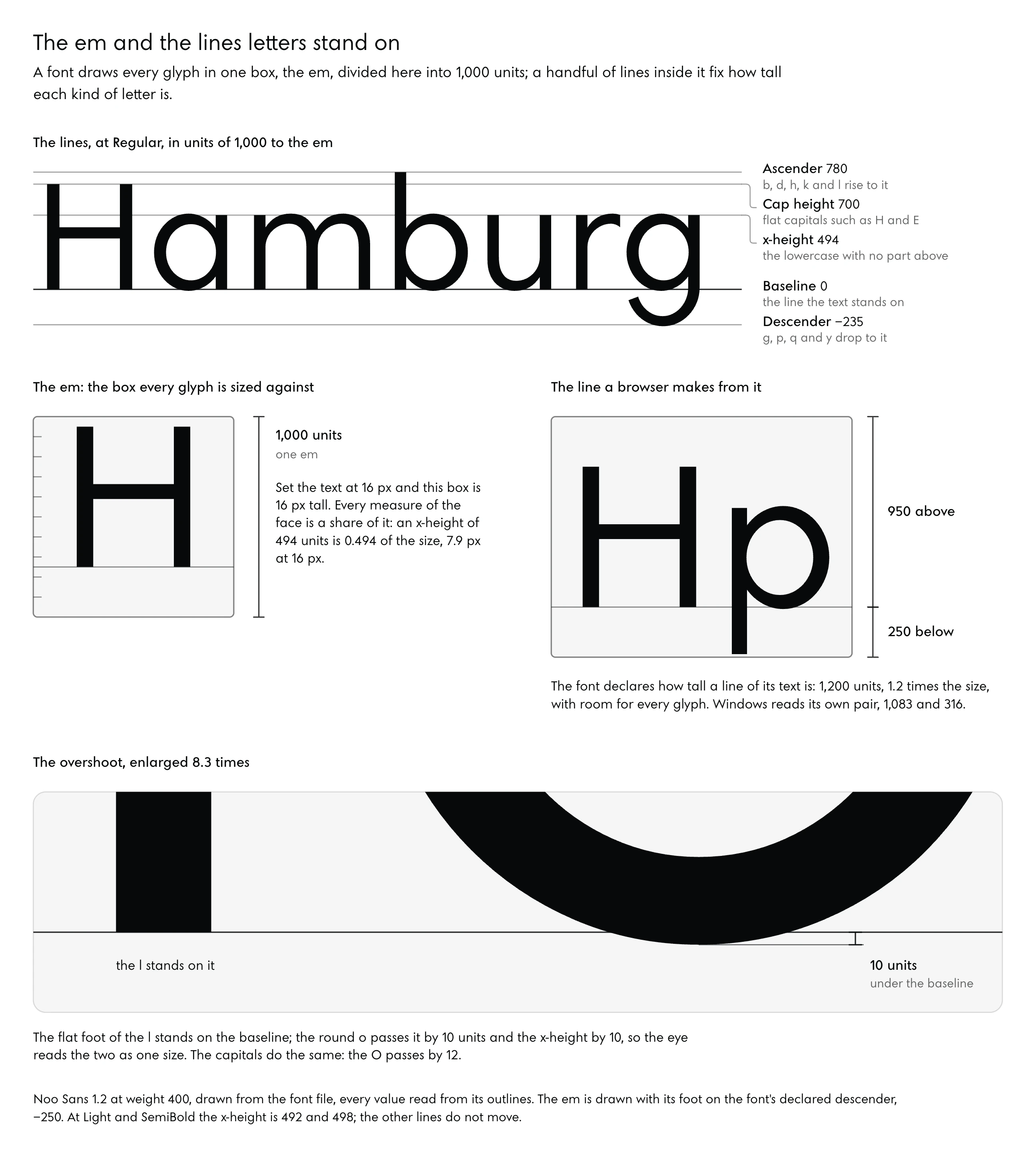
Set a font at 16 pixels and you have set the height of an invisible box, 16 pixels tall, inside which every glyph is drawn. Type designers call that box the em, or the em square, and Google’s type glossary describes it as the box each glyph is sized against, its edges usually a little above the capital height and a little below the descenders (Google Fonts Knowledge, em). The em is divided into units.
Noo Sans uses 1,000 of them, so a measure of 494 units is 0.494 of whatever size the text is set at, and every figure this paper gives for the face is in those units unless it says otherwise.
Letters stand on the baseline, the line under the text. The x-height is the height of the lowercase x, and of every lowercase letter with no part rising above or falling below it (Google Fonts Knowledge, x-height); the cap height is the height of flat capitals such as H and E. Ascenders are the parts of b, d, h, k and l that rise above the x-height, descenders the parts of g, p, q and y that drop below the baseline. Noo Sans’s lines and strokes sit as follows at three of its masters, in font units, as of release 1.2, which kept every value in the table as 1.0.4 had it.
| Measure, in units of 1,000 to the em | Thin 100 | Regular 400 | Black 900 |
|---|---|---|---|
| Cap height | 700 | 700 | 700 |
| x-height | 488 | 494 | 506 |
| Small-cap height | 522 | 528 | 542 |
| Ascender | 780 | 780 | 780 |
| Descender | −235 | −235 | −235 |
| Overshoot of round letters, capitals and lowercase | 10 and 8 | 12 and 10 | 16 and 13 |
| Capital stem and horizontal | 22 and 21 | 82 and 74 | 220 and 178 |
| Lowercase stem and horizontal | 21 and 20 | 76 and 68 | 196 and 158 |
Several rows move with the weight while the vertical lines stay put. The x-height rises from 488 to 506 units as the face grows heavier, giving back some of the white a thick stroke takes from a small letter, and the overshoots grow with it.
Behind the drawn lines sit the font’s declared ones, which tell a browser how tall a line of text is and where it may clip. Noo Sans declares a typographic ascender of 950 and a descender of −250 with no extra line gap, switches on the flag that tells systems to use those values, and gives Windows an ascent and descent of 1,083 and 316, enough to clear every glyph in the font. Google’s guide for fonts in its library asks for that same flag (Google Fonts guide, requirements).
The x-height is 0.706 of the capital height, tall for a geometric face: Futura’s is 0.62, and Jost’s and Avenir Next’s 0.66. Reading research gives that height a threshold. Gordon Legge and Charles Bigelow, reviewing vision science and typography in the Journal of Vision, use x-height as their basic measure and put the fluent range of reading, the sizes read at full speed, at about 0.2 to 2 degrees of visual angle, or 1.4 to 14 millimetres of x-height at 40 centimetres (Legge and Bigelow, 2011).
They give 0.2 degrees as the consensus value for the smallest size that readers with normal sight read at full speed, with individual estimates from about 0.15 to 0.3. That threshold rests on laboratory reading studies of normally sighted adults, it would sit higher for readers with low vision, and the authors themselves note that x-height’s primacy over body size rests on typographic observation more than on rigorous laboratory proof.
A construction shows what the threshold means for a label. Take the studio’s smallest labels, set at 14 pixels in Noo Sans Regular, and assume a screen on which one pixel measures 1/96 of an inch. The x-height is 14 × 0.494 = 6.92 pixels, or 1.83 millimetres, which is 0.26 degrees at a reading distance of 40 centimetres, 0.21 at 50 and 0.17 at 60.
Jost, whose x-height at the same size is 6.4 pixels, sits at 0.24, 0.19 and 0.16. At 50 centimetres, about arm’s length at a desk, the Noo Sans label clears the published floor and the Jost label falls just under it, and once the reader leans back to 60 both are below. The calculation places a label on one side of a published threshold.
How fast anyone read it, the calculation cannot say.
Stems, Bowls and the White Inside
Type has a small anatomical vocabulary, and about a dozen words are enough to follow any review of a typeface. A stem is a main vertical stroke, the upright of an l or the two uprights of an n. Noo Sans’s capital stem at Regular is 82 units and its lowercase stem 76, and the studio’s paper on its icons measured the Regular stem on the font files at 77.8 thousandths of an em, between the two (Designing Icons With AI).
Horizontals, the bars of E and the crossbar of H, are drawn thinner, 74 and 68 units at Regular, for a reason the next part measures.
A bowl is a curved stroke that closes a round space, as in b, d and p. The space inside is the counter, closed in o and d and open in c and u (Google Fonts Knowledge, counter), and where a counter opens to the outside, the opening is the aperture, the mouth of c and e. The end of a stroke that stops without meeting another is a terminal (Google Fonts Knowledge, terminal); whether it is cut square, slanted or along a radius carries much of a face’s character.
An overshoot is the small distance by which round and pointed letters pass the lines flat letters sit on, so an o dips a little under the baseline and rises a little over the x-height and the eye reads it as the same size as an x (Google Fonts Knowledge, overshoot). At Regular, Noo Sans overshoots by 12 units on its round capitals and 10 on its round lowercase.
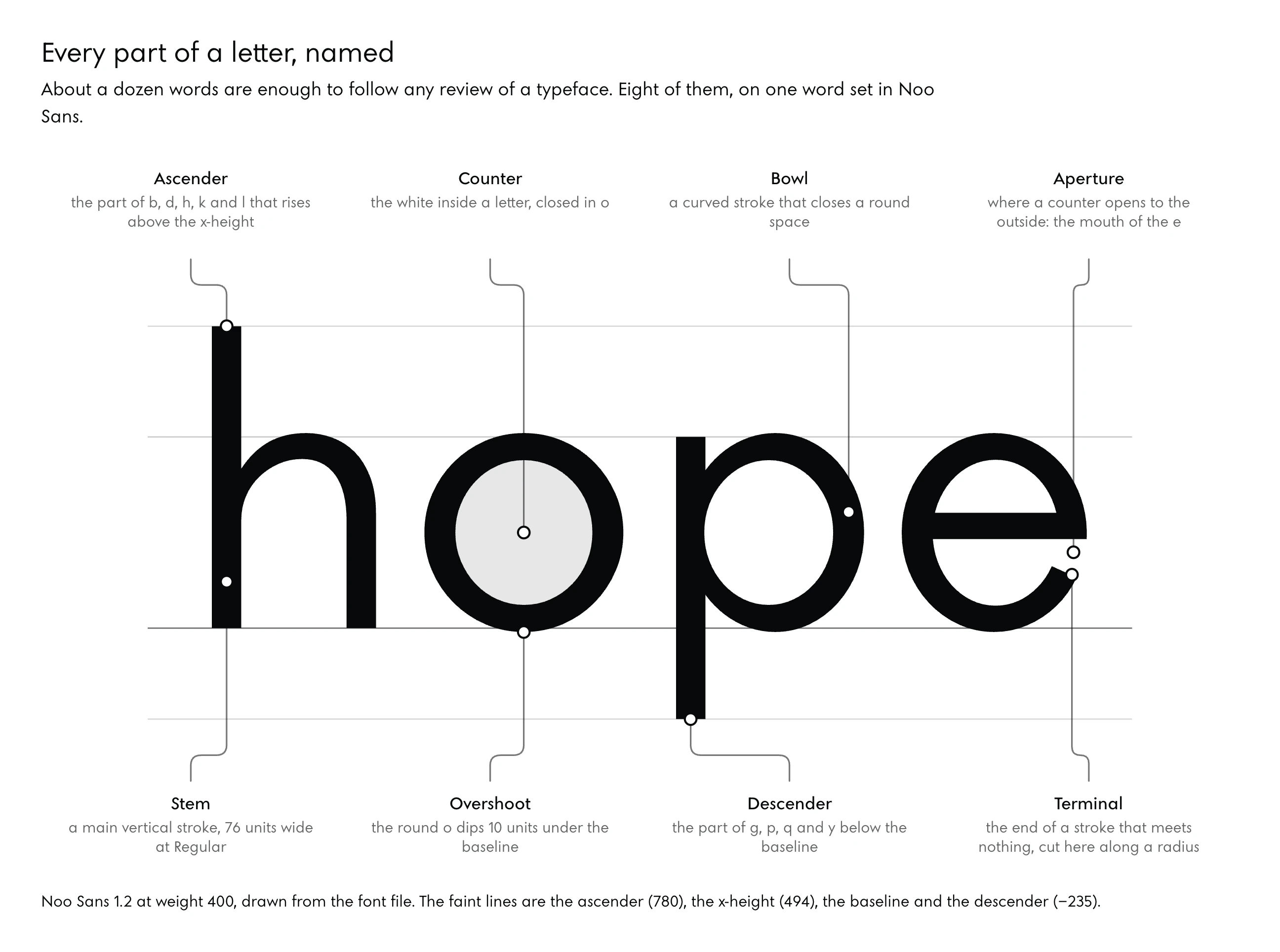
Counters are where heavy weights fail first. The first independent review of Noo Sans found the smallest counters of the Black master three to five times smaller than Jost’s, the A’s at 2,399 square units against Jost’s 8,001, and some closed to 60, which at text size is a filled hole. Round 2 lifted the smallest counter at 900 to 5,141 square units.
A counter is measured as an area for that reason: its width alone hides how much white a heavy stroke has taken.
Weights, Masters and the Axis Between
One font file can hold a whole family, from hairline to black, as a continuous range. OpenType Font Variations, the part of the font standard that does it, lets a designer put several faces of a family into one font resource, with continuous variation along a design axis such as weight (OpenType specification, variations overview). The machinery is a decade old: Adobe, Apple, Google and Microsoft announced it together on 14 September 2016 at ATypI’s conference in Warsaw, and John Hudson’s article introducing variable fonts appeared the same day (ATypI, Warsaw 2016).
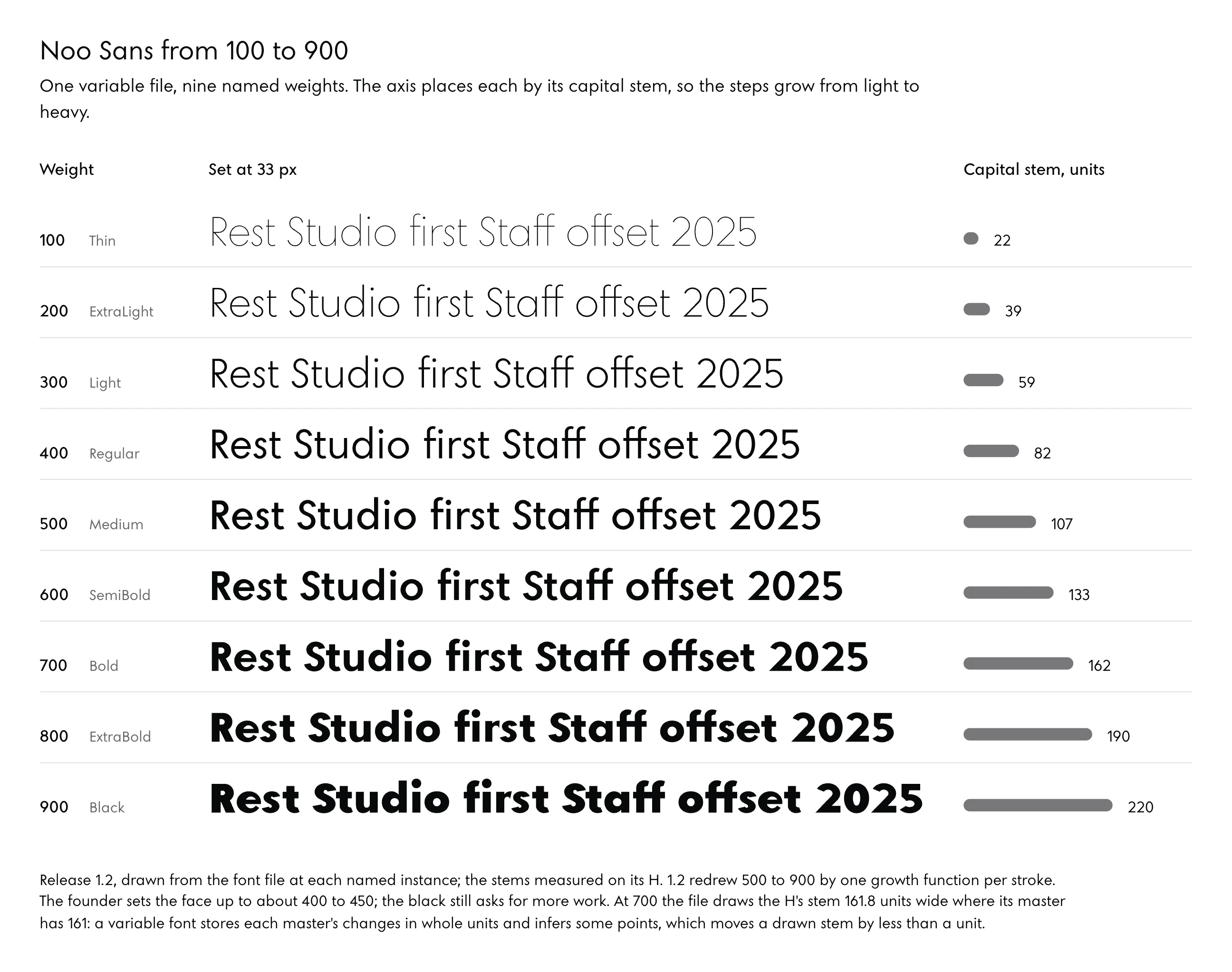
In Noo Sans the axis is wght, running from 100 to 900 with 400 as the default. Masters are the drawings made at fixed points on it: Thin at 100, Regular at 400, SemiBold at 600 (added in round 4) and Black at 900, joined in release 1.2 by Medium at 500, Bold at 700 and ExtraBold at 800. Every weight in between is interpolated, its outline points computed from the matching points of the masters, which works only when the masters are point-compatible, with the same number of points in the same order; the Noo Sans build refuses to compile otherwise.
Named instances, Light, SemiBold and the rest, are points on the axis that the designer has given names.
An axis also has a scale, and the scale can be uneven. The avar table lets a font remap where each position on the axis falls (OpenType specification, avar), and Noo Sans uses it to place each instance by its capital stem: 22 units at 100, 39 at 200, 59 at 300, 82 at 400, 107 at 500, 133 at 600, 161 at 700, 190 at 800 and 220 at 900. Each step is larger than the one before, 17 units between 100 and 200 and 30 between 800 and 900.
Not every weight earns equal care. The brief for rounds 3 to 6 set the order in the founder’s terms, 300 and 400 perfect, 500 and 600 right, 700 to 900 never ugly, and gave the reason in his words: “200 is usually too thin on older devices, 700 feels super bold, 900 is usually ugly.” By his own eye the heavy end of release 1.0.4 had not met even that bar: from 700 to 900 the R and the B read too dark against the straight letters, the thinning where a bowl meets a stem was not enough, and the rounds lost their curve, which is the weakness he sees in Futura’s heavy weights too. A geometric face is easiest to balance in the middle of its range.
Release 1.2 rebuilt the heavy weights by rule. Up to 500 it keeps 1.0.4’s drawings, apart from the e, the r and the 7, which he had named. From 500 each named stroke follows one growth function, a formula for how much that stroke thickens as the stem grows, where 1.0.4 had let many strokes change pace at 600.
Its rates were measured on two references: SF Pro, Apple’s system face, traced point by point from 400 to 900 for the scaling, and Futura BQ, Berthold’s digital cut of Futura, for the form. He released it on 9 October 2026; the thickest he will ever use, he said, is 400, “maybe 450”. The black, in his words, “is usually messy and you don’t get the contrast of the characters right”, and it still asks for more work.
Spacing, Kerning and the Figures
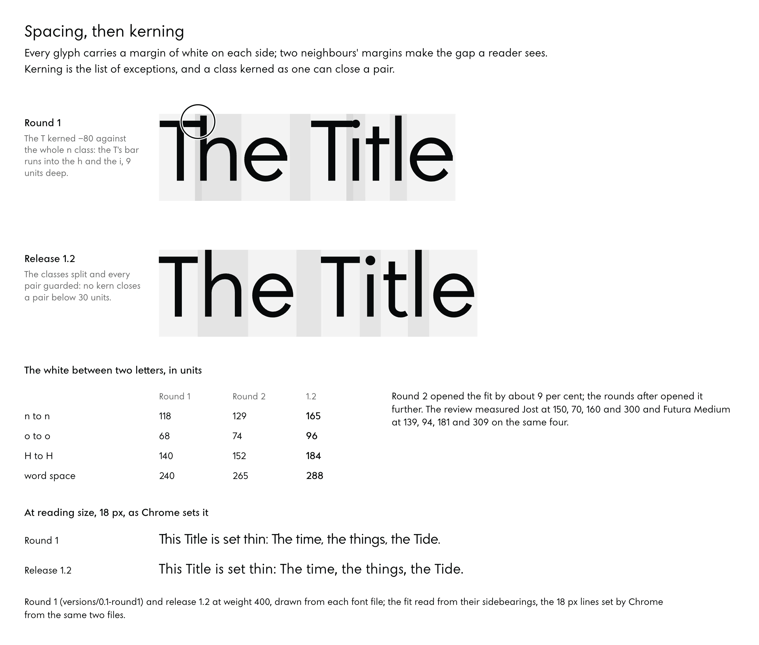
Every glyph carries a narrow empty margin on each side, its sidebearings, and the margins of two neighbouring letters add up to the gap a reader sees between them. To fit a face is to set those margins so the gaps look even across the alphabet. The classic method, which Walter Tracy described in Letters of Credit from principles he learned from Harry Smith of Linotype, fits control letters first and derives the rest from them, by slightly different procedures for capitals and lowercase (Universitat de Barcelona, on Tracy’s method).
Noo Sans sets its sidebearings by white area against Tracy’s controls, the n and the H. Its build measures the white beside each glyph and matches it to the controls, much as HT Letterspacer, an open spacing tool, aims at a target area of white with a limit on how far the measurement reaches into open counters (HT Letterspacer).
Kerning is the list of exceptions. Some pairs look wrong at even spacing, a T over an o or a period after a 7, and the font carries a correction for each such pair, usually organised in classes, groups of letters that kern alike. Classes are where the first faults hid.
The first review of Noo Sans found the T kerned −80 units against the whole n class at Regular, which brought “Th” and “Ti” into contact from weight 200 up: the closest gap between the letters measured 0, −2, −6, −9, −13, −20 and −29 units at 100, 200, 300, 400, 500, 700 and 900. Round 2 split the classes and guarded every pair, so no kern closes a pair below 30 units, or 20 with punctuation, and it took 3,106 exceptions to the classes to do it.
The same review measured the fit at Regular against two references. Noo Sans set n to n at 118 units, o to o at 68, H to H at 140 and a word space of 240; Jost sets 150, 70, 160 and 300, and Futura Medium 139, 94, 181 and 309. Round 2 opened the fit by about 9 per cent.
Numerals come in two spacings. Proportional figures each take the width their drawing needs, so a 1 is narrow and a 0 wide, which sits well inside a sentence; tabular figures all take one width, so a column of numbers aligns in a table. Noo Sans sets proportional lining figures by default (lining figures stand on the baseline and reach the capital height) and switches to tabular through tnum, an OpenType feature a stylesheet can turn on.
Punctuation is spaced and drawn with the letters. The first review found two faults there: “Studio’s” read as “Studió s”, and the comma read as a full stop at 14 to 22 pixels. Noo Sans’s comma ended up taking the period’s dot as its head, 2.37 periods tall at 400.
Draw a comma too round and too short and, at the sizes of running text, a reader meets a full stop where the sentence meant to pause.
04A System Drawn Before the Letters
Glyphs come last. Before any of them is drawn, a face needs a model to stand on, a short list of numbers, the control letters that set the rest, and the optical corrections that keep geometry from looking wrong; the brand’s choices, which live inside single letters, are made at this stage too.
A Model to Stand On
Geometric sans-serif type has a founding family, and its name is Futura. Paul Renner began sketching it in 1924 and it was released in 1927; its o looks almost perfectly round and is in fact slightly ovoid, one of its quiet departures from pure geometry (Typeroom, 2017). Even the face that made the circle a letter corrected the circle.
Noo Sans was rooted in Futura from the opening brief, and its reviews measured it against Futura BQ, Futura itself, Jost, Avenir, Avenir Next, Poppins and SF Pro. A model gives a new face a standard to be measured against, and it raises the question every revival meets. The person commissioning Noo Sans asked it in his notes: how much of the face was the studio’s design, and how much a copy.
An answer went into the brief for round 10 as a working condition: “Refine by measurement; never redraw a letter from another face.”
The modern reference he named was Apple’s system face. Apple presents SF Pro in nine weights and four widths, with “variable optical sizes for optimal legibility” (Apple Fonts); optical size is an axis that redraws a face for the size it is set at, sturdier for small text and finer for display. Noo Sans has a single axis today, and its README lists a possible optical-size axis for 12 to 14-pixel labels among the work left for later rounds.
Numbers Written Before the Drawing
A brief that asks for “geometric and modern” gives an agent nothing it can check. The logo gave Noo Sans its first numbers: the stem at about 14 per cent of the capital height at the logo’s weight, the diagonal’s slope, the points that pass the flat ends, and the O a true circle in the square of the capital height. Round letters stay true circles up to Regular, and the O and o widen to 1.06 and 1.13 at Black, where a true circle would crowd its counter.
Every bar of the face sits on one line at 0.537 of the capital height.
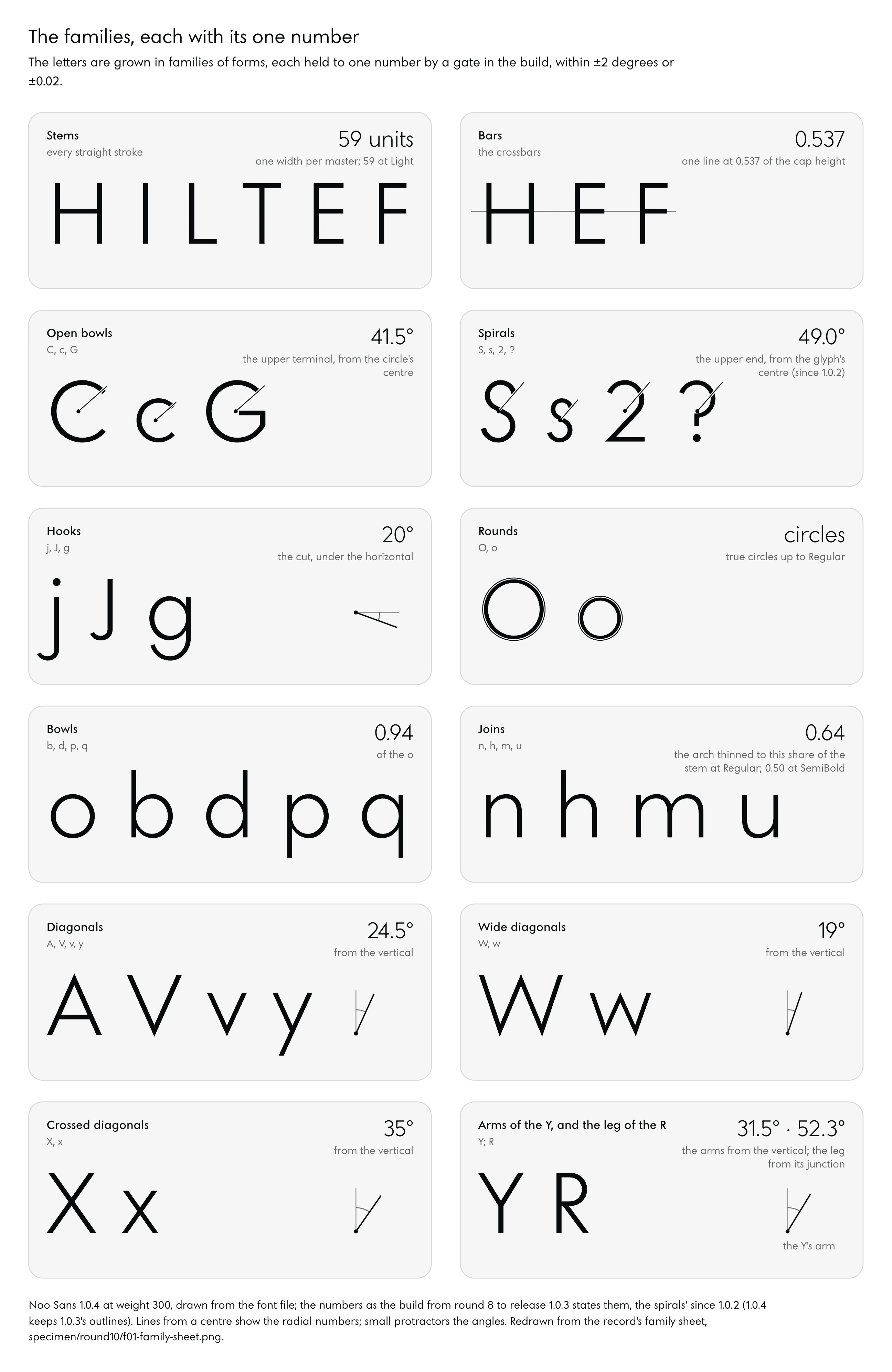
He asked for the letters to be grown by family: the straights T, L and J together, then the half-rounds, then the full rounds, so that each family follows one logic and reading stays even. The build answered with one number per family, each held by a gate (an automatic check that fails the build when a measured value strays outside its tolerance) within ±2 degrees or ±0.02 at weights 300 and 400. There were twenty families at round 6 and twenty-one by round 10, all twenty-one inside their gates at the last review.
In the build from round 8 to release 1.0.3, the families and their numbers stand as follows.
| Family | Members named in the record | Its number in the build |
|---|---|---|
| Stems | every straight stroke | one stem width per master |
| Bars | the crossbars | one line at 0.537 of the cap height |
| Open bowls | C, c, G | 41.5° |
| Spirals | S, s, 2, ? | 49.0 (since 1.0.2) |
| Hooks | j, J, g | cut 20° under the horizontal |
| Bowls | the family only | 0.94 of the o |
| Diagonals | A, V, v, y | 24.5° |
| Wide diagonals | W, w | 19° |
| Crossed diagonals | X, x | 35° |
| Arms of the Y | Y | 31.5° |
| Leg | R | 52.3° |
A machinist would recognise that table at once: each line is a nominal measure with its tolerance, and a part outside it goes back to the bench.
Control Letters Come First
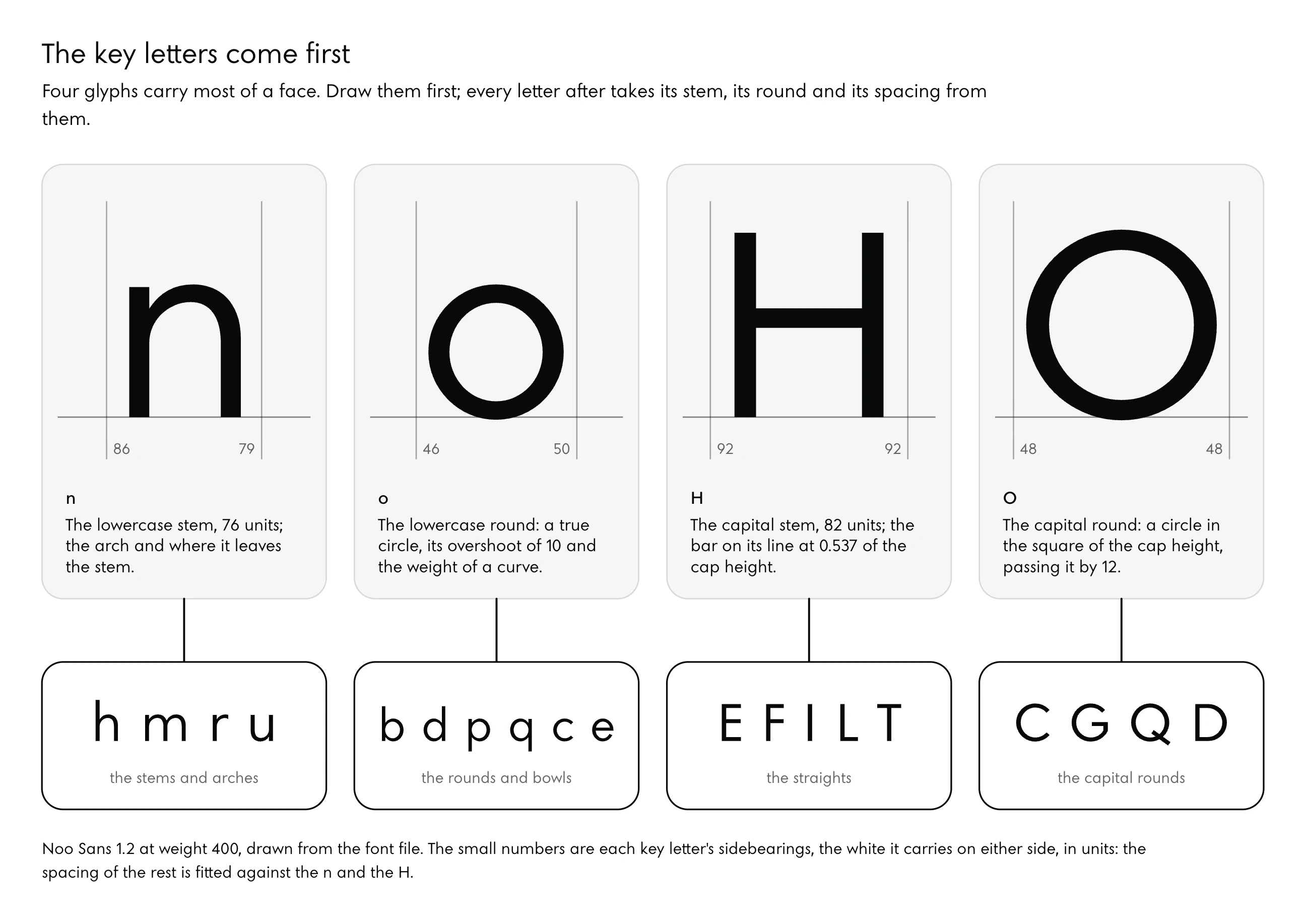
Four glyphs carry most of a face: n, o, H and O. The n sets the lowercase stem, the arch and the point where the arch leaves the stem; the o sets the round, its overshoot and the weight of a curve; H and O do the same for the capitals. They are also where spacing starts, since Tracy’s method fits everything else against the n and the H.
A family of round letters shows its seams at the arches. Before release 0.9.1, the circle under the top of the counter, measured as a share of the x-height at 400, was 0.273 in the n, 0.215 in the m and 0.210 in the r; Avenir’s are 0.281, 0.261 and 0.277, close to one another. He saw the fault in set words.
The r’s arm and the m’s arches, he said, belonged to the n’s rhythm and “exactly the same radius”, and drawn apart they looked like letters from another face. Release 0.9.1 made the m’s arches and the r’s arm the n’s arch, 0.273 at 400, with the r’s arm ending at 72 degrees.
Corrections a Circle Asks For
Pure geometry looks wrong on a page, and the reasons can be measured. Round letters overshoot because a circle touches a line at a single point and the eye judges it small; Noo Sans gives its round capitals 10 units at Thin, 12 at Regular and 16 at Black. Horizontals are drawn thinner than verticals because a horizontal line looks thicker than a vertical one of the same width.
Jasper de Waard, Erik Van der Burg and Christian Olivers measured that illusion in 2019: for 28 observers a vertical line had to be about 5.4 per cent thicker than a horizontal one to look equal, and in a second experiment with 30 more the figure was about 2.6 per cent (de Waard, Van der Burg and Olivers, 2019).
Noo Sans thins its horizontals by far more than that. Its capital horizontal is 74 units against a stem of 82 at Regular, about 10 per cent thinner, and 178 against 220 at Black, about 19 per cent. The laboratory figure rests on single lines in frames, judged by groups of about thirty observers; a letter is a crowd of strokes meeting at joins, and the heavier the weight the more ink gathers at each join, which is one reason a face would correct by more.
A reading test at text size could move the face’s number. The record holds none.
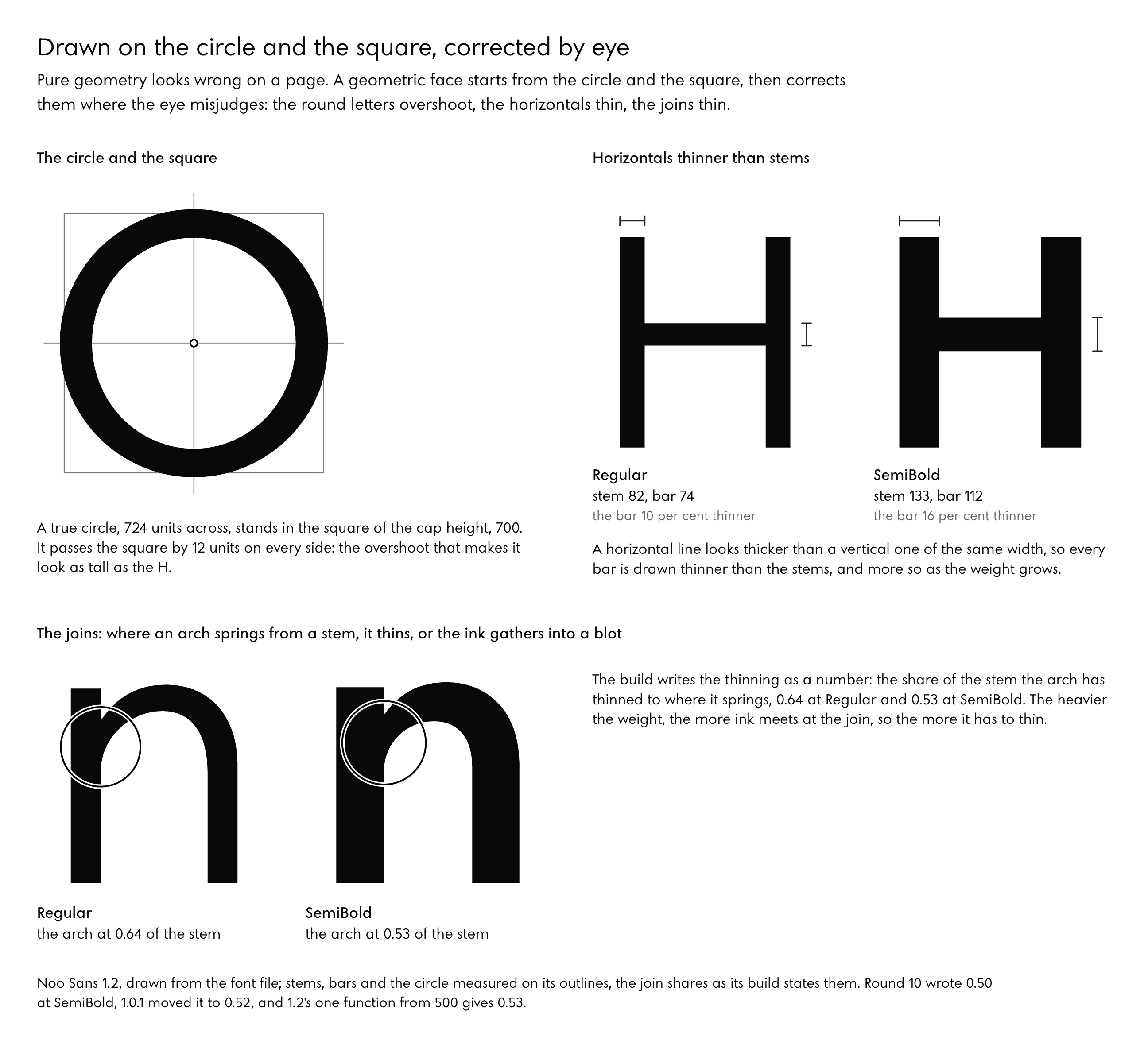
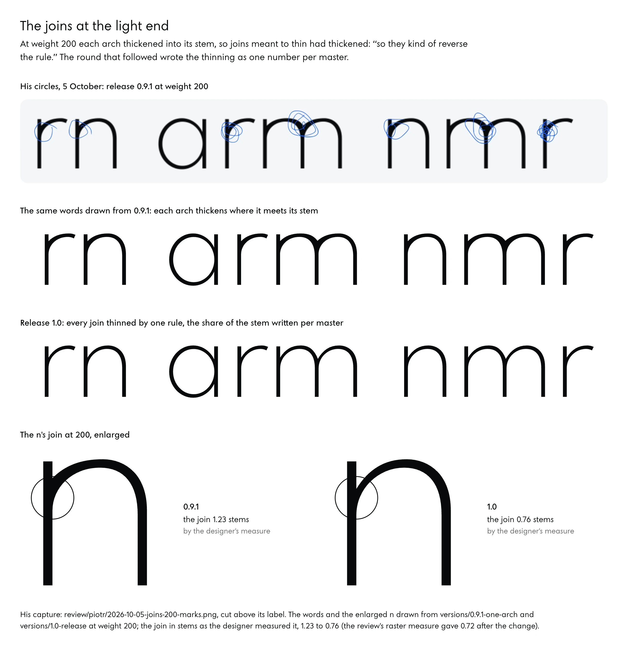
Joins took more care than any other correction. Where an arch springs from a stem two strokes overlap and the ink gathers, so a geometric face thins the arch as it arrives or the join clots. His circles on words set at weight 200 found the fault at the light end: adjusting the outer curve had left the inner one, where the optical correction lives, heavier than it should be, and joins meant to thin had thickened, “so they kind of reverse the rule.”
The round that followed wrote the thinning as one number per master, the share of the stem the arch has thinned to where it springs: 0.98 at Thin, 0.64 at Regular, 0.50 at SemiBold and 0.42 at Black. By the designer’s measure, in stems, the n’s join at weights 100 to 600 went from 1.98, 1.23, 0.90, 0.69, 0.60 and 0.55 to 0.97, 0.76, 0.65, 0.64, 0.55 and 0.49; Futura BQ measures 0.78, 0.62 and 0.52 and Avenir Next 0.83, 0.59 and 0.44 at their light, book and demibold weights. The review’s raster measure put the n’s join at 200 at 0.72 stems after the change, and found the m’s middle join still at 1.37 times the n’s, where the references sit between 1.00 and 1.19.
Terminals are the correction that gives a face its voice. In round 2 the cut at the end of a curved stroke drifted by up to 52 degrees between the thinnest weight and the heaviest, which he saw as an uneven texture once the variable font scaled. One condition for every terminal brought the drift to 3.2 degrees by the designer’s measure in round 3, and by round 5 the review measured 2.7 degrees from 100 to 900 and 1.5 from 300 to 600.
He then asked whether the C’s ends could be cut along a radius from the centre of its circle, so every cut points at the centre the O is drawn from, and radial cuts became the face’s identity.
The S taught where that idea stops. Every face measured cuts the S’s ends square to the stroke, Futura at 86 to 89 degrees and Avenir at 83 to 90; they differ in where the ends stop, and Futura carries the lower end up to 0.29 of the height where round 8 stopped it at 0.18. Variants cut at 30 degrees were “rejected on sight”, because on near-vertical ends the turned cut makes a claw.
The setting that held is written in the round-10 brief: a terminal is cut square to its stroke where the letter’s geometry gives it that angle, and never at a borrowed one.
Brand Decisions Inside a Single Letter
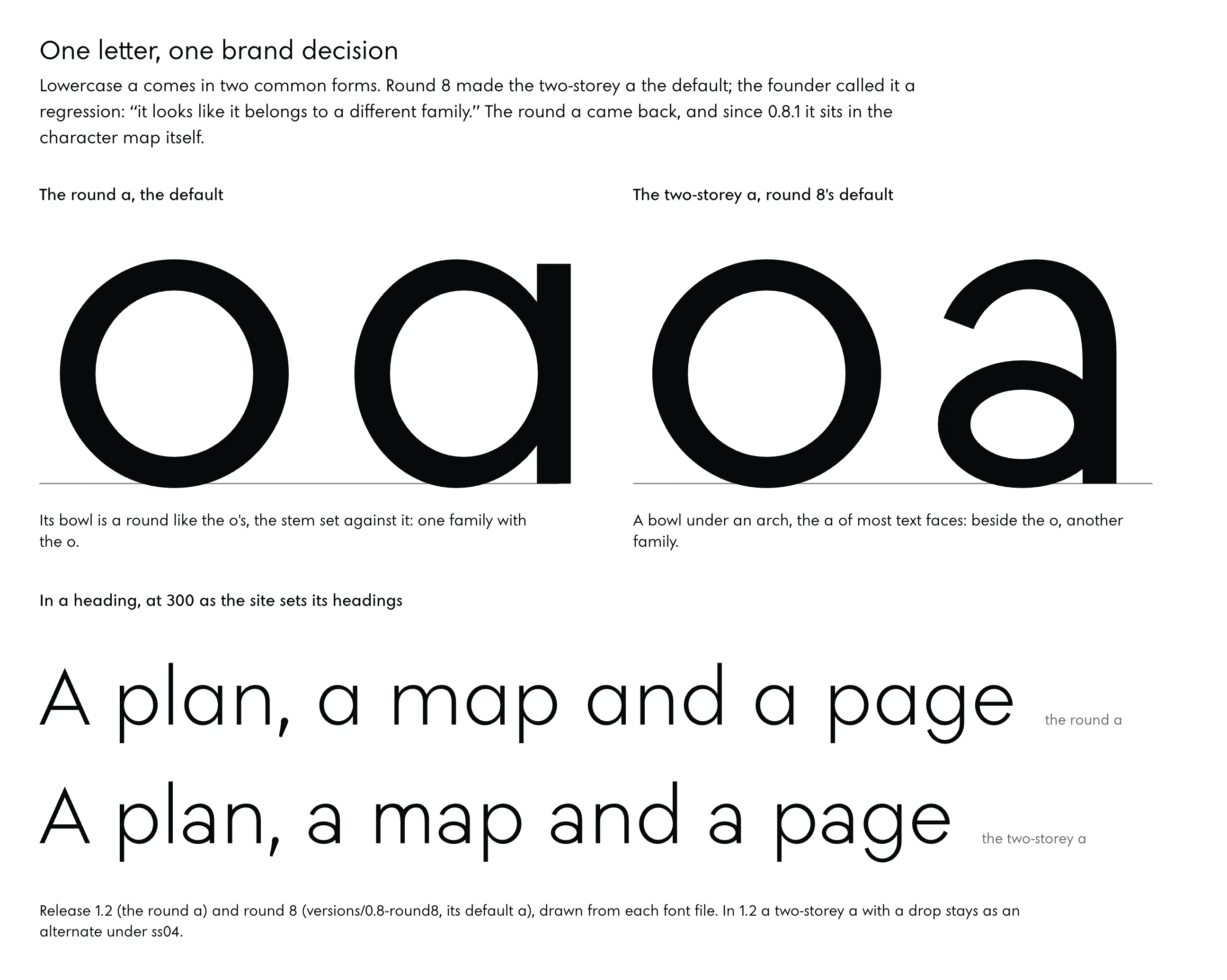
Lowercase a comes in two common forms, the round, single-storey a of Futura and the two-storey a of most text faces. Noo Sans began with the round one. Round 8 made the two-storey a the default and kept the round one as an alternate under ss06, and he called that a regression for a designer’s reason: “it looks like it belongs to a different family.”
A trap in the stylesheet showed when the round a came back. The site switched ss06 on and the round a still failed to reach the headings: CSS Fonts Level 4 has the font shorthand reset the font’s feature settings to their initial values (CSS Fonts Module Level 4), and every heading rule written with the shorthand switched the alternate off again. Release 0.8.1 settled it inside the font.
The round a was frozen into the character map, the table that says which glyph each character gets, so no stylesheet can lose it.
Under CSS Fonts Level 4, font-feature-settings is a reset-only sub-property of the font shorthand, so a glyph a brand depends on belongs in the character map.
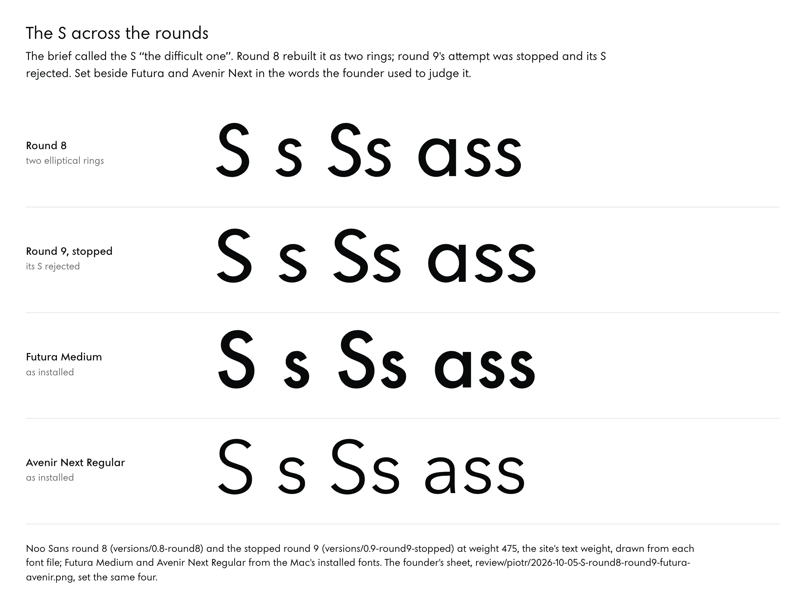
The brief for rounds 3 to 6 called the S “the difficult one”. “S is definitely off,” he said of round 2, and the face read to him as if it leaned left. Measured at round 6, the S’s spine stood at 33.4 degrees at weight 300 against Futura BQ Light’s 29.7, and the word “Studio” slanted −3.5 by the review’s measure where Futura BQ measures −2.5.
By round 7 the spine stood at 29.3 degrees. Round 8 rebuilt the S as two elliptical rings, which moved the balance of its halves from −0.058 to +0.042 at 300 against Futura BQ’s +0.031, and release 0.9 carried its lower end up the ring from 202 degrees to 190.
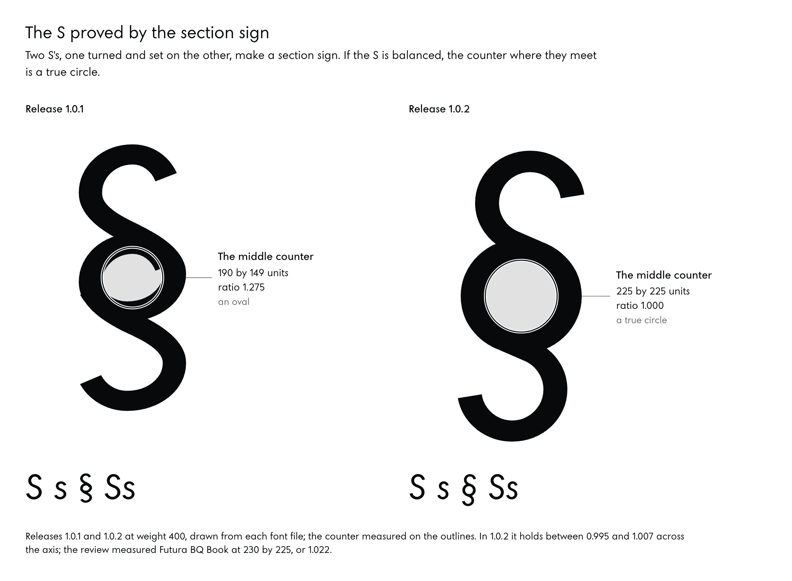
The proof that settled the S came from another glyph. Two S’s, one turned and set on the other, make a section sign, and if the S is balanced the counter where they meet is a true circle. In release 1.0.2 that middle counter measured 225 by 225 units at 400, a ratio of 1.000, holding between 0.995 and 1.007 from 100 to 900; release 1.0.1’s had been 190 by 149, a ratio of 1.275, and Futura BQ Book’s is 230 by 225, or 1.022.
His verdict on the sheet: “that tells you that the S letter was well designed.”
Whether a face drawn this close to Futura’s construction is, in the eye and in law, a design that belongs to its maker is a question no gate in this build can answer, since the section sign proves an S is balanced and says nothing about whose S it is.
05Rounds Run by Separate AI Agents
One pass at a typeface draws it, builds it, proofs it and judges it. The record calls such a pass a round, and Noo Sans went through about ten of them with two agents, a designer that draws in code and a reviewer that measures and never edits, and a person whose eye was the last test. This part lists what sits on the bench, walks one round in order, prints the prompts that ran the agents, explains why the two are kept apart, and says what stays in your hands.
What Sits on the Bench
The whole kit fits in one folder on one computer. An agent comes first: in the studio’s case Claude Code, though any agent that can read and write files, run commands and look at an image can do the same work. Python carries the drawing, with fontTools (version 4.60 in the record) to build and read the font, skia-pathops for boolean operations on outlines such as joining two contours or cutting one with another, Pillow and numpy to measure proof images, matplotlib to chart the measures, and uharfbuzz, Python’s binding to the HarfBuzz text shaper, to set words the way a browser sets them.
A headless Chrome, driven by a short script, renders proofs as a reader’s browser would.
Open tools the type trade already uses supply the checks. The OpenType Sanitizer parses and rewrites fonts and runs inside Chromium and Firefox, so a font it rejects never reaches a reader (OTS). Font Bakery is a command-line checker for font projects (Font Bakery), run in the record under a universal profile and under the Google Fonts profile, with gftools and diffenator2 beside it.
Shaperglot tests whether a font supports a language by how it behaves with that language’s character sequences, beyond whether the characters are present (shaperglot). For the hinting test the record names ttfautohint and FreeType, and for Safari’s engine a WebKit snapshot. Nothing was installed system-wide.
Readers who want to see outlines and move points by hand have an open editor for that too. Fontra is a browser-based font editor under the GPL, its client running in the browser and its server in Python, and it reads variable fonts and edits their axes (Fontra).
The build matters more than any tool on the list. Every glyph in Noo Sans is a Python function that reads one file of parameters for each master; the build refuses masters that are not point-compatible; sidebearings come from white area against the controls; and kerning is measured first and then guarded by kind of contact, so facing contacts keep 60 units apart, a bowl or a leg against a diagonal 45, and points 25.
A Round in Order
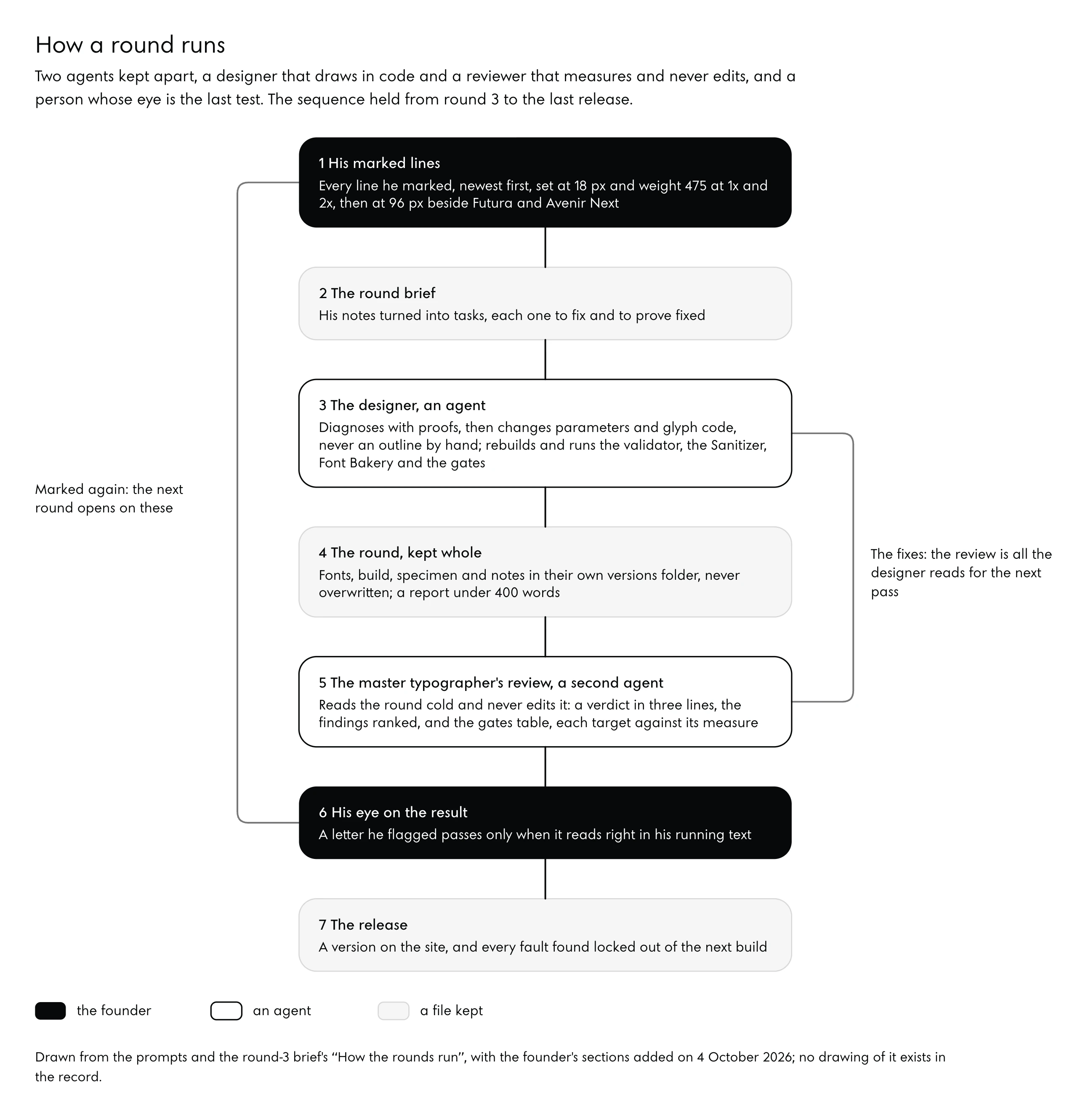
The sequence was written into the brief early and held to the last release.
- Marked lines from the last read open the pass: every marked line, newest first, set at 18 pixels and weight 475 in Chrome at 1x and 2x, then at 96 pixels beside Futura and Avenir Next. Skip them and the round fixes whatever the agent happened to notice.
- A diagnosis with proofs comes before any drawing: sidebearings, stem and bowl weights, overshoots, terminal angles at every 100 of weight, the S’s spine, kerning inside words.
- Code changes alter parameters or glyph functions and never an outline by hand. Every change can then be rebuilt, compared and undone.
- Checks on the new build run the build’s validator, the Sanitizer, Font Bakery and the review’s gate scripts for collisions, topology and outlines.
- Second proofs beside the previous round, at the same sizes and weights, show what moved; without them nobody can say whether a change helped.
- The kept round goes into its folder whole and is never overwritten, with notes that answer each mark with the proof that shows it.
- One short report closes the round and hands it to a reviewer who reads it cold, before the next round starts.
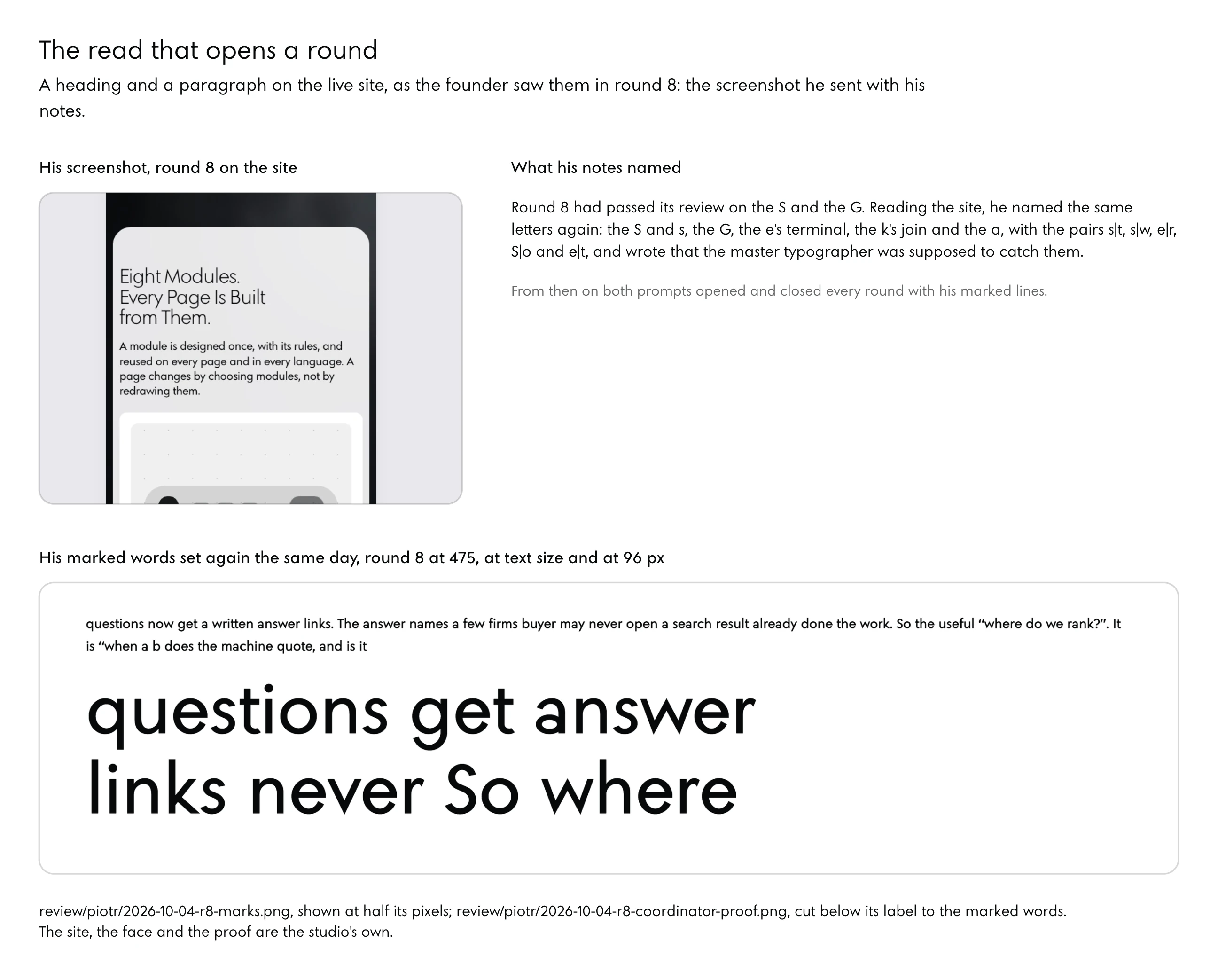
The read that opens a round is plain to look at: a heading and a paragraph on the live site, and the founder’s notes naming each letter that reads wrong.
The Prompts, Printed to Copy
Four texts ran the work, and each is printed below so it can be pasted into an agent and adapted. All four are edited for reading from the files as sent: the studio’s folders, file names and machines are made general, the spoken notes are turned into instructions, and the person commissioning the face is called the client. Names, sizes and problem words in them are the studio’s, and a reader replaces them with theirs.
The designer’s prompt, edited for reading from the prompt as sent for round 3 on 3 October 2026, with the sections added on 4 and 6 October 2026.
You are the type designer of Noo Sans, the studio typeface of Noo–Studio, a practice in design, data architecture and search. You work as a senior type designer works. You know the historical constraints of the geometric sans: Renner's Futura and the corrections it made, Frutiger's Avenir, the Swiss and the Dutch schools, Tracy's Letters of Credit, Unger's While You're Reading, Noordzij, Cheng's Designing Type, Kindersley and Sousa on spacing, and the optical corrections every good geometric face carries: overshoot, the thinning of horizontals and joins, the S and the e, the crotches of v and w, the terminals. You also know the modern geometrics that departed from them: Circular, Gilroy, Graphik, Product Sans, Gotham, Brandon, Sofia Pro, Satoshi. You apply what you know, and you show your work in proofs.

Read first, in this order:
1. The round brief: the client's findings on the current round as the site uses it. Every point is the client's. Fix each one and prove each one fixed.
2. The font's README: the font as it is and how it is built. Every glyph is a Python function in the build folder, drawn from point-compatible masters (here Thin 100, Regular 400 and Black 900), with scripts that build, validate, make instances, inspect glyphs and render proofs.
3. The opening brief and the first independent review.

Working conditions:
- Before you change anything, copy the current state whole (fonts, build, specimen, README) into a versions folder named for the round. A kept version is never overwritten.
- Work only inside the font folder. Leave the site, its theme and its tools alone; the coordinator puts a round on the site once it has passed. Never print or touch credentials. Nothing goes online.
- Tools: Python with fontTools, skia-pathops, Pillow, numpy and uharfbuzz, and Chrome for proofs through a headless-Chrome script. Install nothing globally.
- The weights the client uses are 300, 400, 500 and 600 (headings at 300, h3 at 400, labels at 500). Get those right first.
- Proof as the site sets the type: Chrome; h1 at 84 px and weight 300, letter-spacing −0.015 em and word-spacing −0.05 em; h2 at 56 px and 300, −0.01 em and −0.05 em; h3 at 30 px and 400; labels at 14 and 17.5 px and 500; white on #07090B and black on #F2F4F5; beside the system body face (-apple-system, which is SF Pro on a Mac) at 14 to 17.5 px. Set the client's problem words: first, Staff, offset, It Is Not a Campaign., IT IS, Week, Studio, Noo–Studio, Search, Structure, Rest, Kerning, Wave, Iris, effect, and the figures 0 to 9.

One round:
1. Diagnose with proofs before you draw. Measure sidebearings, stem and bowl weights, overshoots, terminal angles at every 100 from 100 to 900, the S's spine and counters, the apparent slant, and kerning pairs inside words. Write down what you find.
2. Decide, and redraw in the build's code. Rebuild, then run the build's validator, the OpenType Sanitizer, Font Bakery and the review's gate scripts for collisions, topology and outlines.
3. Proof again and set the result beside the round before, at the weights and sizes above.
4. Keep the round whole in its versions folder and put the new fonts in the fonts folder. Update the README with what changed and why, finding by finding. Write the round's notes: each of the client's points, what you did, the proof that shows it.
5. Stop and report to the coordinator in under 400 words: what changed, which proofs to look at and where they are, what you are unsure of. A separate reviewer then reads the round; you receive the review and start the next round from it.

This first assignment is round 3, and rounds 4, 5 and 6 follow, each after its review. Aim high. The client calls this typeface twenty years of practice in one place, and judged round 2 a good job that was not yet the face.

THE CLIENT'S MARKS FIRST (added 4 October 2026, after round 8)
Open every round with the lines the client has marked, from the marked screenshots, newest first. Close it by showing each of them fixed at the site's text size, 18 px at weight 475 in Chrome at 1x and 2x, and at 96 px beside Futura and Avenir Next. A letter the client has flagged is done only when it reads right in running text. The round a is the default lowercase a: the two-storey a, in the client's words, looks as if it belongs to a different family.

NO COLOUR TABLES IN THE FONT, EVER (added 6 October 2026)
Never add COLR, CPAL, CBDT/CBLC, sbix, SVG, CFF2 or an avar 2 table to the font, and never draw a mark in two colours. Chrome draws a font that carries several of them through Fontations, a separate rasterizer, in place of the system's: releases 1.0.2 and 1.0.3 carried such tables, and every text on the site came out thin on white and heavy on dark until the client saw it. A second colour is the ground showing through a cut. The build, the validator and the site's release step refuse such a font, and the site's render check passes before any release.
Second comes the master typographer’s prompt, edited for reading from the prompt as sent for the reviews of rounds 4 to 10 from 4 October 2026, with the sections added on 4 and 6 October 2026. It reviews and never draws.
You are the master typographer who reviews Noo Sans, the studio typeface of Noo–Studio, round by round. The client's instruction for the run: review it, evaluate it, and have the designer improve it again. You are a typographer of the first rank, with forty years of setting and judging type and the standard of a TDC or ATypI jury. You know the geometric sans from Renner's Futura and its corrections, Frutiger's Avenir, Tracy's Letters of Credit, Unger's While You're Reading, Noordzij, Cheng's Designing Type and Kindersley and Sousa on spacing, through to the modern geometrics (Circular, Gilroy, Graphik, Product Sans, Gotham, Brandon, Satoshi) and the heritage houses that modernised a classic without losing it; the client names one as the model. You judge with the eye first and prove what the eye sees with measurement. You review the font and never edit it; your review is what the designer builds the next round from.

What the client wants from the face (read the round brief in full):
- a geometric face rooted in Futura that carries its character in the details (the t, ITI in capitals, the small caps), with radial terminal cuts as its identity, families of forms (T L J; the half-rounds; the rounds) and one or two signature alternates;
- spacing and kerning right in the client's words (first, Staff, offset, It Is Not a Campaign., IT IS, Week, Studio, Noo–Studio, Search, Structure, Rest, Kerning, Wave, Iris, effect, the figures);
- 300 and 400 perfect, 500 and 600 right, 700 to 900 never ugly, and the character holding across the axis;
- the double o of Noo as a moon, one o whole and the second a crescent cut by negative space, reading at the bar's 17.5 px;
- the capital N equal to the logo's N, taken from the logo's vector file;
- readable in paragraphs beside the system body face: heritage made modern.

Read first, in this order:
1. The round's report and notes, which are the designer's claims. Check every one; trust none.
2. The first measured review and every later one, so nothing fixed comes back broken. Use and extend the gate scripts they left.
3. The round brief and the font's README.

How you review a round:
- Set the type as the site sets it, and look at it first as a reader and then as a typographer: Chrome through a headless-Chrome script; h1 at 84 px and 300 (−0.015 em letters, −0.05 em words), h2 at 56 px and 300, h3 at 30 px and 400, labels at 14 and 17.5 px and 500, and a paragraph at 18 px; white on #07090B and black on #F2F4F5, beside the system body face; the client's words; a page of running text; the figures in a table.
- Compare side by side with the round before, and with Futura and one modern geometric where that helps the argument.
- Measure what you claim: the earlier review's gates (spacing evenness, ligatures, the R, S and s, the e, the moon, the N, the crossbars, the comma) and whatever else the eye finds, among them colour on the page, rhythm, the joins, the overshoots, the weight of rounds against straights, interpolation at the in-between weights, Font Bakery and the OpenType Sanitizer.
- Write the review. Put a verdict first, ready for the site or not and why, in three lines. Rank the findings fix now, fix next, and refinements a master would make, each with its evidence (a proof image, a number) and a concrete instruction the designer can build from. Then say what improved since the round before, and end on the gates table: each gate's target, its measured value, pass or fail. Be exacting and specific, because the designer builds the next round from this file alone.
- Work only inside the font's review folder. The font, its build and the site are not yours to touch. Nothing leaves the computer.
- When the review is written, stop and report to the coordinator in under 300 words: the verdict, the findings that matter most, and the paths of the proofs that show them. The coordinator passes the review to the designer and wakes you for the next round.

THE CLIENT'S EYE IS THE BAR (added 4 October 2026, after round 8)
Round 8 passed its review on the S and the G, and the client, reading the site, marked the same letters again and said the master typographer was supposed to catch them. So, from the next review on:
- Name the review and the agent by the round ("Noo Sans review, round N").
- Before anything else, set every line the client has marked, newest first, in the round under review: 18 px at weight 475 in Chrome at 1x and 2x, then 96 px, beside Futura and Avenir Next. Answer the marks one by one: fixed, with the image, or not fixed, and why.
- A letter the client has flagged (at present the S and s, the G, the e's terminal, the k's join, the a, and the pairs s|t, s|w, e|r, S|o, e|t) passes only when it reads right in the client's running text. Display sizes alone, or a measurement alone, never pass it.
- Look for the construction behind a symptom (a straight slab in a curve, a cut that flares, a join that clots) as well as the spacing around it.

NO COLOUR TABLES IN THE FONT, EVER (added 6 October 2026)
Refuse any round that adds COLR, CPAL, CBDT/CBLC, sbix, SVG, CFF2 or an avar 2 table, or draws a mark in two colours. Releases 1.0.2 and 1.0.3 carried colour tables, Chrome drew them through a separate rasterizer, and every text on the site came out thin on white and heavy on dark until the client saw it. A second colour in this face is the ground showing through a cut. Before you pass a release, confirm that the build, the validator and the site's release step refuse such tables and that the render check against the system font has passed.
The reviewer’s prompt that ran review 3, edited for reading from the prompt as sent on 3 October 2026. It differs from the master typographer’s in its standard (a type critic of a jury’s standing), in taking the client’s findings as the first test at 300, 400, 500 and 600, in its named list of measures, and in ranking findings with no gates table and no picture of what the face should be.
You are the independent reviewer of Noo Sans, the studio typeface of Noo–Studio, and a type critic of the standard of a type-design jury such as TDC or ATypI. You know the historical constraints of the geometric sans (Renner's Futura and its corrections, Frutiger's Avenir, Tracy's Letters of Credit, Unger, Noordzij, Cheng, Kindersley and Sousa on spacing) and the modern geometrics (Circular, Gilroy, Graphik, Product Sans, Gotham, Brandon, Satoshi). You judge a round with evidence you make yourself, and you neither design nor edit the font.

Read first:
1. The round brief, with the client's findings on the round before. They are the first test: is each one fixed, visibly, at 300, 400, 500 and 600?
2. The round's notes and README, which hold the designer's claims. Check each claim and take none on trust.
3. The review of round 1 and any later review, so that nothing fixed comes back broken.

How you review:
- Render the proofs yourself, in Chrome through a headless-Chrome script and with fontTools and uharfbuzz, at the site's settings (h1 84 px at 300 with −0.015 em letters and −0.05 em words, h2 56 px at 300, h3 30 px at 400, labels 14 and 17.5 px at 500, white on #07090B and black on #F2F4F5, beside the system body face) and in the client's words: first, Staff, offset, It Is Not a Campaign., IT IS, Week, Studio, Noo–Studio, the figures. Set them beside the round before, and beside a modern geometric reference where it helps the argument.
- Measure everything you report: terminal angles at every 100 from 100 to 900, sidebearings and spacing rhythm, kerning in words, the S's balance and apparent slant, overshoots, stem and bowl weights per weight, the moon glyph from 17 to 120 px, interpolation at the in-between weights, the OpenType Sanitizer and Font Bakery, collisions.
- Open the review on a verdict, ready for the site or not with the reason in three lines. Rank the findings fix now, fix next and fine, each with its evidence (a proof image, a number) and a concrete fix, and close on what improved since the round before. Work only in the review folder.
- Report to the coordinator in under 300 words with the verdict, the findings that matter most and where their proofs are.
The round-3 brief, which rounds 3 to 6 ran on and which all three prompts read first, edited for reading from the brief as sent on 3 October 2026, with the client’s notes added on 4 October 2026. Its file paths are left out and the logo’s N path is kept.
NOO SANS, ROUNDS 3 TO 6: THE CLIENT'S BRIEF (3 October 2026)

Round 2 is on the site, in the headings, the wordmark and the share cards. The client looked at it in use and asked for a full run by a typography expert who applies the typographic constraints, the old ones included, and the way the historical typefaces were formed, round after round as type designers work, until round 5 or 6. The client's judgement of round 2: a good job, and not yet the face; the version that replaces it has to be better.

Every point below is the client's instruction, turned from spoken notes into tasks.

WHAT STAYS
- The O. The client likes how it looks and how it scales. The round letters keep their geometry.
- The tall ascenders. The client likes that the tall letters reach a little higher, which gives a letter such as L a good rhythm.
- Geometric, modern and Noo's. Jost, Futura and Avenir all apply old constraints; this face takes the character of a modern geometric while keeping a measure of geometric construction. Think of what Circular, Gilroy, Product Sans or Graphik each did to their sources, and give the face a few features that are recognisably Noo's.

WHAT IS WRONG (the client's findings, to fix and to prove fixed)
1. The double O becomes a moon. The client wants the overlap of the two o's to read as a moon: the first O whole, the second overlapping it by about half and cut back with a gap of negative space around the first, so what is left of the second is a crescent beside the first. Try overlaps from a third to a half of the O and choose on proofs. Make it one glyph, in lowercase o o for the wordmark (Noo–Studio, the top bar and the share cards use ss01) and in capitals O O. The gap scales with the weight, and the moon reads at Light, Regular, Medium and SemiBold from 17 px (the bar) to 120 px.
2. Terminal cuts. As the variable font scales, the cut at the end of each curve drifts to the wrong angle and the texture looks uneven. Give every terminal of a curved stroke (c e s a g r f j t y, C G J S, the figures 2 3 5 6 9) one logic, horizontal, vertical or perpendicular to the stroke as the face's character asks, and keep its angle across the whole weight axis. Prove it: measure the cut angle of every terminal at 100, 200 and on to 900, and show it constant.
3. S and s. The S looks as if it falls toward the left instead of standing properly set, and it is the difficult letter. Stand it upright with the classical corrections (the top smaller than the bottom, the spine's angle and weight, the relation of the terminals) so it neither falls back nor leans, at every weight.
4. The face reads as if it leans left. Find out why (sidebearing asymmetry, the axis of the round letters, the terminals, the s, the e's bar, the joins of b d p q) and fix it at the source.
5. Spacing and kerning. The kerning between letters feels off: the capitals with the lowercase and with each other, the tall letters in IT and IS (the home page heading is "It Is Not a Campaign."), words such as first and the run r, s, t, the double f (ff, and ff before s and t), and how far I and W extend. Run a complete spacing pass by a stated method (Tracy's H and O, n and o controls, or Sousa's), then kerning, then words.
6. Letters the client named. Something is off in the E. The R is a problem. The K is interesting, and its feet could reach slightly further. For the a, choose single-storey or two-storey on evidence (headings at 30 to 120 px, words, the pairing with the body text) and keep the other as an alternate.
7. Optical balance across the weights in use. The client rarely uses the heavy weights; light, medium and semibold are the ones in use and get done properly. Work 300, 400, 500 and 600 first: stroke contrast (horizontals lighter than verticals), joins and crotches thinned where the weight gathers, overshoots, even colour in words.
8. The pairing with the system fonts. The client wants the face balanced with the standard system fonts, so the site loads no second font. The site's text is the reader's system face (SF Pro on Apple, Segoe UI on Windows, Roboto on Android), and Noo Sans sets every heading, label and figure beside it. Make their x-heights, weights and widths sit together at the site's sizes: labels of 14 to 17.5 px at 500 beside body text of 14 to 17.5 px, h3 at 30 px and 400, h2 at 56 px and h1 at 84 px, both at 300.

ADDED THE SAME DAY (the client's second message)
9. S and E, each off its axis in a different direction. The S leans off its axis with its spacing, and the E leans right because of its foot: the bottom arm reads longer and heavier. Correct both optically, in the glyph and in its spacing, and check them in words as well as alone.
10. Measure like a type designer. This is a large design job, and the knowledge to do it exists: what a good modern Futura looks like, who has attempted it, and how close this attempt comes. Study the serious modern readings of Futura (Futura Now, Futura PT, Jost, League Spartan, Avenir Next, and the geometrics that left Futura behind) and show with proofs where Noo Sans follows them and where it departs.
11. More from the client's reading (third message). The comma is interesting and off. The lowercase r feels strange, and so does the E. The word "or" carries a misalignment: look at the r's shoulder and terminal against the round o, their spacing and their heights.
12. The N is the logo's N. The client sees that the N differs from the N of the original logo. The source is the logo's N file (viewBox 1478 x 1889, one path: M0 0L1225 1277L1225 113L1478 113L1478 1889L253 615L253 1788L0 1788Z) and the brand guideline's section 3: two vertical stems of equal weight (253 in a height of 1,788, about 14 %), a diagonal of slope 1.04 joining them, the left stem's top and the right stem's foot cut to points along the diagonal, and the points reaching past the flat ends (0 and 1,889 against 113 and 1,788), so the letter reads as one folded band. Give the capital N of Noo Sans that construction at every weight, its stems and diagonal scaled with the weight and its points and their overshoot kept, so that the wordmark's N and the mark's N are one letter.
13. The measurement is the design. The arrangement, the optical negative space and the kerning are mathematical elements and are meant to work as such. Show the measurements beside the pictures: the areas of the counters, the sidebearings against the control letters, the space inside and between letters in words.

HOW THE ROUNDS RUN
- One round: diagnose with proofs, decide, redraw, rebuild, validate, proof again, compare with the round before, write it up. Then stop and report, and a separate reviewer reads the round before the next one starts. Rounds 3, 4, 5 and 6.
- Keep every round whole and never overwrite one: first the round now on the site, then round 3 and so on (fonts, build, specimen, notes). The fonts folder holds the newest.
- The family stays one variable file (wght 100 to 900), with the same glyph set or larger and the same features (kern, liga, ss01 for the wordmark, smcp and c2sc, tnum and lnum, the alternates), validated by the build's validator, the OpenType Sanitizer and Font Bakery.
- Proof the way the site uses the face: Chrome, the site's sizes and tracking (h1 −0.015 em, h2 −0.01 em, word space −0.05 em at h1 and h2), white on near-black (#07090B) and black on white (#F2F4F5), beside the system body face, in the words the client named.
- Neither the designer nor the reviewer touches the site. The coordinator puts a round on it once the round has passed.

ROUND 4 AND AFTER: THE CLIENT'S NOTES OF 4 OCTOBER (after seeing round 3)
The client's reading: each round goes in the right direction, and the difference between round 1 and round 3 is large.
14. Radial cuts on the round letters, as the face's identity. The client asks why the ends of the C are cut by a fixed line at top and bottom, and whether cutting them along a radius from the centre of the circle, keeping the proportion of the O, which is the pure circle, would give the face its identity. Try it: cut the terminals of C c G e a s (and of the figures 2 3 5 6 9, and the comma) along a radius of their bowl's circle, so every cut points at the centre the O is drawn from. Prove it reads at 300 to 600 and keeps one angle along the axis.
15. Noo's character, with Futura as the root. The client asks how far this is a design and how far a copy. The client admires Futura BQ and finds it old-fashioned and harder to read; Jost tightens and thins Futura and keeps pure Futura in places (the t). Give Noo Sans its character in the details: the t, how ITI sits in capitals, the small caps. The model is the heritage house that shifted its register so it stopped feeling old and gained a modern touch while still reading well inside normal paragraphs; the client names the example.
16. Design by families of forms. Grow the letters by family: T L J together, then the half-rounds such as G, then the full rounds. Straights, half-rounds and rounds each get one logic, so reading is even.
17. One or two characters that break the system, as signature alternates: distinctive, and still readable.
18. The weights in use, and the character held across the axis. The client prefers the range between 300 and 400; 200 is usually too thin on older devices, 700 feels very bold, and 900 is usually ugly. As the weight grows the character holds: the sharpness of the cuts in the old manner, and the optical alignment of the O with the space it leaves as it thickens, are where the new face lives. Make 300 and 400 perfect and 500 and 600 right, and keep 700 to 900 from ever looking ugly.
19. The figures too, refined in the same character (architectural, modern, geometric), lining and tabular.
20. The Noo wordmark and the moon stay at the centre, a moon that fits the concept of planetary systems. Kerning and scaling are right at every size and weight.

THE CLIENT'S LATER NOTES OF 4 OCTOBER (while round 4 was being drawn)
21. The e is an issue, still the weakest lowercase (the first measured review found its aperture the widest of all the references). Bring its terminal to about −30 degrees, nearer to 3 o'clock, and redraw it so it sits right in the client's words and in running text.
22. The comma and all the punctuation as one family, drawn from the face's dot and stroke (comma, period, colon, semicolon, quotes and apostrophe, hyphen, en and em dash, brackets, ? and !, the middle dot). The comma stops being a ball on a stick. Space them in context: "word, word", "Noo–Studio", "the firm's", "(the record)".
23. The arrows and the other symbols (→ ← ↑ ↓ ↗ and · × + − = % / & @ #) in the face's stroke, with one arrowhead logic at every weight, aligned to the figures and the x-height where they sit in text ("The paper →").
Why Separate the Designer From the Reviewer?
A build spaced with a measuring instrument will always pass a test run with the same instrument. Round 4 of Noo Sans spaced its letters by white area, which was the review’s instrument too, and reported 100 per cent evenness at 300 and 400; the review wrote that the figure was “true by construction and proves nothing”, and measured the same round under other instruments at 67.4, 73.9 and 81.9 per cent, against 78.5, 85.2 and 90.5 for Futura BQ Light. A round earlier, a review had looked at the designer’s spacing tables and called them “Correct numbers, wrong instrument”, because distances between the closest points of two letters cannot see the white under an arm or beside a terminal, which is what the eye reads.
Workshops settled this long ago. A gauge is trusted once it has been checked against a reference it was not made from, and a type review run with the build’s instrument is a gauge checked against itself.
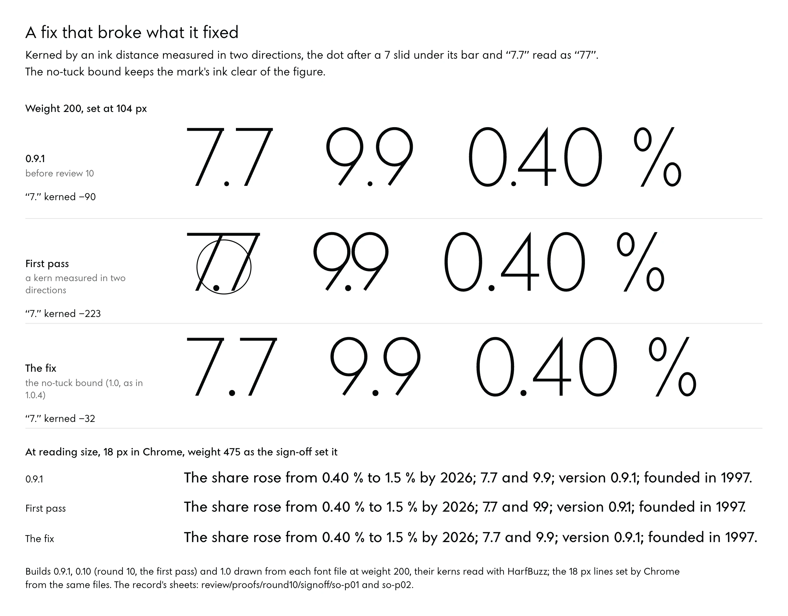
The clearest case in the record is a fix that broke what it fixed. Answering review 10, the designer agent kerned every figure and mark by an ink distance measured in two directions, which counts the empty space under the 7’s bar and inside the 9’s bowl as white. “7.” was kerned −195 units at weight 475 where 0.9.1 had −90, and “9.” −166 against −46; at the sizes of running text “7.7” read as “77” and “0.9.1” as “0.91”.
Of the measure the designer had written for itself, the sign-off review said: “That rule is the defect.” The coordinating session applied the review’s instruction, a no-tuck bound that keeps the mark’s ink half the gap between two zeros clear of the figure’s extreme, plus 2 units for rounding, and ran the review’s four acceptance checks. All four passed, and “7.7” now stands 193, 208, 239 and 265 units apart at weights 200, 300, 475 and 600, where 0.9.1 stood 168 apart at 475.
Claims fail the same way numbers do. Review 10 found that a “177 PASS, 0 FAIL” result for the Google Fonts profile, as reported, had never been measured, since that profile stops after 159 results.
Whoever drew the letter is the last one to ask whether it is right.
Reviews are wrong as well, and the good ones say so. Review 6 wrote that it had been a mistake for review 4 to advise keeping a fit that his eye and the new numbers both rejected, and of review 3 it wrote that “the gate passed and the eye did not.” Two separate agents leave the reviewer fallible and put every disagreement on paper, where a person can settle it.
What Stays in Your Hands
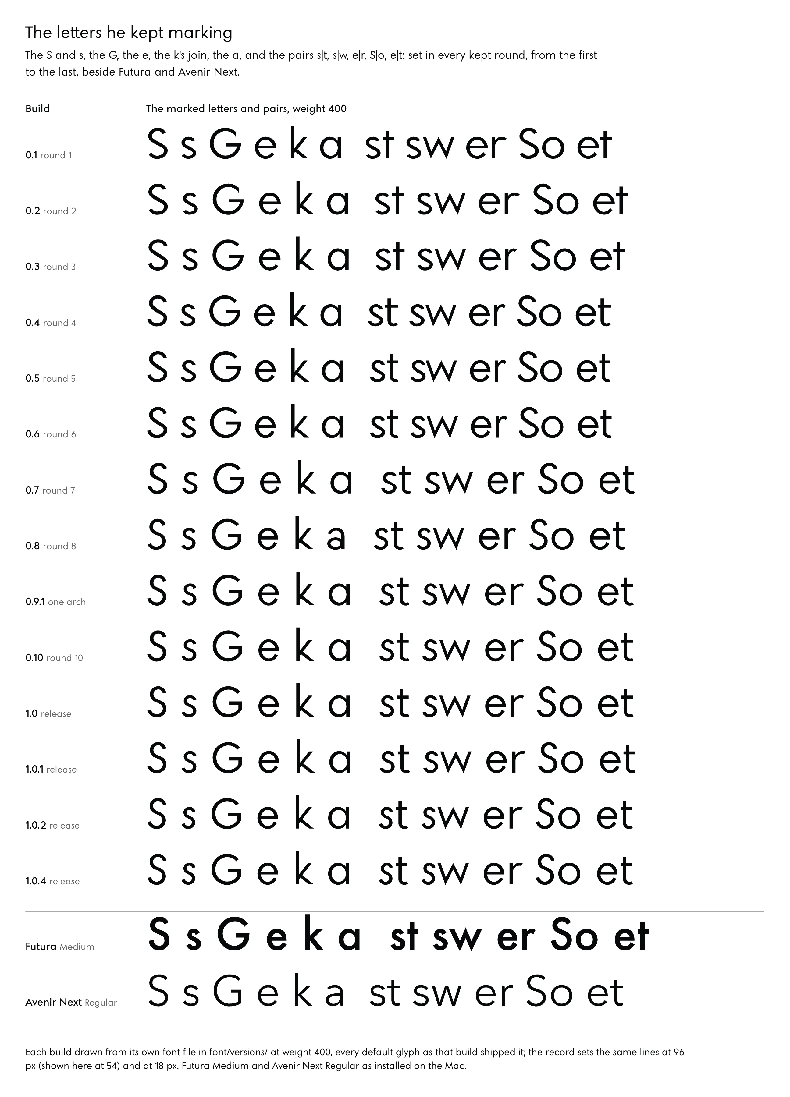
Every one of those texts ends with a person reading the result. Round 8 passed its review on the S and the G. He read it on the site and marked the same letters again, the S and s, the G, the e’s terminal, the k’s join and the a, with the pairs s|t, s|w, e|r, S|o and e|t, and added: “Your master typographer is supposed to catch all of those.” From then on both prompts opened and closed every round with his marked lines, and a flagged letter passed only when it read right in his running text.
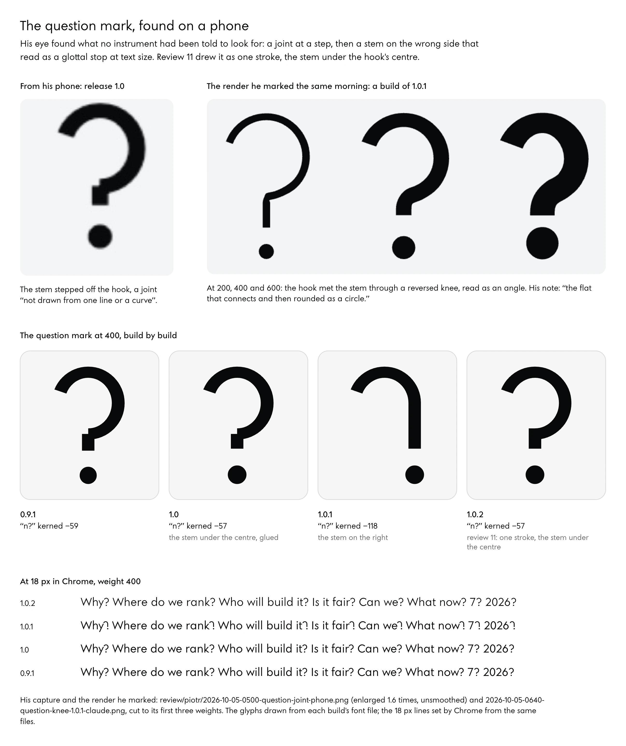
His eye also found what no instrument had been told to look for. A question mark seen on his phone led to an audit of every glyph at every instance: release 1.0 had 50 glyphs with a step at a join (947 instances) and 1.0.1 had 23 (323), each named, and the final check wrote: “He was right, and the review had missed it.” The choice of build was his as well. Three builds, 0.9.1, 1.0 and 1.0.1, were set side by side at reading size, and he took 1.0.1.
How the agents run counts as much as what they are told. For rounds 4 to 8 the designer was one agent, resumed each round, carrying about 720,000 tokens of context by round 8 (a token is a fragment of a word, the unit a model reads in) and re-reading it on each of about 270 steps a round. Round 10 ran overnight as an automated workflow in which each stage was a fresh agent, the drawing and the fixes on one model and the review and sign-off on another, and he judged it a mistake: “it’s important that each of them is doing and carrying the context.” For the last reviews the font ran on one model, Opus 5.5 in the record, as a master typographer that made the fixes itself.
Agents also overreach an instruction. Asked a question about the comma, one agent rebuilt the comma whole, and he answered that he had only asked a question. His note on an earlier rebuild was blunter: “usually your initial choice are good then you start to refine and you get lost.” Write a decision as a decision, and a doubt as a doubt.
Monotype’s Charles Nix, asked in 2025 whether AI can design a typeface, named the same habit from the supplier’s side: the models, he said, tend to redraw a design from the start when asked to refine an earlier version (Cousins, 2025).
06From Proof Sheet to Release
A font that passes its validators can still draw wrong on a reader’s screen. This part covers proofing at the sizes people read, the faults a validator lets through, one fault told whole because it cost the most, the choice between a closed face and an open one, and what a first week takes.
Proofs at the Sizes People Read
Running text is where a face is judged, because a paragraph shows its colour and its rhythm at once and a headline hides both. Paragraphs at 18 and 15 pixels, on white and on near-black, at 1x and 2x, beside the reader’s system font (SF Pro on Apple devices, Segoe UI on Windows, Roboto on Android) were the studio’s proof of Noo Sans. Its last review before launch found weight 300 faint below 15 pixels on a 1x screen, its stem 0.84 of a pixel wide at 15.3 pixels and 0.65 at 11.1, and wrote that “400 holds everywhere.” Settling on one weight by size, the site now sets running text at 350 from the body’s size up, where the stem is one pixel wide at 15.3 pixels, and at 400 below it, on both grounds.
Hinting is a set of instructions inside a font that snaps outlines to the pixel grid at small sizes. ttfautohint automates about 99 per cent of that work and notes that platforms such as Windows still need hints for text to look good (ttfautohint). The studio tested hinting with FreeType at 11 to 16 pixels: the share of grey pixels moved by 0.03 to 0.06 either way, 0.62 unhinted against 0.57 hinted at weight 400 and 15 pixels, and the technical check’s verdict was “ship unhinted.” That test ran on a Mac. No Windows screen has yet shown the face, and the one platform the hinting tool names is the one left untested.
The pages themselves were the coverage check. Headless Chrome walked 64 pages of the site, and every one of the 119 Latin characters they set is in the font. Accents were checked by behaviour: before the font gained mark and mkmk, the OpenType features that attach accents to letters and to other accents, shaperglot scored Dutch ÍJ́ at 27.1 per cent and Lithuanian at 92.4, and afterwards both scored 100.
What a Validator Waves Through
Font Bakery’s universal profile passed the studio’s build of release 1.0.2 with no failures and one warning, which it put down to the colour layers “by design”, and the OpenType Sanitizer passed it as well, colour tables included. That same file drew every paragraph on the site wrong in Chrome on a Mac. Validators check that a font is well formed and well described.
How it draws, and whether two letters read as one word, lie outside what they look at.
- Colour tables in a variable font pass every validator and send Chrome on a Mac to a different rasterizer, the code that turns outlines into pixels, as the next section tells.
- Letters outside every kerning class, such as ď, ľ, ť and Ľ, kept their drawn spacing: “ľa” stood 232 units stem to bowl at 400, against 139 for “la”.
- A hyphen under the arm of E and F reads as part of the letter. “E-mail” set it 38 units from the arm at 400 and 15 at 600, and 85 at both after the fix.
- Outlines built from separate pieces are legal in a font file. Release 1.0.1’s question mark was three pieces, and Z, z and 7 were rectangles whose corners stood outside the diagonal, by 29 units at 400 and 97 at 900.
- An unreported kern put the apostrophe 30 units tighter after a, d, h, i, l, m, n, q and u, in 239 places on the site’s pages.
- The font shorthand in a stylesheet resets every feature setting, so an alternate switched on in one rule is off again in the next.
- One-year caches on a font under an unchanging name kept an old build in service, until every font file carried its version in its name.
Of those faults, one was found on a phone. Release 1.0.1’s question mark hung its stem on the right of the hook and read as “ʔ” at 15 to 18 pixels, and its spacing had collapsed, “n?” kerned −118 units at 400 against −57 in 1.0. Review 11 redrew it with the stem under the hook’s centre as one stroke and spaced it where 1.0 had it, “n?” at 1.12 of n|n at 400.
He marked the join twice, and the second mark asked for “the flat that connects and then rounded as a circle.”
The Colour Tables, Told Whole
For an evening, text on the studio’s dark pages read heavier than the same text on white, which is the opposite of what the system font does. The site grew separate weight settings for dark grounds to compensate (300, 350, 450 and 325 in different rules), all withdrawn once the cause was found; the journal’s verdict was that “the bloom was the font file’s.” An earlier check had “blamed the eye: it measured one font alone.”
The test that found it was small and controlled. One paragraph, “Hamburgefonstiv quick joins and stems, 0123456789 the same line on both grounds”, was set at 18 and 15 pixels and weight 400 with no page styles involved, in seven rows: 1.0.3 as live, with its colour tables; 1.0.3 with COLR and CPAL removed; 1.0.1, from before the tables; 1.0.3 as a TrueType file; the candidate 1.0.4; SF Pro through system-ui; and Futura. Each row sat on a white ground (#FFFFFF with #07090B text) and a dark one (#07090B with #F2F4F5), each with font smoothing left on auto and set to antialiased, and every cell was rendered in headless Chrome at 1x and 2x.
Ink was the measure: the summed coverage of the text colour over its ground, from 0 to 1 a pixel, so a light cell and a dark cell drawn the same way give the same number.
At 2x in Chrome on the studio’s Mac, ink per cell for each ground and smoothing setting reads as follows.
| Build | Light, auto | Light, antialiased | Dark, auto | Dark, antialiased |
|---|---|---|---|---|
| 1.0.3 as live, with COLR and CPAL | 3,059.3 | 3,059.3 | 4,279.1 | 4,279.1 |
| 1.0.3 without the two tables | 4,232.5 | 3,596.0 | 4,787.9 | 3,679.2 |
| 1.0.1, before the tables | 4,243.2 | 3,605.9 | 4,800.4 | 3,689.1 |
| 1.0.4 | 4,232.5 | 3,596.0 | 4,787.9 | 3,679.2 |
| SF Pro (system-ui) | 4,805.4 | 4,143.2 | 5,385.1 | 4,226.6 |
| Futura | 5,432.5 | 4,828.7 | 5,965.5 | 4,911.6 |
Read the first row first. With its colour tables, 1.0.3 drew identically whether smoothing was auto or antialiased, so the setting a stylesheet uses to lighten text had no effect at all, and on dark it laid down 4,279.1 against 3,059.3 on white, 1.40 times the ink; SF Pro’s dark antialiased cell against its light auto cell gives 0.88. At 1x the gap was wider still, 4,790.5 on dark against 2,475.7 on white, nearly twice.
The second row is the same file without COLR and CPAL, and it draws within about 0.3 per cent of 1.0.1, the build from before the tables. Release 1.0.4 is that file.
In Chrome on a Mac at 2x, the build that carried colour tables laid 1.40 times as much ink on a dark ground as on white, where SF Pro, set the same way, laid 0.88.
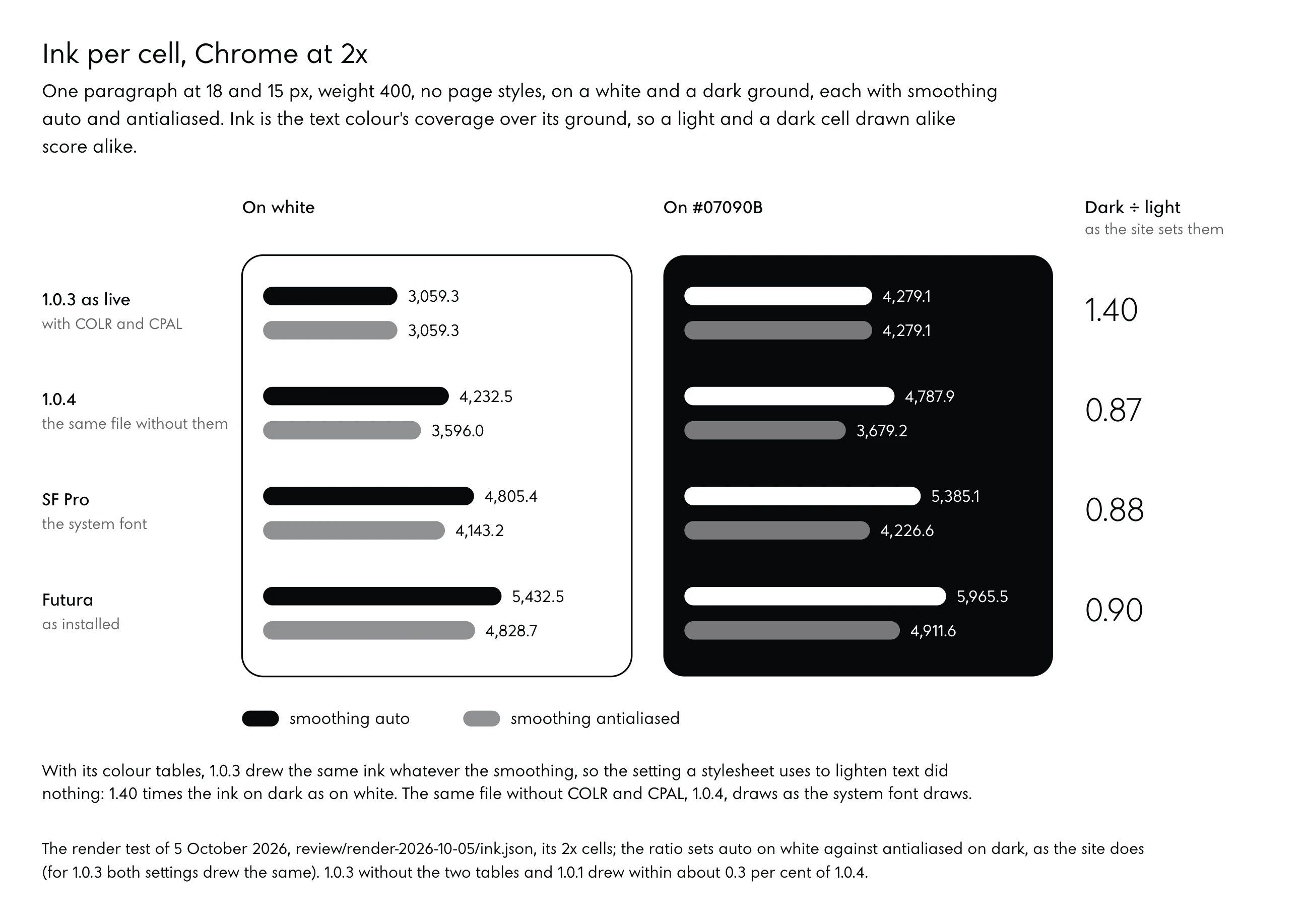
The cause sat in two small tables. Release 1.0.2 had added COLR and CPAL, the OpenType tables that build a glyph from coloured layers and hold the palettes for them (OpenType specification, COLR), for the two two-colour icons at U+E004 and U+E005. Chromium decides how to draw a web font in one source file, and for a variable font with a version-0 colour table it uses the system’s renderer only on Windows, where DirectWrite supports variations, and sends the font to Fontations everywhere else (Chromium, web_font_typeface_factory.cc).
Fontations is the family of Rust font libraries Chrome adopted for memory safety; Chrome 128 switched it on for less common formats such as colour fonts and CFF2, and Chrome 133 for all web fonts on Linux, Android and ChromeOS and as a fallback on Windows and the Mac (Röttsches, Sheeter and Brokaw, 2025). On that path -webkit-font-smoothing is ignored, a property that works only on macOS and whose antialiased value draws light text on a dark ground lighter (MDN, font-smooth). SF Pro obeyed the setting and the colour-table build did not, so the dark pages bloomed.
Safari, and Chrome on Windows, drew the font correctly, which hid the fault from anyone checking there.
Review 11 had written that “COLR v0 is drawn by every current browser.” It is, and the sentence missed the point: every browser drew the colour glyphs, and one of them drew every paragraph around them through a different rasterizer. The same source file routes other tables much the same way. CBDT and CBLC bitmaps, COLR version 1, CFF2 outlines and the second version of avar always go to Fontations, and sbix bitmaps do on Windows and on systems that rasterize with FreeType.
Those names carry a little history of the phone, sbix being Apple’s bitmap table for emoji-style glyphs and CBDT/CBLC Google’s colour bitmap pair, used heavily on Android (FontLab, 2026), so every web page inherits two answers to how a phone should draw a laughing face. None of that history belongs in a text face.
The 1.40 rests on one Mac, one headless Chrome, one paragraph at two sizes and two pixel densities. A Chrome release that changed which tables go to Fontations would move it. Firefox was never tested, and on Windows the variable COLR v0 path goes to the system’s renderer, so the fault would not show there at all.
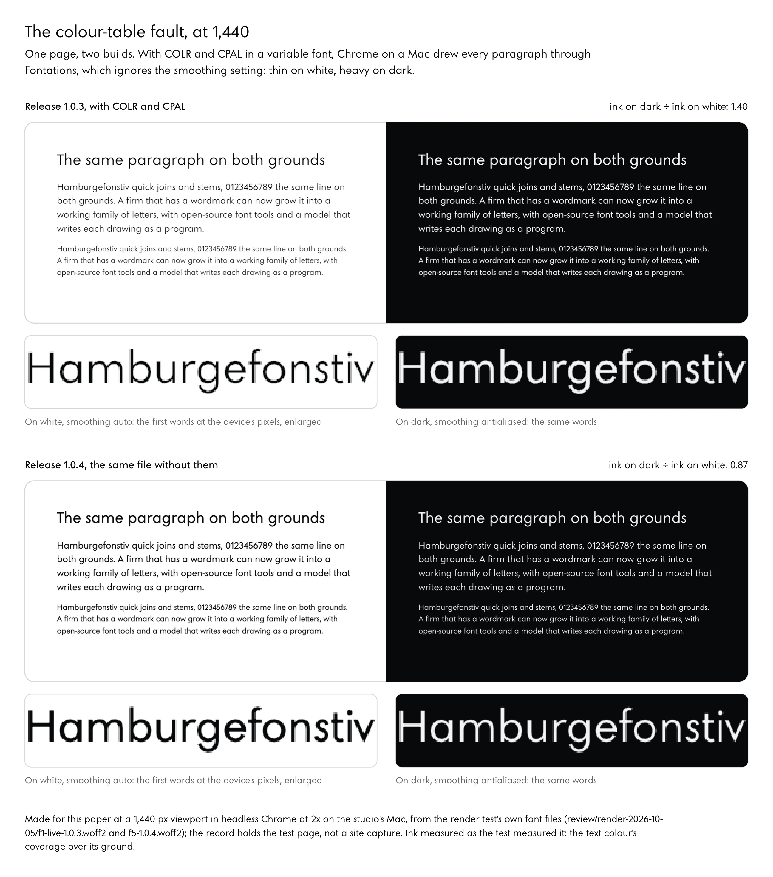
Release 1.0.4 is 1.0.3 without its colour tables, with outlines, metrics, features and marks unchanged. The two-colour icon points now draw the one-colour icon, whose outline “was U+E001’s knockout all along”, and the icon’s two looks are the glyph at U+E001 in two text colours, “the ground showing through the N.” His comment on the fix was short: “it never had to have colored glyphs in the first place.” On 1.0.4 the render check gave a smoothing ratio of 1.177 against SF Pro’s 1.160, and a dark-to-light balance of 0.869 against SF Pro’s 0.880.
Four locks keep the fault out, each tested on 1.0.3, which they refused, and on 1.0.4, which they passed. The build asserts that no such table is present, and the validator gained a check for the web. A release step on the site refuses any font that carries one.
Before installing a font, a render check sets it beside SF Pro in Chrome and refuses one whose smoothing has no effect, or whose dark ground draws more than SF Pro’s within 0.08. Both prompts gained a section that forbids the tables outright. Release 1.2 went through the same locks on 9 October 2026 and carries no colour table.
The render check gives it 1.0.4’s own numbers, a smoothing ratio of 1.177 and a dark-to-light balance of 0.869, because at weight 400 it keeps 1.0.4’s drawings apart from the e, the r and the 7.
A Closed Face or an Open One
Round 1 wrote “all rights reserved” into the font’s name table, and by round 10 Noo Sans was under the SIL Open Font License 1.1. That licence lets anyone use, study, change and pass the font on, under conditions: the font may not be sold by itself, though it may be bundled and sold with software so long as each copy carries the copyright notice and the licence; a modified version may not use a Reserved Font Name without the copyright holder’s written permission; and the font, changed or whole, in part or in full, goes out under this licence and no other (SIL Open Font License 1.1).
His reason for opening it was reach. He was content for people to take the font, because he meant to put it on Google Fonts, with a description and visuals, and have the studio better known for it.
The package for Google Fonts is prepared and not submitted. It holds the licence file, the metadata file, the article and an upstream repository laid out as Google’s guide asks, with the font in a build that leaves out the studio’s marks, since Private Use Area glyphs mean something only by private agreement. Google’s guide sets a minimum Latin set that any Latin family carries (Google Fonts guide, requirements), and review 10 found the font 8 characters short of it.
Font Bakery’s Google Fonts profile later gave 183 passes, 2 failures and 5 warnings, both failures waiting on the upstream repository’s address, which he creates. The vendor ID is still unregistered, a designer profile is still needed, and submitting is his.
A closed face keeps the letters as a mark only the firm sets, which suits a firm whose letters are the brand and whose competitors could otherwise set them. The Reserved Font Name is the middle course the licence offers: open files, with the name kept for the original.
The Kit for Monday Morning
Time first, in one sentence: a working family took under three days, and the care after launch has no end date. Most of what a first week needs is decided before anything is drawn.
- Logo vectors: decide which file is the master drawing of the letters, so every number comes from the outline and none from a screenshot.
- A handful of numbers written before the drawing: the stem’s share of the height, the circle, the diagonal’s angle, how a stroke ends, the x-height against the cap height.
- Weights in use, ranked. Noo Sans got 300 to 600 right first and asked of 700 to 900 only that they never look ugly.
- Your problem words, the headings, names and pairs you will read in every round, set at the sizes your pages use.
- One computer with an agent that reads and writes files and runs commands, Python’s font libraries in one local environment, and a headless browser.
- Two prompts kept apart, a designer’s and a reviewer’s, adapted from the ones printed in this paper, each told what it may touch.
- Render checks beside your system font on light and dark grounds, run before every release and able to refuse one.
- Licence wording for the name table on the first build: all rights reserved, or the Open Font License.
Of those eight, the last is the one that cannot be walked back. The licence’s fifth condition sends every copy, changed or whole, out under the same licence and no other, so a face opened on Monday stays open in every copy already given away.
07Method and Sources
Everything this paper says about Noo Sans comes from the studio’s dated records, and everything else from documents opened and linked where they are named. Derived figures, the ratios, the visual angles and the steps between weights, are computed in the text from the record’s numbers, with both inputs shown.
The Studio’s Records
The figures come from the font folder’s briefs (the opening brief, the round-3 brief, the round-10 brief, and the final-check and final-review briefs), its reviews (review 1, reviews 3 to 8 and reviews 10 to 12, review 10’s sign-off, the final check, and the technical checks of releases 1.0.2 and 1.0.3), each round’s notes and reports (round 12’s notes among them, which describe release 1.2), the README as of release 1.0.4, the release table, the render test with its page, scripts and ink.json, the marked screenshots, the three prompts, and the studio’s decision log and design journal. Work on the face ran from Saturday 3 October 2026 at 11:00, when the opening brief was written, to Tuesday 6 October at about 00:05, when 1.0.4’s notes and the prompts were last saved, with noo-studio.com going live in Noo Sans 1.0.2 on Monday 5 October at 17:38; all times are Poland time, and records written before the evening of 4 October came from a Mac whose clock ran on UTC+8, so this paper anchors those rounds on the files’ own times. Round 12, which became release 1.2, was drawn and released on Friday 9 October.
The record also names what it does not claim: no test with readers, no listing on Google Fonts, no test in Firefox or on Windows, and no effect on the studio’s search or enquiries. Release 1.0.4 was checked by its validator, the Sanitizer and the render check, and no master typographer has reviewed it. Its successor, 1.2, went live once its gates, the Sanitizer and Font Bakery among them, and the render check had passed.
A fresh master typographer’s review of it (review 14) found that from 600 to 900 it reads as the same family as the middle at text and heading sizes, and listed four faults at display sizes from 800 to 900, the S and s closing, the slot of the a with a drop, the e’s eye and the N, for the next round.
Outside Sources
Each document cited above, numbered in the order of its first citation, with its address:
- Studio Type, Information, the foundry’s guide to commissioning custom fonts and how long they take.
- Jamie Clarke, How to Commission a Custom Typeface, 20 July 2026.
- Alice Savoie, Kai Bernau, Wayne Daly, Raphaela Haefliger and Sebastian Baez Lugo, Automation and Artificial Intelligence in the Type Design Process, Visible Language 60, no. 1, April 2026.
- Anthropic, Claude Code overview, Claude Code documentation.
- fontTools documentation, the Python library for reading and writing fonts.
- Nadav Benedek, Ariel Shamir and Ohad Fried, NIV: Neural Axis Variations for Variable Font Generation, arXiv 2606.05261, June 2026.
- Xiaoke Huang and others, VecGlypher: Unified Vector Glyph Generation with Language Models, arXiv 2602.21461, February 2026, accepted to CVPR 2026.
- Zhenhua Yang, Dezhi Peng, Yuxin Kong, Yuyi Zhang, Cong Yao and Lianwen Jin, FontDiffuser: One-Shot Font Generation via Denoising Diffusion with Multi-Scale Content Aggregation and Style Contrastive Learning, AAAI 2024.
- Unicode Consortium, FAQ on private-use characters.
- John Hudson, Something Like a Typeface, Tiro Typeworks, January 2025.
- Jack Cousins, Can AI Design a Typeface?, 30 June 2025, an interview with Charles Nix of Monotype.
- Google Fonts Knowledge, glossary entries, CC BY-SA 4.0: em, x-height, counter, terminal and overshoot.
- Font file requirements, in the Google Fonts Guide.
- Gordon E. Legge and Charles A. Bigelow, Does Print Size Matter for Reading? A Review of Findings from Vision Science and Typography, Journal of Vision 11, no. 5, article 8, 2011.
- Microsoft, OpenType specification 1.9.1: the Font Variations overview, avar, the axis variations table and COLR, the colour table.
- ATypI, the Warsaw 2016 conference, on the announcement of OpenType variations on 14 September 2016.
- Universitat de Barcelona, Arts Gràfiques, on Walter Tracy’s spacing method, citing Letters of Credit, pages 74 to 75.
- Huerta Tipográfica, HT Letterspacer.
- Typeroom, Futura: The Story of a Font Ahead of Its Time, 20 October 2017.
- Apple, Fonts for Apple platforms, on SF Pro.
- Jasper M. de Waard, Erik Van der Burg and Christian N. L. Olivers, A Thickness Illusion: Horizontal Is Perceived as Thicker than Vertical, Vision 3, no. 1, article 1, 2019.
- W3C CSS Working Group, CSS Fonts Module Level 4, the font shorthand, Editor’s Draft.
- OpenType Sanitizer (OTS).
- Font Bakery.
- Shaperglot, from Google Fonts.
- Fontra, the browser-based font editor.
- ttfautohint, from the FreeType project.
- Chromium source, web_font_typeface_factory.cc.
- Dominik Röttsches, Rod Sheeter and Chad Brokaw, Memory Safety for Web Fonts, Chrome for Developers, 19 March 2025.
- MDN Web Docs, font-smooth.
- FontLab, Color Fonts in 2026, FontLab blog, May 2026.
- SIL International, SIL Open Font License, Version 1.1, 26 February 2007.