An icon set looks consistent when every icon obeys the same few decisions: one grid, one stroke at each weight, one family of corners, one amount of air between parts, one optical size. Those decisions can be written down before the first icon is drawn, and an AI can then draw to them, measure itself against them and be judged by them. This paper shows how, from an empty grid to a finished font, with Noo Icons, the studio’s own family of 165 icons, as the worked example.
On Saturday 3 October 2026 the founder asked for “a full-on icon system that can be used consistently across all of the materials”, one for “the animations and the videos in the future”, built “with the principles of good design” and with “variable weights, the same as Google have the icon font”. We wrote a brief from his words and gave it to a Claude agent as the designer. When its first build was done, a second Claude agent, with its own prompt and no right to edit, judged it. By the afternoon the judge had found what failed and the designer had fixed it; by the evening the set had grown from 116 icons to 165; at two the next morning its stroke was tuned to the studio’s own typeface and the font went into the site.
Everything below comes from that record: the brief and the prompts as they were sent, the judge’s findings with their measurements, and figures drawn from the icons’ own files. What a reader can take from it: a method in ten steps, the rules that make a set consistent, the prompts to copy, and the font itself, free to download at the end.
01Ten Steps
To design a consistent icon set with AI, write the rules before the drawings, let the AI draw in code against those rules, and have a second AI judge the result with measurements; keep the meanings and the final choices with a person. As we ran it, in ten steps:
- Write the law first. The grid, the keylines, the stroke, the corners, the air between parts, the angles a line may take, all as numbers. See The Grid First.
- Say what each icon means, in one line of your own words. The AI draws the idea it is given; an icon without a stated meaning becomes a picture of an object.
- Draw a core dozen in whole squares, then round them. Look at both stages before drawing the rest. See Drawn, Then Rounded.
- Calibrate the stroke to your typeface at every weight, so icons and words read as one colour. See Weight and Contrast.
- Turn the rules into checks the build runs on every master, so a drawing that breaks one is refused rather than noticed later.
- Draw the whole set from one engine. Every icon is the same construction, so consistency comes from the method, not from care taken icon by icon.
- Proof at the sizes and states it will be used in: 16, 24 and 48 px, on white and on black, every weight and fill. See Small and Large and Outline and Fill.
- Hand the build to a separate judge with its own prompt, its own tests and no right to edit. See Designer and Judge.
- Fix in rounds, and leave to a person what only a person can decide: here, four icons whose meaning had more than one good drawing.
- Ship it as a versioned font and as SVGs, and use it by one set of rules in the interface. See From Drawings to a Font and Icons in the Interface.
The record shows how fast this runs once the law is written. The designer’s first build, 116 icons with a variable font and 1,740 SVG files, took an hour and a half. The judge’s review took three quarters of an hour, the second round another hour and a half.
| When (Poland time) | What happened |
|---|---|
| Saturday 3 October, 11:06 | The brief, written from the founder’s words |
| 11:07 | The designer starts |
| 12:34 | Version 0.1: 116 icons, a variable font with three axes, 1,740 SVG files |
| 12:35 | The judge starts, with its own prompt |
| 13:20 | The verdict: not ready for the site; 3 blocking findings, 8 important, 13 polish |
| 13:21 to 14:52 | Round two: every blocking and important finding fixed; four icons drawn as options for the founder |
| The same evening | Version 0.2: 49 icons for editors and ordinary pages, 165 in all |
| Sunday 4 October, about 02:00 | Version 0.3: the stroke follows the studio’s own typeface; the font goes into the site |
02What Consistency Means
An icon set is consistent when you cannot tell which icon was drawn first. Every icon sits on the same grid, inside the same live area, carries the same stroke at each weight, turns its corners at the same radii, keeps the same air between its parts, reaches the same optical size and says one idea in the same abstract language as its neighbours. A set is not consistent because its icons look alike; it is consistent because they were all made by the same decisions.
The Decisions That Make a Family
These are the decisions behind Noo Icons. Each is a number or a rule that can be checked, which is what makes it usable by an AI.
| Decision | Noo Icons |
|---|---|
| The grid | 24 units, 2 of them padding, a live area of 20 |
| The optical size | four keylines: a circle 20 across, a square of 18, a portrait 16 by 20, a landscape 20 by 16 |
| The stroke | 2 units at Regular, 0.92 at Thin, 2.94 at Bold, following the stems of the studio’s typeface |
| The corners | radii on the stroke’s centreline: containers 1, elbows 2, small blocks sharp, dots circles; round caps and joins |
| The air | at least one visible unit between any two parts, at every weight, size and fill |
| The angles | lines along the grid; 45 degrees only where the meaning needs it |
| The geometry | the circle and the square, the O and the N of the typeface |
| The language | abstract, one idea per icon, never a picture of a real object |
| The colour | one colour, the text’s own |
Why AI Needs Rules, Not Pictures
Ask an AI for a set of clean line icons and it draws each one as a new picture. The first arrow and the fortieth chart will differ in stroke, in corner, in how close their parts sit, because nothing told them to agree. A person drawing a set by hand meets the same drift, which is why every professional family is built on a grid and a construction.
With AI the remedy is stronger than with a person. The rules can be written as code, and the code can refuse a drawing. The build of Noo Icons refuses any icon whose parts come closer than a unit at any weight, any cut that leaves its solid, any contour that crosses itself and any ink outside the live area. Consistency stops being a matter of taste checked by eye; it becomes a property the build proves on every icon, every time it runs.
The founder said it of the studio’s drawings before a single icon existed: “as an icon they are supposed to be within a grid … share the same type of identity: whether it’s rounded, not rounded, squared, it’s important.”
The Bar We Set
The brief named the families to measure against: Google’s Material Symbols, Apple’s SF Symbols and Phosphor. From Material Symbols we took the method, not the look: a variable font with weight, fill and optical size axes, icons set by their names. The drawings had to be the studio’s own, from the geometry of its own typeface.
03The Grid First
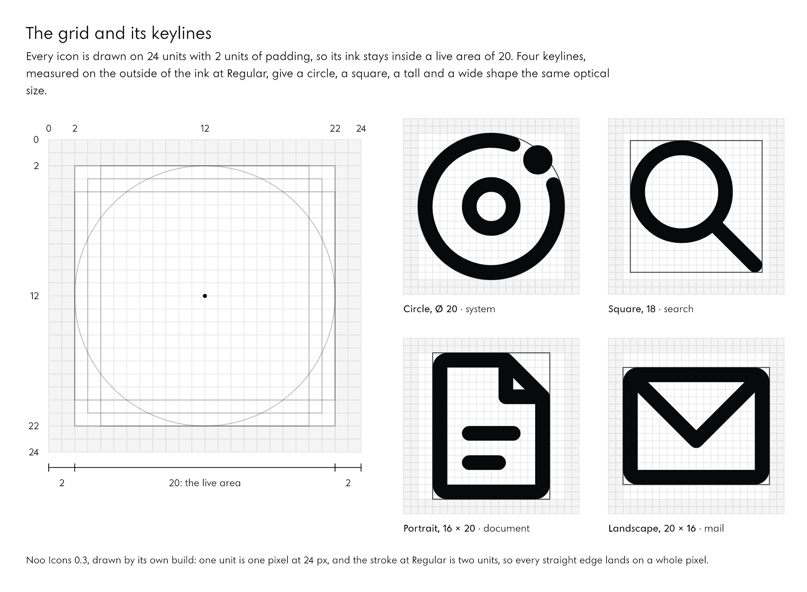
Start with the grid, before any icon and before any prompt about icons. An icon grid is the square every icon is drawn on, with a margin no ink may enter and a few keyline shapes that give every icon the same optical size. Ours is 24 units with 2 units of padding, so every icon’s ink lives inside a square of 20.
24 Units, 2 of Padding
The grid is 24 because 24 px is the size icons are set at most often: one unit is then one pixel. Every node of every skeleton sits on a whole unit and the stroke at Regular is 2 units, so at 24 px on a 1x screen every straight edge lands on a whole pixel and stays sharp.
The designer considered a grid of 48 and refused it, with a reason worth keeping: a finer grid only adds half-unit positions, and a half unit is half a pixel at 24 px, exactly the size where edges matter most. A finer grid gives more freedom and less sharpness.
Keylines
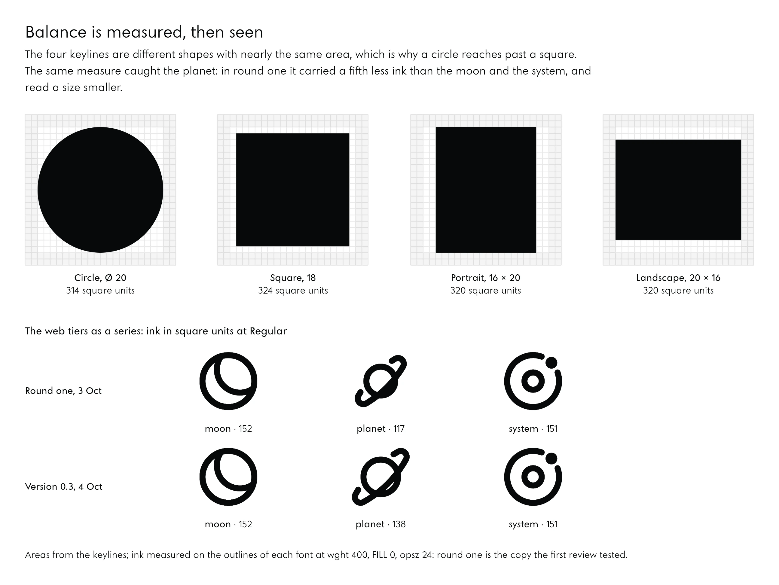
A keyline is the shape an icon of a given kind fills, and Noo Icons has four, measured on the outside of the ink at Regular. A round icon fills a circle 20 units across, touching the padding; a square icon stops a unit inside, at 18; a tall icon is 16 by 20 and a wide one 20 by 16.
The reason is optical, and it can be measured: the four shapes enclose nearly the same area, 314, 324, 320 and 320 square units. A circle and a square of the same width do not look the same size, because the circle gives up its corners; a circle and a square of the same area do.
Say It as Numbers First
The way to prompt for this is to ask for the grid as numbers and for nothing else, then to read the numbers before a single icon is drawn. An AI that starts drawing at once invents its grid icon by icon; one that has written the grid down, and been told the grid is the law, draws to it. The brief stated the grid in its first numbered item, the keylines in the same line, and asked the designer to argue for any change. A prompt in that shape, for a set of your own:
Prompt: the grid first
Before you draw any icon, write the system as numbers and stop.
1. The grid: 24 units with 2 units of padding, a live area of 20 x 20. If you would choose another grid, say which and why; the icons must stay crisp at 24 px on a 1x screen at Regular.
2. The keylines, measured on the outside of the ink at Regular: circle 20, square 18, portrait 16 x 20, landscape 20 x 16.
3. The stroke at Regular: the Regular stem of [your typeface] at the same size, rounded to whole units. The other weights from the same typeface's stems, compressed so Thin stays visible and Bold keeps its gaps. Write the formula.
4. The corners: radii on the centreline of the stroke. Containers, elbows, small blocks and dots each get one radius; round caps and joins.
5. The air: every two separate parts keep a visible unit at every weight and size.
6. The angles: lines along the grid; 45 degrees only where the meaning needs it; links bend at a radius, never at an angle.
I will read these numbers before you draw anything.
Then describe the icons in words. The brief gave each of the studio’s own icons its meaning in a few words, and those words decided the drawings more than any picture could: “search measures (the instruments, the record of what happened); position reads (the buyers’ words, the field, one place nobody holds); alignment aligns (brand, pages and search brought into one line, checked monthly)”, and “Moon is one site, complete; Planet is a catalogue site with its languages; System is a main site with satellites on orbits.”
04Drawn, Then Rounded
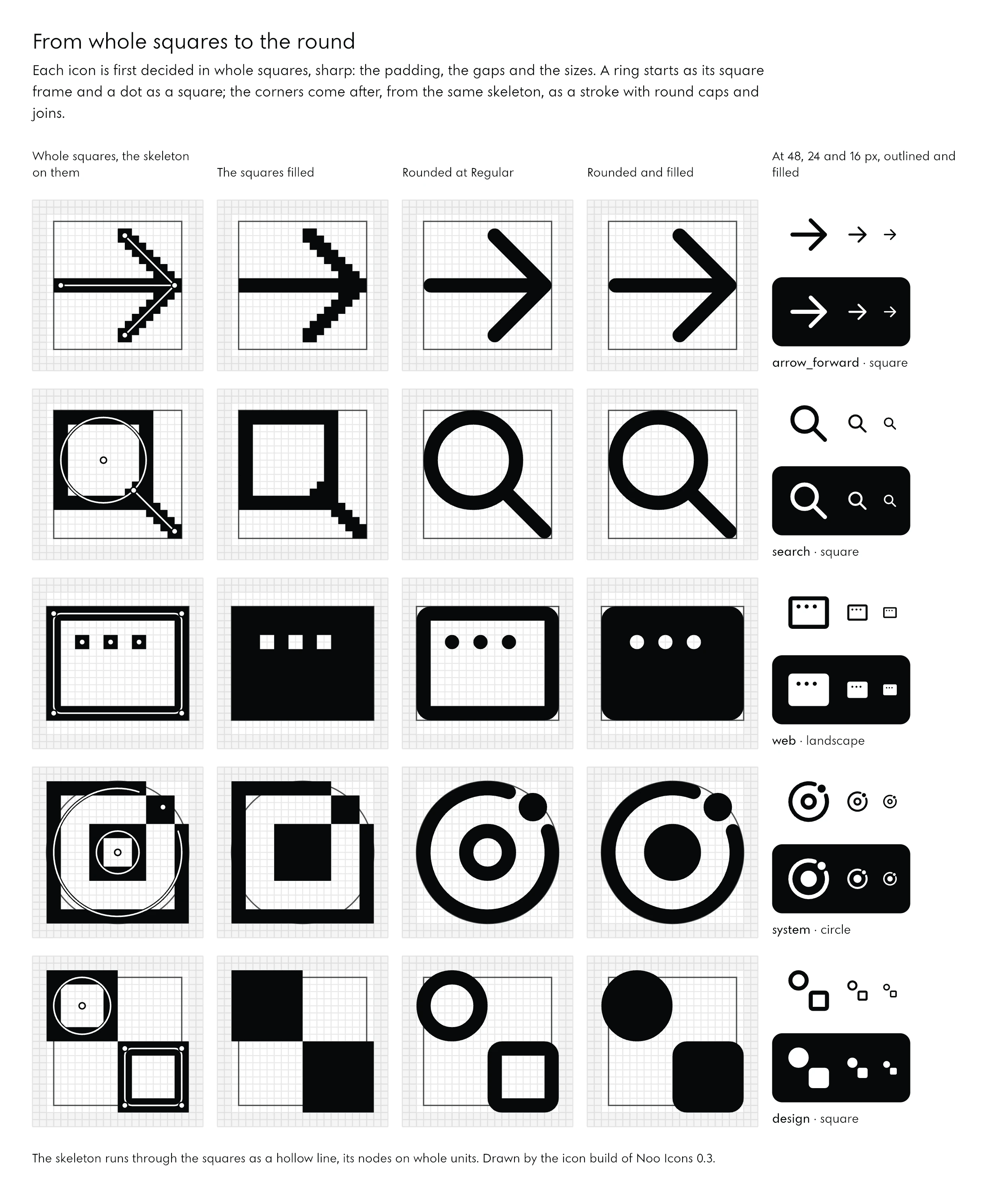
Draw every icon first as a picture of whole squares on its grid, with sharp corners, and round it only after. The squares decide what matters, the padding, the gaps and the sizes; the corners then come from the same skeleton, by rule. The founder set this law for all the studio’s drawings: “The grid allows you to do the pixelated drawing first with sharp corners, filling up the whole space and deciding whether two squares is the padding or one square; the little dot becomes a circle that comes from the border radius; then you turn them into pills, you turn them into animation.”
The Pixel Stage
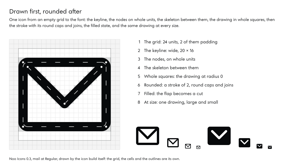
In the build, every icon is a skeleton: centrelines between nodes on whole units, closed shapes, dots. The pixel stage draws that skeleton at a radius of 0: square caps, mitred corners, a ring as its square frame, a dot as a square. At this stage one question is answered for every part: is the gap between these two things two squares or one? The answer is final; rounding never moves a node.
Two conventions keep the stage honest. Circles and straight parts are drawn at radius 0, so a ring shows as the square it will be rounded from. Curves made from intersections, a crescent or a ring seen at an angle, cannot be squares, so they are shown as the raster of their rounded shape, and the proofs say which.
From Squares to Pills
The rounded stage strokes the same skeleton: every line becomes a pill with round caps, every corner a round join, every dot a circle. Nothing is redrawn between the stages, so nothing decided in squares is lost. The order matters because rounding hides decisions: a gap that looks fine between two rounded ends can be half a unit, and only the squares show it.
A Core Dozen First
The brief asked for twelve icons through both stages before any other was drawn: the arrow, the check, search, play, mail, the key, the moon, the planet, the system, and the three service families. Twelve icons cover lines, circles, containers, dots, diagonals and constructed curves, so every rule is tested before it is repeated a hundred times.
The designer looked at its own sheets and redrew before anyone else saw them. Its report lists what it caught: “the first moon read as a face, the flat rings as a bowl, spec sheet and paper as calculators, engine as a birthday cake.” An AI that can see its own proofs, and is told to look, finds the worst of its mistakes itself.
Abstract, Never Too Real
An icon says an idea, not an object. The founder’s words, about the drawings that came before the icons: they “read better as understanding the structure and the system rather than actually showing how some design looks … that’s always the problem, when it’s too much real”. So in Noo Icons a site is a frame and its words, the web a window and its three buttons, a server one rack with two shelves and their lights, a book a cover, a spine and its mark. On the site the founder twice rejected a drawn key for the logins a firm receives; the tile now shows an account in the firm’s name.
05Balance and Space
Balance in an icon set is optical, not mathematical: icons look the same size when they carry about the same area and the same weight of ink, not when they share a bounding box. Space is the other half of every drawing, the white inside and between the parts, and it has to stay open at every weight.
Optical Balance
The keylines already balance the shapes. The same measure balances a series: in round one the moon carried 152 square units of ink, the system 151 and the planet 117, and its box was 18 units where theirs were 20. Beside them the planet read a size smaller. Round two built the planet’s ring as a wider oval and gave it a larger body: 139 square units in the same 20-unit box, and a series that reads as one.
The method is the one the founder holds the studio’s typeface to: build on the construction, then correct what the geometry decides badly, by measuring first and changing one thing at a time. Of the typeface he said, “Trust the math … ours is just slightly more geometric and calculated, and that’s what my studio does.” The numbers come first, the eye decides.
White Space and Dark Space
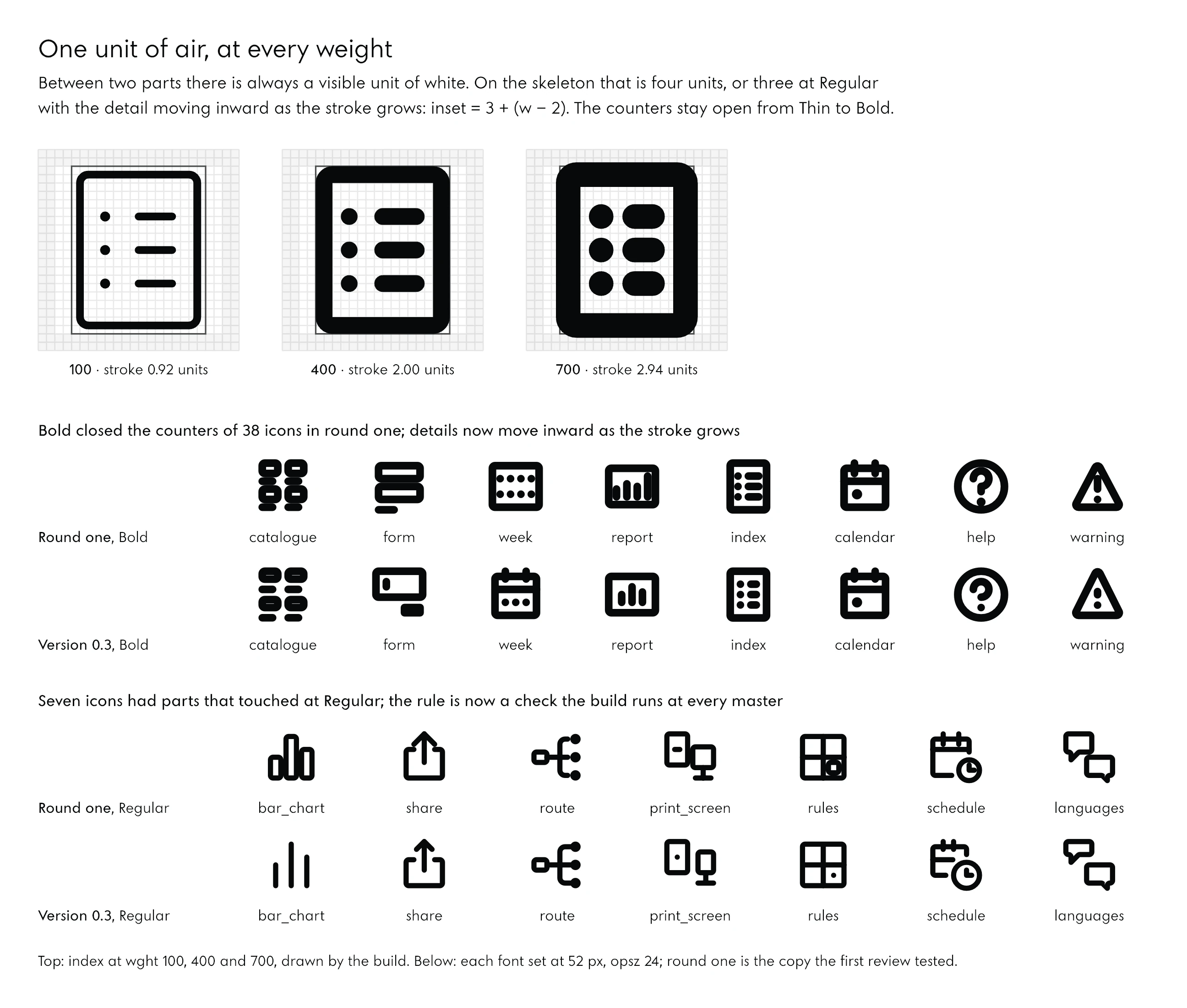
Every icon is made of two spaces: the ink, and the white it encloses and leaves between its parts. The law of Noo Icons is that every two separate parts keep a visible unit of white at every weight, optical size and fill. On the skeleton that means 4 units between strokes, or 3 at Regular with the detail moving inward as the stroke grows: inset = 3 + (w − 2), where w is the stroke.
Round one broke this law without anyone deciding to. Seven icons had parts whose skeletons sat 2 units apart, so at Regular the gap was exactly zero and the parts touched; at Bold, 38 icons of 116 closed their counters. The fix was the inward rule above, and the rule became a check the build runs at every master, 36 of them.
Filled, the dark space takes over and the same law runs the other way: a cut keeps at least a unit of solid around it, and a unit from any other cut, so a filled icon never breaks into pieces.
One Idea per Icon
The brief’s line for a modern icon was short: “fewer strokes, one idea per icon, generous negative space”. It is the hardest rule to keep, because every detail added makes an icon more precise and less legible. In round one the brand tier drew the mark on its construction as a full cross through a circle; at 24 px it read as a gun sight, and it carried the most ink in the set, 211 square units. Its guides now stop a unit short of the mark, and the icon carries 177. The founder said it of the site’s colour, and it holds for drawing: “adding more doesn’t mean getting the better results”.
06Sharp and Round
Decide every corner sharp, then round it by rule. In Noo Icons radii are written on the stroke’s centreline, so one stroke keeps one even width at every weight, and a small family of radii is chosen once and used everywhere.
The Radius on the Centreline
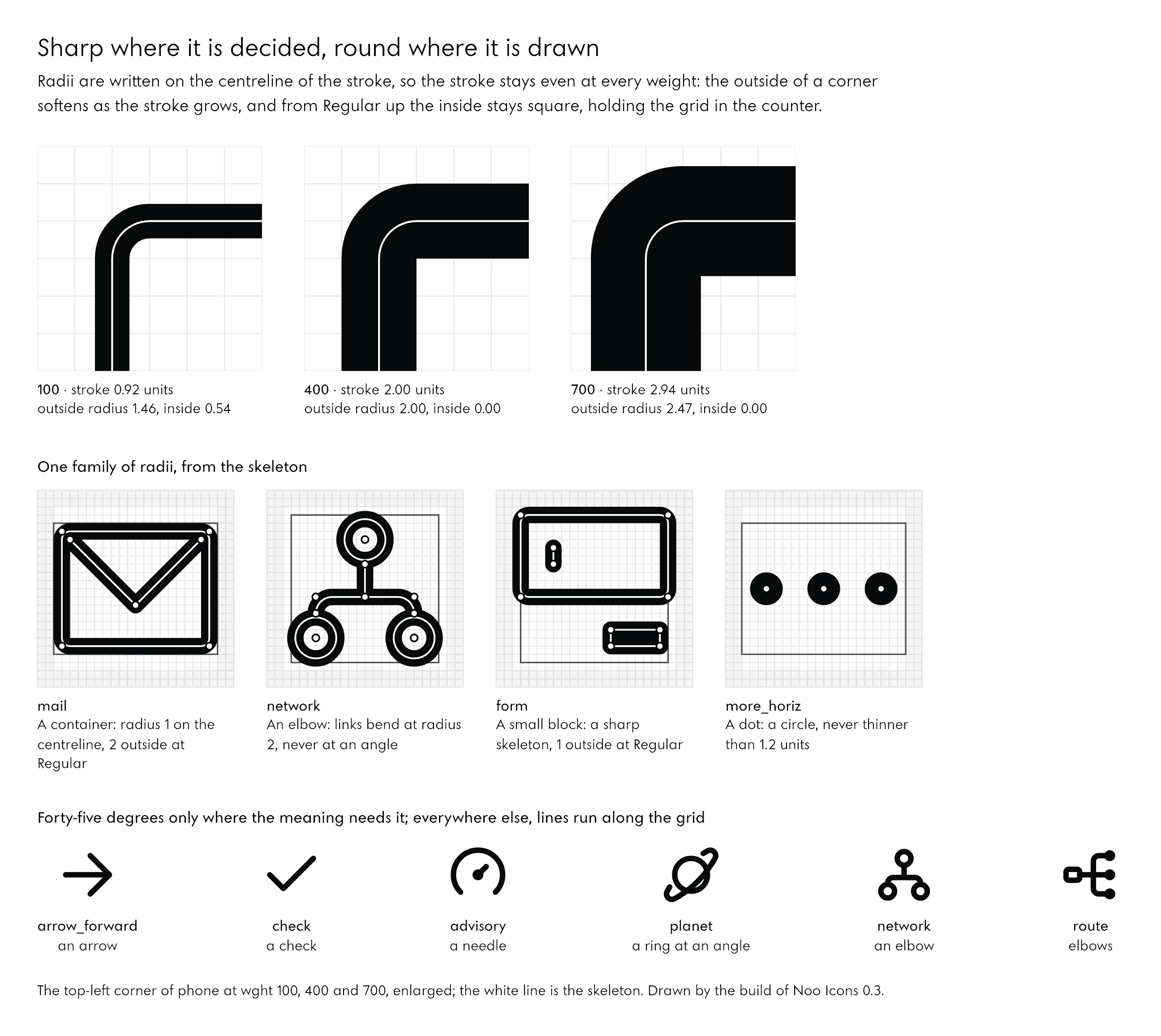
A container’s corner has a radius of 1 unit on its centreline. The outline is the stroke built around it, so the outside of the corner turns at the radius plus half the stroke and the inside at the radius minus half the stroke. At Thin the outside turns at 1.46 and the inside at 0.54; at Regular the outside turns at 2 and the inside is square; at Bold the outside turns at 2.47 and the inside stays square.
The result is the look of the whole family: a soft silhouette around a counter that keeps the square of the grid. Rounded any other way, for example with the same radius inside and out, a corner carries more ink than the sides it joins, and a different amount at every weight.
One Family of Radii
Four radii make every corner in the set. Containers turn at 1 on the centreline, 2 outside at Regular. Elbows, where a link bends, turn at 2. Small blocks keep a sharp skeleton, which gives them 1 outside at Regular. Dots are circles, their skeleton radius plus half the stroke, kept at 1.2 units or more at Thin, as the dot of a thin i is kept visible in type. No other radius is allowed, so no icon can look rounder or sharper than its neighbour.
Where Lines May Turn
Lines run along the grid. A diagonal is used only where the meaning needs it: an arrow, a check, a gauge’s needle, a ring seen at an angle. Where a link has to change direction it bends at a radius, never at an angle: the founder’s objection to the first drawings was exactly this, “you draw it like the angles just because it’s simpler: not a nice way”. Every exception is decided and written down: the isometric plates of layers and box at a slope of 1 in 2, the folds of the map at 1 in 3, the near-equilateral triangles of play and warning with their nodes on the grid.
Arrowheads by Role
Even arrowheads follow a rule. An arrow on its own has a head of 7 units; an arrow inside a composition, as in download, has 5; the small arrows of share and sort have 4. A difference decided once and written down is a rule; a difference that just happened is drift.
07Weight and Contrast
An icon’s stroke should match the stem of the text it sits beside, at every weight, so a line of words and its icons read as one colour on the page. Contrast across the set is then consolidated by measuring each icon’s ink and keeping icons shown together within a narrow band of it.
The Stroke Is the Type’s Stem
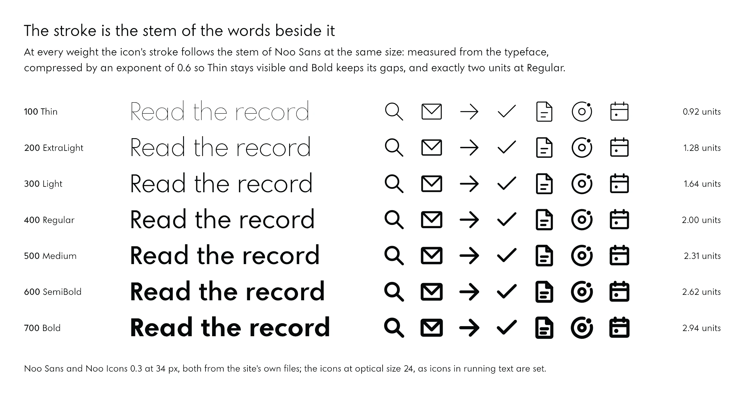
Set at the same size as the text, the 24-unit grid is the em, so a stem of s thousandths of an em is 24 s / 1000 units. Noo Sans, the studio’s typeface, has a Regular stem of 77.8 thousandths: 1.87 units, taken as 2 so every edge lands on a pixel at 24 px. The other weights follow the typeface’s own stems, compressed:
The stroke at every weight
stroke(wght) = 2 x (stem(wght) / stem(400)) ^ 0.6

Noo Sans stems, thousandths of an em:
100: 21.4 · 400: 77.8 · 700: 147.5
Strokes, in units:
100: 0.92 · 400: 2.00 · 700: 2.94
The exponent is the design decision. Followed exactly, the typeface’s Thin would give a stroke of half a unit, half a pixel at 24 px, and its Bold 3.5 units, which would close every gap. Compressed by 0.6, Thin stays visible and Bold keeps its air, and the icons still move with the type.
| Weight | Noo Sans stem (1/1000 em) | Stroke (units) | At 16 px | At 24 px | At 48 px |
|---|---|---|---|---|---|
| 100 Thin | 21.4 | 0.92 | 0.71 px | 0.92 px | 1.57 px |
| 200 ExtraLight | 37.2 | 1.28 | 0.94 px | 1.28 px | 2.18 px |
| 300 Light | 56.0 | 1.64 | 1.17 px | 1.64 px | 2.79 px |
| 400 Regular | 77.8 | 2.00 | 1.40 px | 2.00 px | 3.40 px |
| 500 Medium | 99.7 | 2.31 | 1.59 px | 2.31 px | 3.93 px |
| 600 SemiBold | 122.8 | 2.62 | 1.77 px | 2.62 px | 4.46 px |
| 700 Bold | 147.5 | 2.94 | 1.96 px | 2.94 px | 4.99 px |
The first build followed Jost, the typeface the site used then, because the studio’s own face was still being drawn. The mapping was written as one table of stems, so when Noo Sans passed its review the icons moved to it by replacing the table: the light weights gained a little body, as Noo Sans’s own thin weights do, and Regular to Bold moved by less than a tenth.
One Weight of Ink per Row
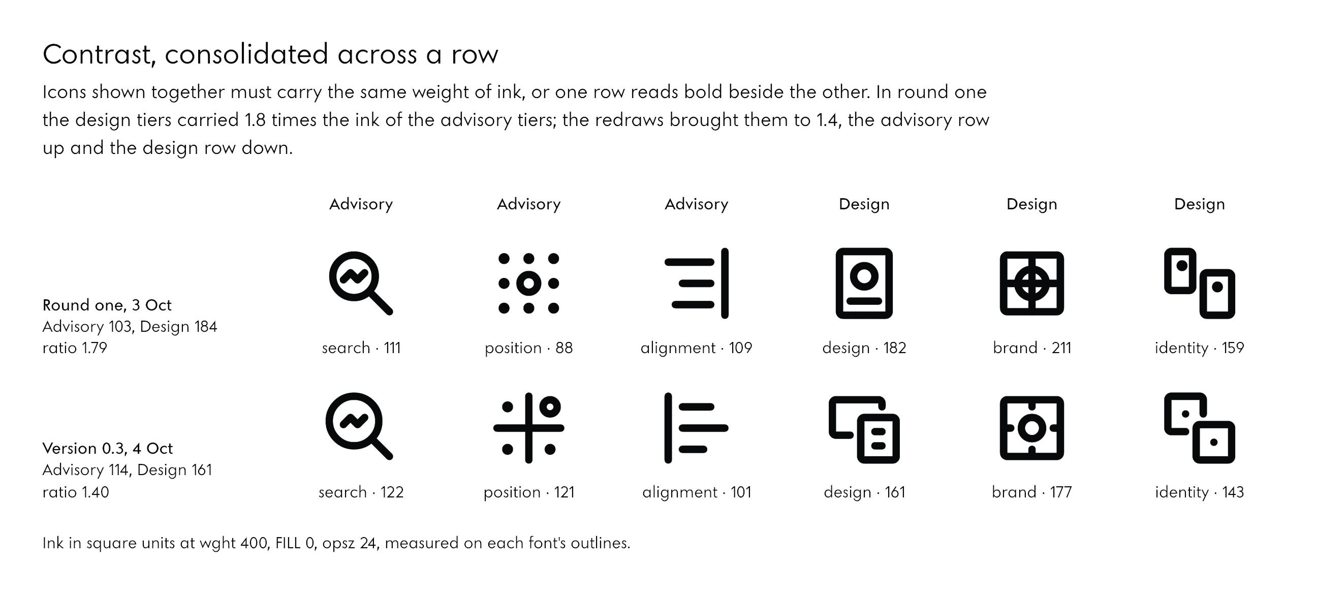
Icons that are shown together have to carry the same weight of ink, or one row reads bold beside the other. On the studio’s services page the three advisory tiers and the three design tiers sit in rows. In round one the design row carried 1.8 times the ink of the advisory row, 184 square units on average against 103. The judge measured it, asked for each row to stay within about a fifth of its own mean, and the redraws brought the two rows to 161 and 115.
Never Bold When Large
The heavier an icon looks, the rounder and softer it reads. When the icons first went into the site’s discs at a large size, the founder saw it at once: “the width of the icons that we are using on those circles, it’s too much. And because of that, it … reads rounded. So we have to use the smaller one.” The rule since: an oversized icon is drawn at weight 100 to 200, never bold.
08Small and Large
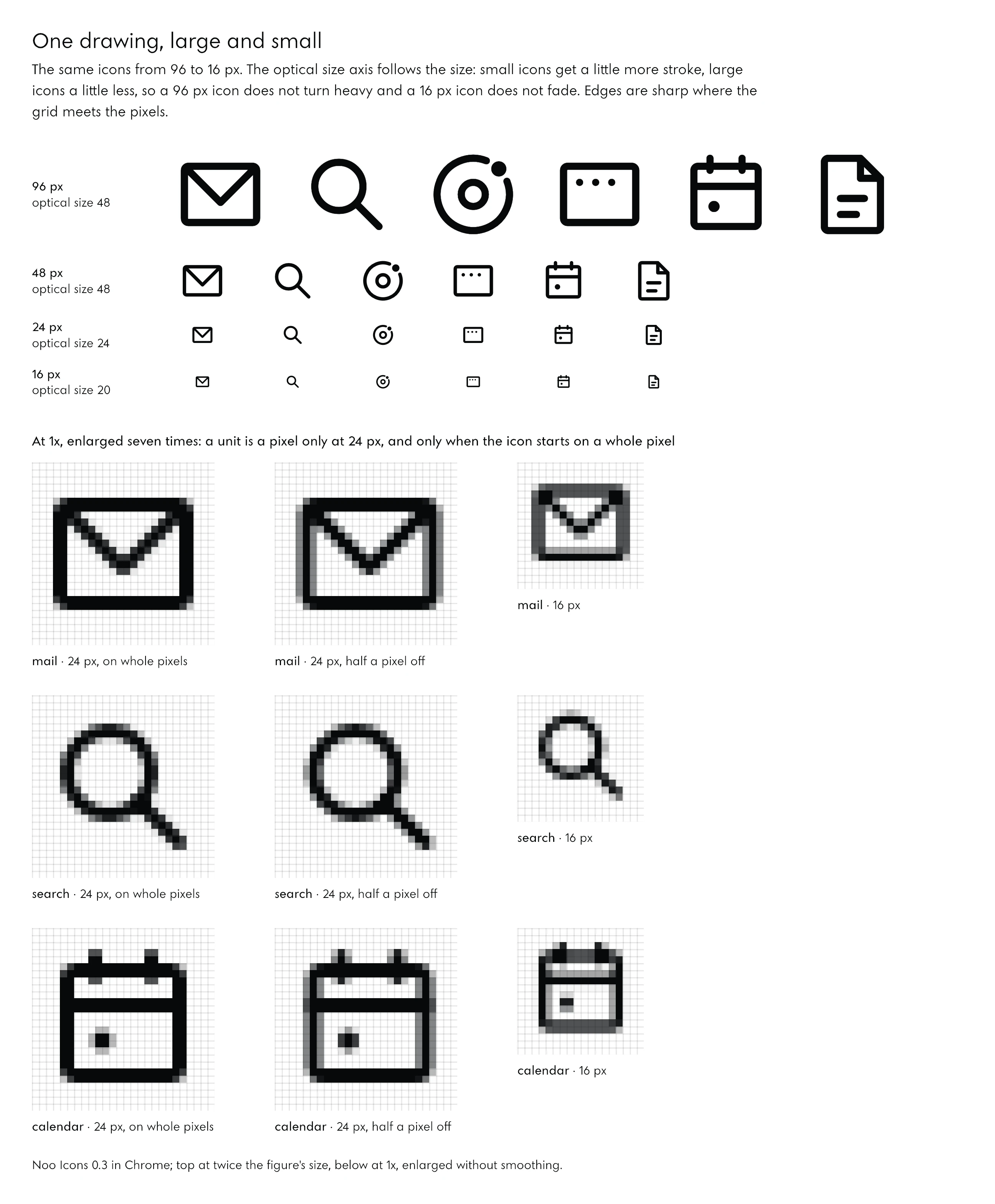
Icons stay legible at small sizes when the icon grid meets the pixel grid and when the stroke is adjusted for the size. At 24 px each unit of the grid is one pixel, so the edges are sharp; below and above it, an optical size axis gives small icons a little more stroke and large icons a little less.
Sharp at 24, Soft Elsewhere
At 24 px on a 1x screen, an icon that starts on a whole pixel draws every straight edge on a whole pixel. Moved half a pixel, the same icon blurs every vertical edge across two pixels, which is why an interface should place icons on whole pixels. At 16, 32 and 48 px a unit is no longer a pixel and the edges soften by construction; the drawing still holds, but it is no longer crisp.
Optical Size
The optical size axis runs from 20 to 48. At 20, used for everything under 20 px, the stroke grows by 15 per cent at Thin and 5 at Regular, and not at all at Bold: a heavier Bold at small sizes only closes the gaps, and type does the same, opening its ink traps at small sizes rather than adding weight. At 48 the stroke shrinks by 15 per cent, so a large icon does not turn heavy. In an interface the browser picks the optical size from the font size by itself.
What Fails at 16 Pixels
Not everything survives 16 px, and the record says so. Thin and ExtraLight are display weights: at 16 px a Thin stroke is under three quarters of a pixel and turns grey, so below 24 px we set 300 or more. The densest icons, the catalogue, the plan, the week and the checklist, have details that fall below a pixel at 16 px; they need hinting or a drawing of their own at that size, and both are still open.
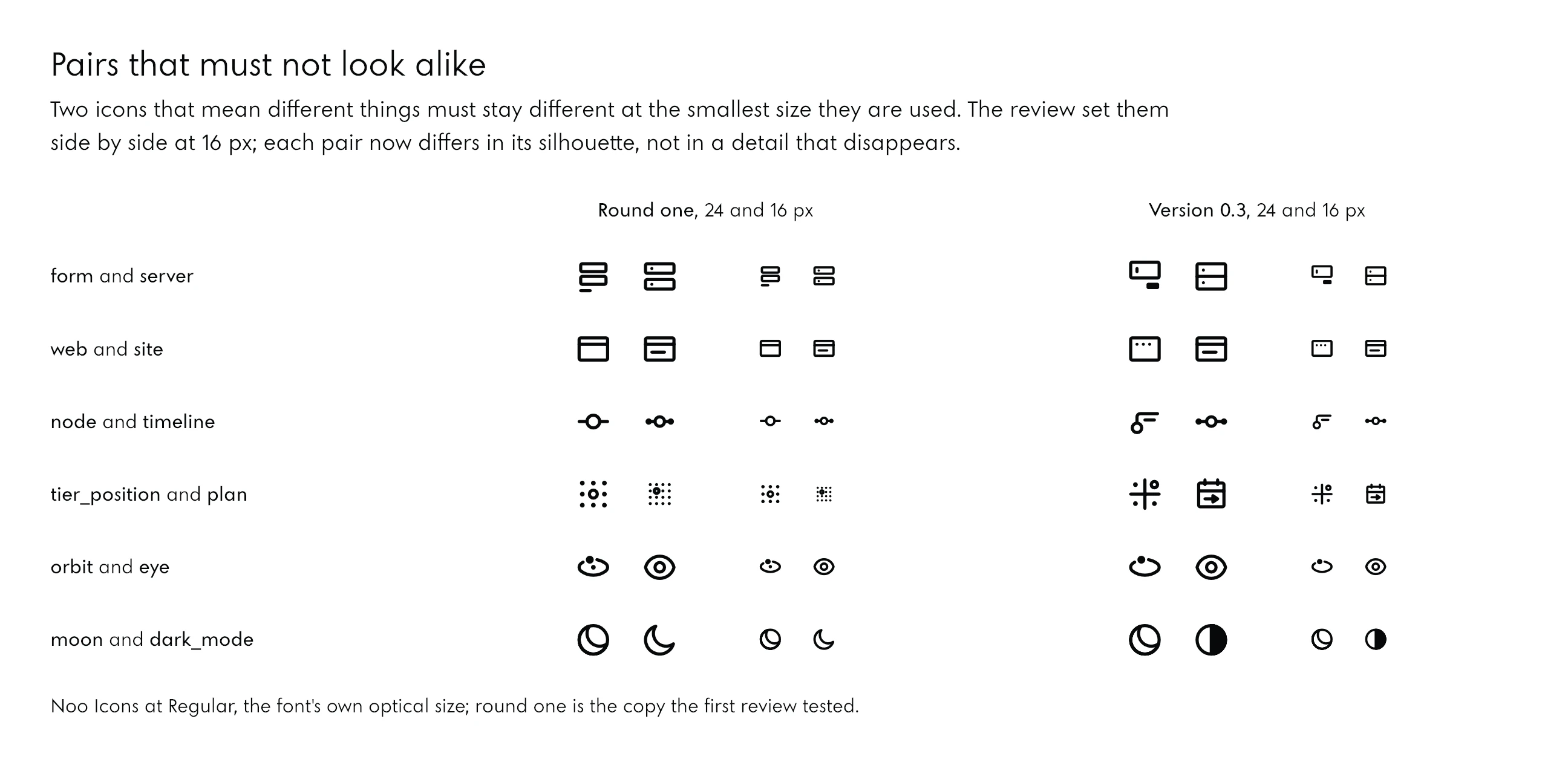
Pairs are the other danger at small sizes. Two icons that mean different things must not look alike at the smallest size they are used, and the judge set them side by side at 16 px to find out. Each pair now differs in its silhouette, not in a detail that disappears.
09Outline and Fill
An outlined and a filled icon should be one drawing in two states, so a state can change without the icon changing identity. In a variable icon font that is one axis, FILL, from 0 to 1, and the values between are frames of motion.
Every Part Has a Kind
Each part of each icon is declared as one of a few kinds, and the kind says what happens to it when the icon fills:
| Kind | Outlined | Filled |
|---|---|---|
| line | an open stroke | the same |
| ring | a closed stroke | the same, as orbits and the back sheet of a copy stay |
| box | a closed stroke | solid: its counter closes, or becomes the cut of its main detail |
| hole | a closed stroke inside a box | the box’s counter becomes the hole, as the eye of the pin |
| dot or block | solid | solid |
| cut | ink, like any line or dot | a cut-out in the solid around it |
Cuts Without Booleans
A cut is not made by subtracting one shape from another. Its outline is drawn the other way round, so over empty space it is ink and over a solid it is a hole. This matters for a variable font: boolean operations change the number of points, and every master of a variable font must have the same points in the same order. Drawn by direction, the cut keeps the structure and the font interpolates cleanly from outlined to filled.
No Blank Frame
In round one every icon with a cut passed through a blank silhouette at half fill, 39 icons in all: the envelope empty, the window without its buttons. The files icon twisted on its way, the location pin grew a spike, the eye passed through a target. The judge saw it in the frames, and the brief had asked for icons that animate.
Round two changed the construction. Up to half fill the counter closes into a moat around the details, which stay as ink. From half to full the counter tightens into the cut of the icon’s main detail, a line, a dot or a hole, so the detail never disappears. A master was added at three quarters for the icons with several details. No frame is blank now.
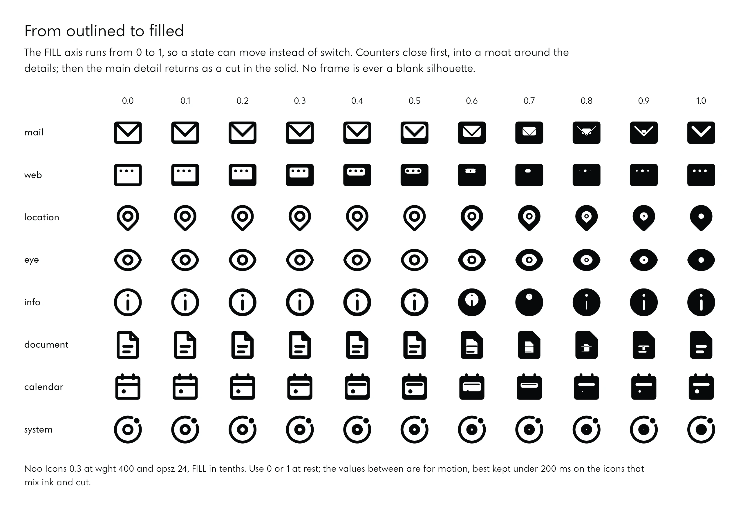
At rest an icon is at 0 or 1. The frames between are for motion, and on the few containers whose details turn over, the mail, the map, the clock, the change is best kept under 200 milliseconds.
10The Prompts
The prompts that work for icon design with AI do four things: they give the system as numbers before any drawing, they state what each icon means in words, they set how the AI must check and show its work, and they give a separate judge its own prompt and its own tests. These are the prompts we used, as they were sent, cleaned only of file paths, machine settings and names.
The Brief
The brief is the document every other prompt points to. It opens with the founder’s words, quoted rather than paraphrased; then the drawing law, the system as numbers, the set with its meanings, the order of work and what to deliver.
The brief, shortened where it lists the set
# The icon system: the brief

## What the founder asked for (his words)
"Design and review our own icon system: a full-on icon system that can be used consistently across all of the materials; we can use that for the animations and the videos in the future; with the principles of good design; and variable weights, the same as Google have the icon font." It sits beside two other pieces of work running now: the studio's own typeface (a geometric, Futura-rooted variable face, wght 100 to 900) and the large drawings. The icons are the small, functional end of the same language.

## The drawing law
- Drawn first, rounded after. "The grid allows you to do the pixelated drawing first with sharp corners, filling up the whole space and deciding whether two squares is the padding or one square; the little dot becomes a circle that comes from the border radius; then you turn them into pills, you turn them into animation." Every icon is first a picture of squares on its grid, sharp, black on white; then its corners: strokes with round caps and joins (pills), small blocks one unit of radius, containers two, dots and rings circles. Show both stages in the proofs.
- Geometry from the typeface: the circle and the square (the O and the N of the typeface). Lines run along the grid; 45 degrees only where the meaning needs it (an arrow, a check). Links and connectors bend with rounded elbows, never at arbitrary angles.
- Planned space: padding and gaps decided in whole units, the same counter sizes across the family, horizontal and vertical spacing deliberate.
- Abstract, never "too real": structure and meaning, not pictures of real objects or real interfaces.
- Modern means clean: fewer strokes, one idea per icon, generous negative space, consistent optical size (keylines).
- Colour: monochrome in the text colour; a second, lighter tone only where a duotone mode needs it.

## The system
1. Grid and keylines: a 24-unit grid with 2 units of padding (live area 20 x 20), keylines for circle (20), square (18), portrait (16 x 20) and landscape (20 x 16), so every icon has one optical size. If a finer grid (48) serves the pixel-first drawing better, decide and say why; the icon must still be crisp at 24 px on a 1x screen at wght 400.
2. Variable axes, like Material Symbols: wght 100 to 700 (the stroke at 400 matches the text it sits beside: calibrate it against the typeface's Regular stem when the studio's face has one, against Jost until then, and write the mapping), FILL 0 to 1 (outlined to filled, interpolating cleanly so the change can be animated), and opsz 20 to 48 as a stretch goal. Every master point-compatible.
3. Formats: a variable icon font (TTF and WOFF2) where the icon's name is a ligature and each icon also has a Private Use Area codepoint; SVG for every icon at the named weights, with its parts as separate paths and ids, so it can be animated; manifest.json (name, codepoint, category, tags); a CSS snippet.
4. Motion: a few demonstrations in the specimen of what the system allows (outline to fill, a stroke drawing itself on, an orbit turning, an arrow nudging), each one respectful of prefers-reduced-motion.

## The set (version 0.1, about 110 icons)
- Interface: arrow right, left, up, down; arrow up-right (external); the four chevrons; menu; close; plus; minus; check; search; play; pause; listen (an article read aloud); … sun and moon (theme); filter; sort; grid view; list view; expand; collapse.
- The studio's world: moon; planet (with its ring); system (a body with an orbit and a satellite); satellite; orbit; trajectory; node; network; layers; axis; compass; signal; schedule.
- The services: web, advisory, design (the three families); search, position, alignment; design, brand, identity (the tiers). Meanings: search measures (the instruments, the record of what happened); position reads (the buyers' words, the field, one place nobody holds); alignment aligns (brand, pages and search brought into one line, checked monthly); brand is the mark on its construction, its colours, its type; identity is one mark on every surface the firm shows. Moon is one site, complete; Planet is a catalogue site with its languages; System is a main site with satellites on orbits.
- What a firm receives (one icon each): site, brand book, letter, languages, mail on the firm's own domain, search result, form, key (the logins in the firm's name), catalogue, … plan, posts, record, direction, session.
- Data and documents: bar chart, line chart, table, document, paper (a research paper), invoice, map, timeline.

## Process
1. Write the system as code, so that one command regenerates everything.
2. Pixel sheet first for a core dozen (arrow, check, search, play, mail, key, moon, planet, system, the three families), round sheet, final sheet (light on #07090B and dark on white), at 16, 24, 32, 48 px and large. LOOK at them and iterate until the core is right; only then draw the rest.
3. Proof the axes: every icon from wght 100 to 700 and FILL 0 to 1 in steps; at 24 px on a 1x render too.
4. Test the font in Chrome: ligatures, codepoints, font-variation-settings.

## Deliverables
The build, the SVGs, the fonts, the specimen, manifest.json, the CSS, and a README: the principles, the grid and keylines, the axis mapping, how to add an icon, what is left for the next version.
The Designer
The designer’s prompt is short because the brief carries the content. It adds four things the brief does not: the bar to reach, a warning about the hard part, how to look at its own work, and the shape of its report.
Prompt: the designer
You are the icon designer for Noo–Studio. Read the brief first, completely. It holds the founder's words, the drawing law shared with the studio's other drawings ("drawn first, rounded after": a pixel picture on the grid, then the corners), the system (24-unit grid with keylines; variable axes wght 100 to 700 and FILL 0 to 1 like Google's Material Symbols; a ligature icon font plus SVGs with separate, animatable parts), and the set of about 110 icons with their meanings.

The bar is a professional icon family, on a par with Material Symbols, SF Symbols or Phosphor, but in the studio's own language: geometric (the circle and the square), clean, one idea per icon, consistent optical size, planned space. A separate reviewer, also on Opus, will judge your first complete build against the brief. After that you will get its findings to fix.

Context you can read but must not edit:
- the drawing engine for the studio's larger symbols (its corner rules and its three-view sheet: pixel, round, final), and the symbols in progress;
- the typeface being built in parallel by another agent. Read it only to calibrate the stroke at each weight; never write there.

How to work:
- Build everything as code, so that one command regenerates the SVGs, the variable font, the manifest, the CSS, the specimen and the proofs. Python has fontTools, Pillow, brotli and skia-pathops.
- The masters must be point-compatible. Strokes are the hard part: an outlined stroke with round caps and joins has to keep the same point structure from wght 100 to 700, and the FILL axis has to interpolate cleanly. Design the construction so that holds, for example with parametric contours generated per master, rather than boolean operations that change the point count.
- Proof constantly and LOOK at the proofs; you can see PNGs. Show the pixel stage and the rounded stage for the core dozen before drawing the rest. Render at 16, 24, 32 and 48 px (also at 1x) and large, light on #07090B and dark on white, every weight and fill in steps.
- Capture with headless Chrome; load fonts as data URIs or over a local server, because Chrome blocks fonts on file:// pages.

Rules:
- Work only inside the icons folder. Never touch the site, the typeface's folder, any database or the system's fonts.
- Do not spawn agents of your own.
- Search the web only for a specification detail, for example Material Symbols' axis ranges or the OpenType rules for ligature icon fonts; at most about 10 searches.

When v0.1 is complete (the full set, both axes, the font with ligatures, SVGs, manifest, CSS, specimen and README), stop and report. The report must cover:
- what you built (icon count, axes, files);
- the key decisions with their reasons (grid, keylines, the stroke mapping to the typeface, corners, how FILL works);
- the paths of the 5 to 8 most telling proof PNGs;
- what you are least sure of;
- what is left for 0.2.
Keep the report under 600 words.
Three lines in it did most of the work. The warning about point-compatible strokes steered the designer to generate every outline from its skeleton for each weight, which is why the font interpolates. “LOOK at the proofs” is how it caught its own moon that read as a face. And the request for “what you are least sure of” is why its report named the weak icons before the judge did.
The Judge
The judge is a second agent with a different job and a different prompt. It is told what bar to judge by, what the icons must mean, what to test with its own renders, and that it may change nothing but its own report.
Prompt: the judge
You are the independent reviewer of Noo–Studio's new icon system, v0.1, built by another agent. Judge it as a senior type and icon designer would judge a retail icon family (Material Symbols, SF Symbols, Phosphor), strictly and concretely.

Read first:
- the brief (the founder's words, the drawing law "drawn first, rounded after", the system, the set and its meanings);
- the designer's README;
- the proofs (look at every PNG: the core sheets, the set, the axes, the interpolation, the specimen);
- the studio's larger symbols, whose concepts the icons must share. In short: Moon is one complete page; Planet a catalogue with a ring of languages; System the main site with satellites on an orbit; Search bars and a trend with "the reading now" as a line ending in a dot; Position a field on two axes with one empty quarter taken (a ring and a dot); Alignment three bars brought to one line; Design a slide on its grid with a sheet over it; Brand the mark on its construction (circle in a square, guides) and its colours; Identity one mark at the centre of every surface; the key with its name on a hairline leader (the logins in the firm's name).

Check, with evidence (renders you make yourself where needed):
1. Drawing quality: the pixel stage and the rounded stage; keylines and optical size across the family; consistent stroke, corners, terminals, gaps, counters; crispness at 16, 24 and 32 px at 1x.
2. Meanings: does each icon say its meaning at 24 px without its label? Are the studio's own icons (world, services, deliverables) aligned with the symbols' concepts above? Name every weak one and propose a concrete redraw (what the icon should show, on the 24 grid).
3. The axes: wght 100 to 700, FILL 0 to 1, opsz 20 to 48. Interpolation without kinks; FILL transitions; Thin legibility; Bold counters.
4. Technical: open the font with fontTools; check that every master is point-compatible, the ligatures (GSUB) and the PUA mapping, fvar, STAT, the name table and the vertical metrics. Test it in headless Chrome: write a test page that sets icons by name and by codepoint, with font-variation-settings at several values, and capture it. Also check the SVG exports and the CSS.
5. Fit with the brand: on #07090B and on white, beside Jost text at 400; the "beautiful and clean, modern studio" bar the founder set.

Rules:
- Do not edit anything in the icons folder except writing your report and your own test files in its review folder.
- Touch nothing else.
- Do not spawn agents of your own.

Deliverable: REVIEW-1.md, findings ranked by severity (blocking, important, polish), each with the icon or table concerned, what is wrong, the evidence (a proof path) and the exact fix. Add a short verdict: ready for the site or not, and what must change first. Reply with the verdict and the top ten findings, under 500 words.
The judge’s prompt gives it the meanings a second time, in different words: the studio’s larger drawings, not the brief’s list. A judge that reads the meanings from another source catches the icons that drifted from them.
The Second Round
The findings go back to the same designer, which still holds its own context: the engine it wrote, the decisions it made. The prompt orders the fixes, names what the founder decides himself, and asks for disagreement with reasons.
Prompt: round two
Round two for Noo Icons: the independent review is in (REVIEW-1.md, with its proofs and scripts beside it). Read it in full and fix every blocking and important finding, then the polish items you agree with.

In this order:
1. Enforce a spacing rule in the build: details move inward as the stroke grows, inset = 3 + (w − 2), and the build's audit rejects any gap under the rule at every master. That fixes the seven touching icons and the 38 that close their counters at 700.
2. Fix the outline at cusps by taking the turn from the chords, and make the build reject self-crossing contours. Redraw the ai_answer star.
3. Redraw tier_design and tier_position to the symbols' concepts (the reviewer's sketches are beside the review): design is a slide on its grid with a sheet over it; position is two axes with the empty quarter taken (a ring and a dot). Make the web tiers read as a series (moon, planet, system the same optical size and ink), merge tier_brand and mark into one idea, give logins the key with its name tag.
4. Redraw the misreading deliverables (week, brand_book, session, domain_mail) and separate the confusable pairs at 16 px (form/server, web/site, node/timeline, plan/tier_position, orbit/eye).
5. FILL: no blank frame at 0.5 in the cut icons, and no twisted or spiked frames (files, location, eye).
6. CSS: font-optical-sizing: none on inline icons; prefix every SVG id with ni-.

The founder chooses four icons himself: moon, tier_brand, tier_identity and languages. For each, draw two or three clearly different options on one sheet (72 px and 24 px, light on #07090B and dark on white) and keep your current choice in the font until he picks.

Rebuild, rerun every check and the reviewer's scripts, look at the proofs, then reply in under 400 words: what changed, the proof paths, and anything you disagree with in the review and why.
Starting Your Own
Two prompts in the same shape, for a reader’s own set. The first is the grid-first prompt from The Grid First; after the numbers are agreed, the brief carries them. The second adds an icon to a finished family without breaking it.
Prompt: one more icon
Add one icon to the family: [name], in the [group] group, meaning [one line in your words]. Its keyline: [circle, square, portrait or landscape].
Draw it with the build's own drawing functions: nodes on whole units, ink inside 2 to 22, 4 units between parts (or 3 at Regular, moving inward as the stroke grows), its main detail marked if it has several. Run the build; it must pass every check at every master.
Then show it at 72 and 24 px, outlined and filled, on white and on black, beside the five icons nearest to it in meaning, and tell me whether it can be confused with any of them at 16 px. Append it: never change an existing codepoint.
What made these prompts work, in short:
- The founder’s words quoted, not paraphrased, so every agent judged by the same sentence.
- The bar named: three real families to measure against, and the studio’s own geometry stated.
- The hard part named in advance: point-compatible strokes, without boolean operations.
- An order to look: the agents could see their own PNGs, and were told to.
- A report that asks for doubt: “what you are least sure of”.
- A judge that cannot edit, whose every finding carries its evidence and an exact fix.
- What only a person decides, said plainly: four icons went to the founder as options.
11Designer and Judge
Use two separate AI agents: one designs, the other judges, each with its own prompt. The judge cannot edit the work, and every finding must carry its evidence and an exact fix. A designer that judges its own work finds what it was already looking for; a judge with its own tests finds the rest.
The First Build
We ran both as Claude agents from one working session. The designer worked in the project’s folder with Python, fontTools and a headless Chrome, and it could see every proof it rendered. In an hour and a half it produced version 0.1: 116 icons in five groups, a variable font with 27 masters and 130 names (116 icons and 14 aliases), 1,740 SVG files, a manifest, the CSS, a specimen and its proofs, all regenerated by one command in about 16 seconds. The font weighed 68 KB as WOFF2.
The Verdict
The judge wrote its own test scripts: every name and alias shaped with HarfBuzz, every outline checked at 13 weights, 3 optical sizes and 11 fills, every icon rendered in Chrome by name and by codepoint at 11 axis settings and compared pixel by pixel, the gap between every two parts measured at Thin, Regular and Bold and at three optical sizes. Its verdict, three quarters of an hour later: “Not ready for the site yet.”
The engine passed. All 27 masters were point-compatible, all 130 names worked in HarfBuzz and in Chrome, name and codepoint drew the same icon at every setting, and the 45 interface icons were close to Material’s quality. The studio’s own icons did not pass:
- Seven icons had parts that touched at Regular, and 38 lost a gap at Bold.
- Two service tiers said the wrong thing: design read as a contact card, position as a dot grid.
- Deliverables misread at 24 px: the week as a keyboard, the brand book as a door, the session as a film strip, the mail on the firm’s own domain as unread mail.
- One outline was malformed: at a tip of the AI-answer star, where two arcs met head on, the side of the turn was chosen by rounding noise.
- Filling went blank at half in 39 icons.
- Inline icons did not match the text: optical sizing made them 12 to 17 per cent too light at 48 px and 14 per cent too heavy at 16.
- The SVG ids were bare names such as moon and search, which would collide with the site’s own anchors.
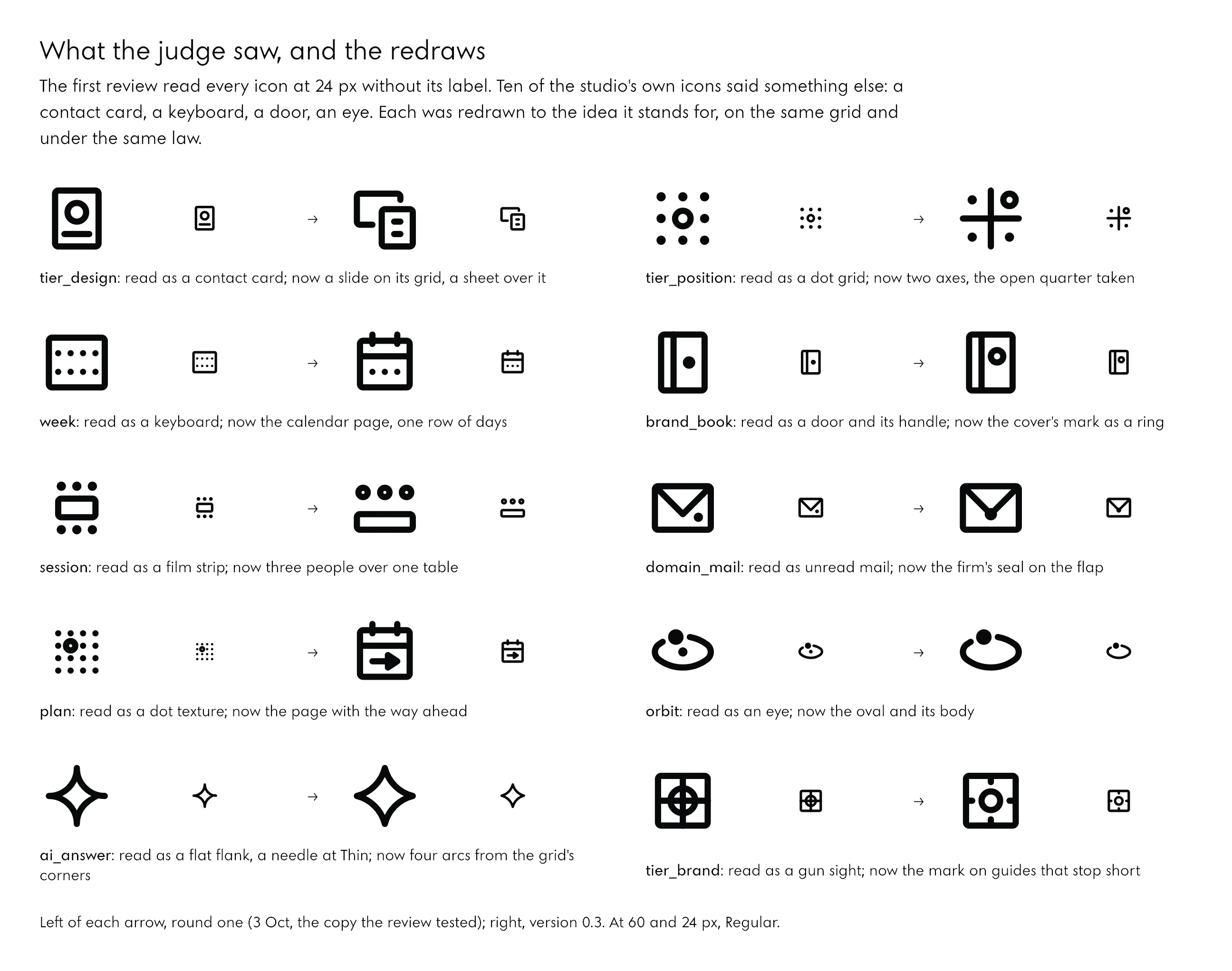
What Failed
The judge did not only find faults; it drew its own fixes with the designer’s engine, held to the same law at every master, and reported the ones that failed as well. A level ring on the planet read as a flying saucer. A disc with a bar read as a no-entry sign. An upright gauge needle read as a power button; a mark with ticks outside it, as a target. Each failure became a rule for the redraw. A judge that shows what fails is worth more than one that only approves.
Where the Designer Disagreed
The second round fixed every blocking and important finding, and the designer’s report kept its disagreements, with reasons. It kept satellite, node and web as drawings of their own instead of dropping or merging them, because without satellite the orbit and the trajectory have no body. It did not centre a ring over the letter’s lines, because a circle centred over lines reads as a name badge; the mark moved to the top right. It did not thicken Bold at the smallest optical size, because a heavier Bold there only closes the gaps. Disagreement with a reason is part of the record, and some of it was right.
Four Icons Left to a Person
For four icons the judge could not find a clearly better drawing: the moon, the brand tier, the identity tier and languages. These are the studio’s own ideas, not interface conventions, and their meaning is the founder’s to fix. The designer drew two or three options for each, every one held to the same law at all 36 masters; option A stands in the font until he chooses.
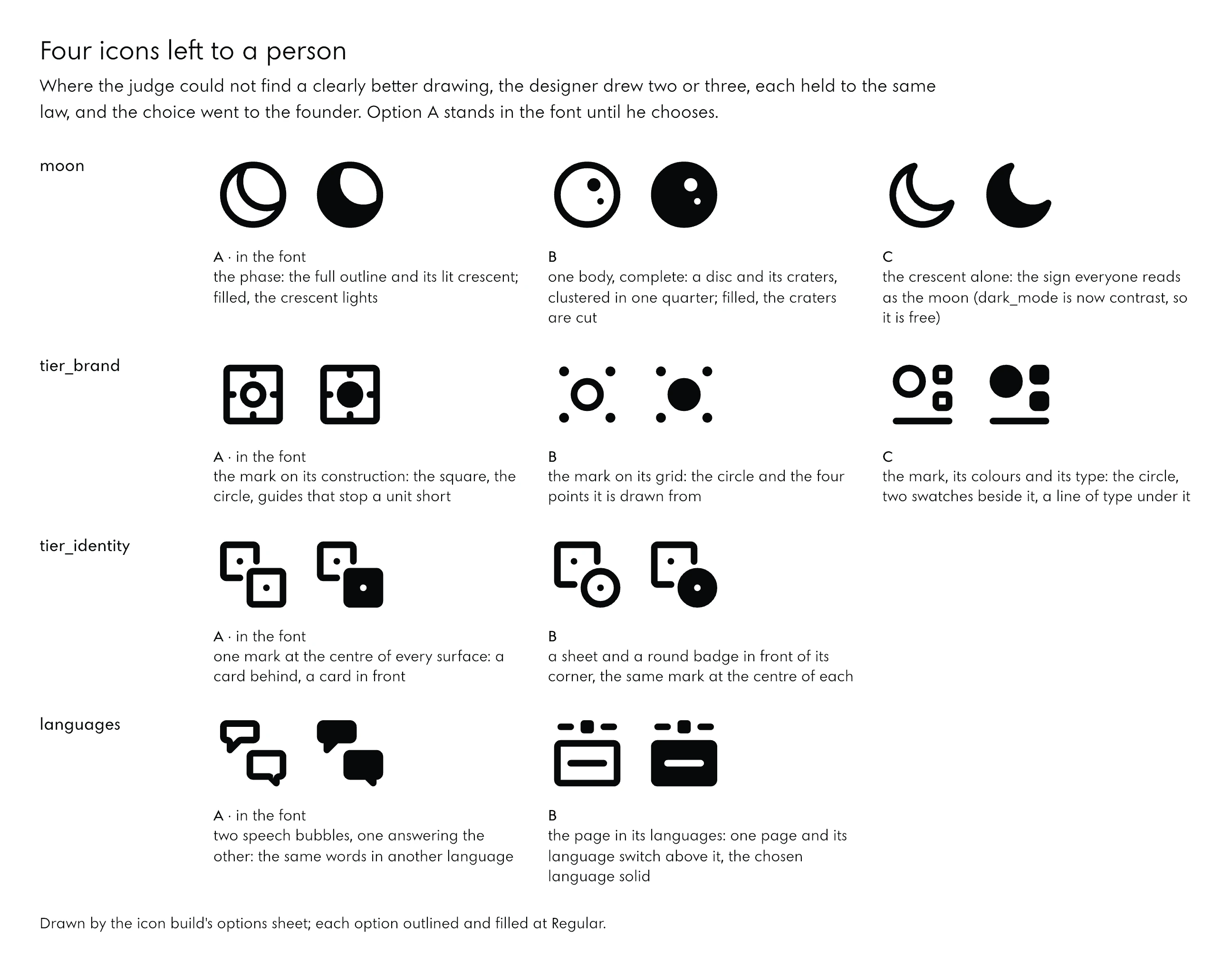
The Checks the Build Runs
Every finding that could be written as a rule became a check, so it cannot come back. The build runs the first five on every icon at every master and stops before a font is written if one fails; the last compares the finished font with its own drawings:
| Check | What it prevents |
|---|---|
| The same points in all 36 masters | a font that cannot interpolate |
| At least one unit between separate parts | touching parts, closed counters at Bold |
| Every cut at least one unit inside its solid and from other cuts | a filled icon that breaks into pieces |
| No contour that crosses itself, at every master and at fill in tenths | twisted frames, outlines that tools cannot read |
| All ink inside the live area | icons that grow past their padding |
| The font against its SVGs in Chrome, pixel by pixel | a font that draws something else than the files |
12From Drawings to a Font
An icon font is a font whose glyphs are icons, set by name as a ligature, so typing arrow_forward draws the arrow, or by a codepoint in Unicode’s Private Use Area. Built as a variable font, one file carries every weight, the fill and the optical size.
Names as Ligatures
In Noo Icons the letters are empty glyphs with no width, and each icon’s name is a ligature that replaces them with the icon: 165 names and 18 aliases, so brand and mark both draw the brand tier’s icon. The ligatures sit in two features, so names keep working where a page switches ordinary ligatures off. Each icon also has a codepoint, from U+E000 to U+E0A4; new icons are appended, and a published codepoint never changes.
Two consequences are worth knowing. A mistyped name draws nothing, because its letters are empty, so templates should be checked against the manifest’s names. And a name inside an uppercased element, without the icon class, turns back into its letters.
Three Axes, Thirty-Six Masters
The font has three axes, as Material Symbols does: weight from 100 to 700, fill from 0 to 1, optical size from 20 to 48. It is built from 36 masters, three weights by four fills by three optical sizes, and the browser interpolates everything between them. Every master has the same points in the same order, because every outline is generated from the icon’s skeleton for that master’s stroke: the sides offset, the round joins and caps added, the cuts drawn the other way, and nothing ever merged by a boolean operation.
The font on a web page
<link rel="stylesheet" href="noo-icons.css">
<!-- by its name -->
<span class="ni">arrow_forward</span>
<!-- by its codepoint -->
<span class="ni"></span>
<!-- filled, Light, 32 px -->
<span class="ni ni-fill ni-300 ni-32">mail</span>
<!-- in running text: the size and weight of the words -->
<p>Read the paper <span class="ni ni-text">arrow_forward</span></p>
.ni { font-family: "Noo Icons"; font-feature-settings: "liga", "rlig";
font-optical-sizing: auto; font-variation-settings: "FILL" var(--ni-fill, 0); }
.ni-text { font-size: inherit; vertical-align: baseline;
font-optical-sizing: none; }The weight follows the text’s own font-weight, so an icon in a Light heading is drawn Light. In running text the optical size is switched off, so the stroke stays the stem of the words around it at any size: the judge’s finding about inline icons, fixed in one line.
SVGs with Named Parts
Every icon is also exported as SVG: outlined and filled at each of the seven named weights, and as its skeleton stroked at Regular, 2,475 files in all. Each part is its own path with a name, such as the envelope and the flap of the mail, so a part can move on its own. Every id carries the prefix ni-, so an icon can sit on a page that already has a section called moon or search, and every SVG is marked as decorative until a label is added.
Drawing an Icon in Code
The designer drew every icon in a few lines of Python, on whole units, with the stroke of the master being drawn available to anything that has to grow with it. This is the mail:
The mail icon, as it is drawn
@icon('mail', 'interface', 'email envelope message', keyline='landscape')
def _(g):
    # a box: it fills
    g.rect('envelope', 3, 5, 21, 19)
    # a line; filled, it becomes a cut, a little shorter
    g.line('flap', (4, 6), (12, 14), (20, 6),
           knock=[(6, 8), (12, 14), (18, 8)])
Shipping a Version
The site serves its fonts with a cache of a year, marked as never changing. A font replaced under the same file name never reaches a browser that has loaded it once, and version 0.2 had been installed under the old name, so a browser that knew 0.1 would never have fetched it. Since then the version is in the file name, noo-icons-03.woff2, and in the stylesheet that loads it.
13Icons in the Interface
Icons look right inside an interface when they follow the same few rules everywhere: one family, sized relative to their container, lighter as they grow, aligned to the words beside them, and changing state only where the state means something.
One Family on Every Page
The studio’s site had borrowed one demonstration from Google’s Material Symbols: the pitch for the Moon tier drew its example site with them. When Noo Icons 0.2 was done, every one of those icons was replaced from the studio’s own SVGs, so the site carries one family. The same rule reached the smallest places: the consent notice’s corner icon, which the founder found drawn in another style (“that little icon supposed to be the icon from our icons”), is now Noo Icons’ shield; the button that opens the contact form is a disc with its envelope.
An Icon in Its Disc
On the site an icon rarely stands alone; it sits in a disc, the way the site’s planets sit in the sky. The founder asked for it when he first saw the icons in the site’s tiles: “why they are not in circles, why they are not like planets”. On dark pages the disc is black on black with a slight gradient, which he called the velvet; on white it is white, lit the same way.
The proportion took several rounds. An icon draws inside its own em with two units of padding on each side, so its ink is five sixths of its font size. Set at 58 per cent of the disc’s width, its ink spans half the disc. The first version was larger and heavier, and the founder’s note was exact: “oversized icon, thinner … proper spacing and arrangement”. The icon is now half the disc at weight 150, and the disc, the title and the words share one left edge.
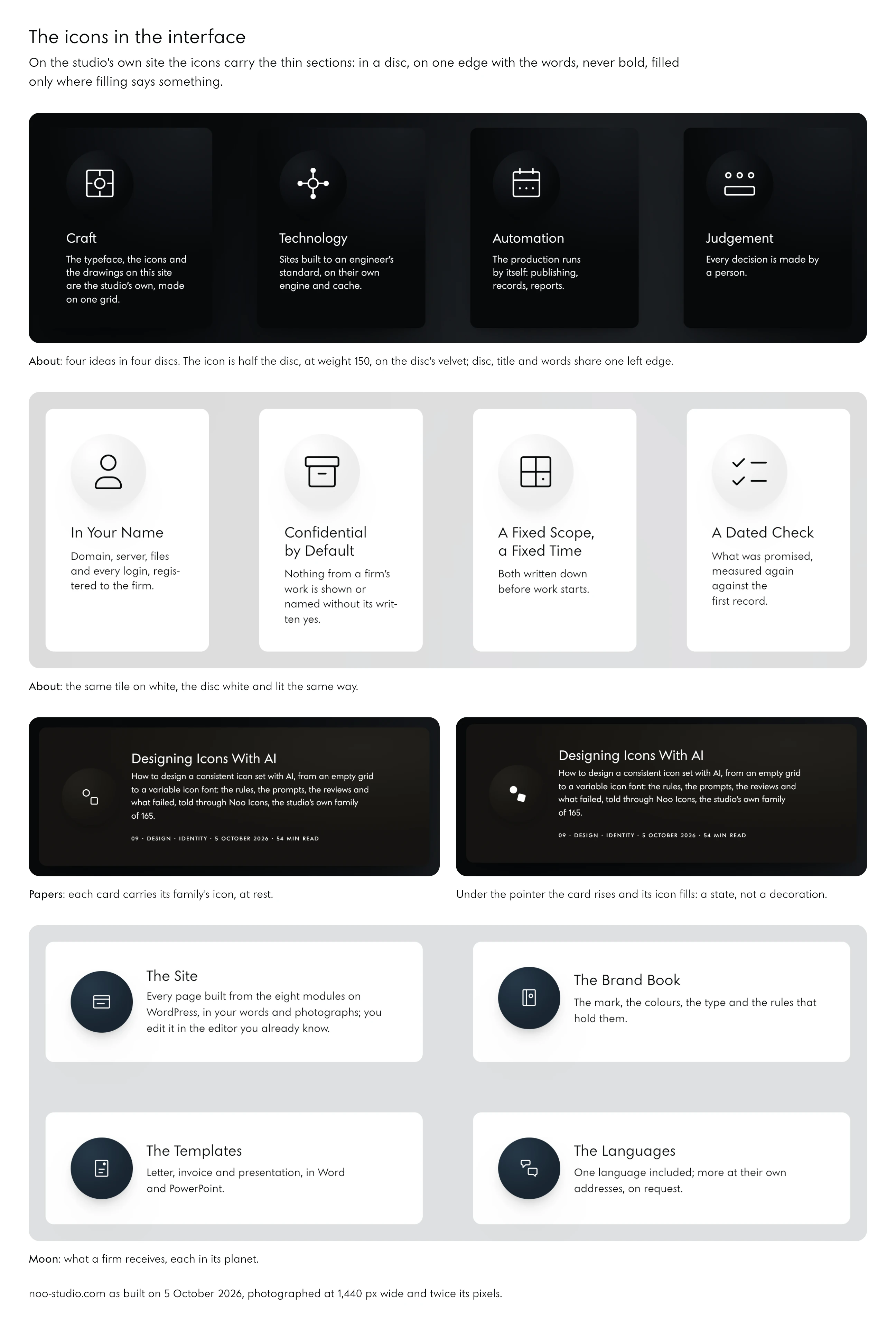
States That Mean Something
A paper’s card is a link: under the pointer it rises a few pixels and its icon fills, in a third of a second. A deliverable’s tile is not a link, so its icon never fills: a state that means nothing teaches a reader to ignore states. For a reader who has asked the system for less motion, the change is instant.
In Running Text and in Counts
In a sentence, an icon takes the size and the weight of the words around it and sits on the middle of their capitals. In the cases on the Work page, icons also count: seven document icons stand for seven documents, one session icon for the one meeting, so the reader sees the size of the work before reading its number.
14Motion
Icons animate well when the motion is built into the drawing rather than added to it: parts with names that can move one after another, strokes that can draw themselves on, and axes the browser can interpolate. The brief asked for this from the start, because the same icons are meant for the studio’s videos.
Strokes That Draw Themselves On
Every icon’s skeleton is exported as a stroked SVG in which each path has a length of exactly 1. To draw an icon on, a page moves one value, the dash offset, from 1 to 0, part by part. The figure below is made that way, from the icons’ own files, with no animation software.
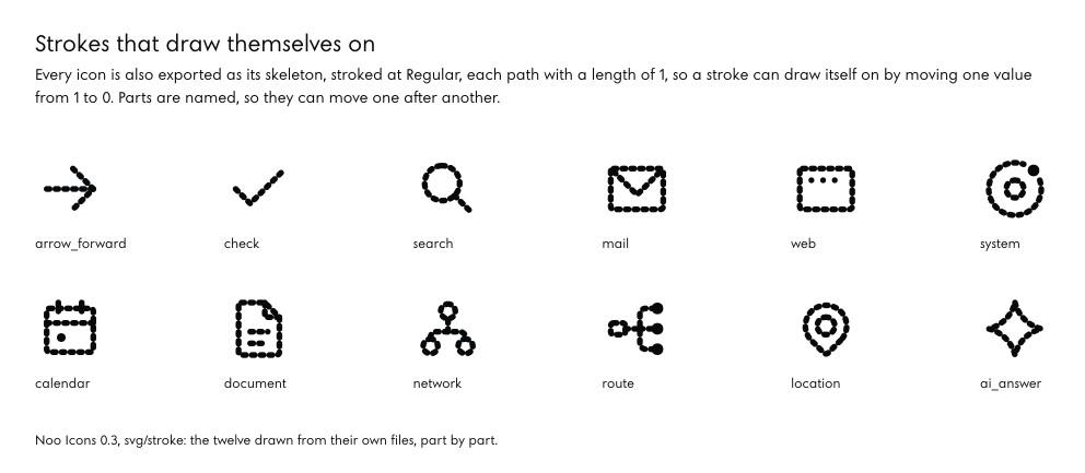
A stroke that draws itself on
.ni-draw path { stroke-dasharray: 1 2; stroke-dashoffset: 1.02;
                animation: draw .9s ease-in-out forwards; }
.ni-draw path + path { animation-delay: .25s; }
@keyframes draw { to { stroke-dashoffset: 0; } }
@media (prefers-reduced-motion: reduce) { .ni-draw path { animation: none; stroke-dashoffset: 0; } }
One detail decides whether this looks clean: a dash of zero length with round caps still draws a dot. The gap in the dash pattern is longer than the path and the offset starts just past 1, so nothing shows before the stroke begins.
States as Motion
The fill axis is motion too. A change from outlined to filled is one CSS transition on a variable, and because no frame of it is blank, it can be slowed down for a video as well as played fast on a hover. The construction animation at the top of this paper is the same idea at its largest: one icon, its grid, its squares and its round stroke, drawn by the build’s own geometry.
A Motion Axis

Version 0.4, drawn on the evening of 5 October, puts the movement inside the font itself: a fourth axis, MOVE, on which each icon’s moving part travels while the rest of the drawing holds still. The gauge’s needle climbs its scale by 60 degrees, the arrow steps two units forward, the mail’s flap lifts, the document’s short line writes itself on, the bars of the chart rise.
At 0 every icon is exactly the drawing of 0.3, point for point, and the build proves it: 85,800 outlines compared at 260 places in the font’s design space, and 31,933,440 pixels rendered in Chrome, none different. In its pose a moving part may step one unit into the padding, never out of the em. On a hover the icon fills and moves at once, in 0.35 seconds; for a reader who has asked for less motion it only fills.
15The Whole Set
Noo Icons 0.3 has 165 icons in six groups: 45 for the interface, 13 for the studio’s world, 9 for its services, 41 for what a firm receives, 8 for data and documents, and 49 tools added in version 0.2 for editors and ordinary pages. Every icon is set by its name or its codepoint; the lists under each plate give every name, its codepoint, its aliases and the words it can be found by.
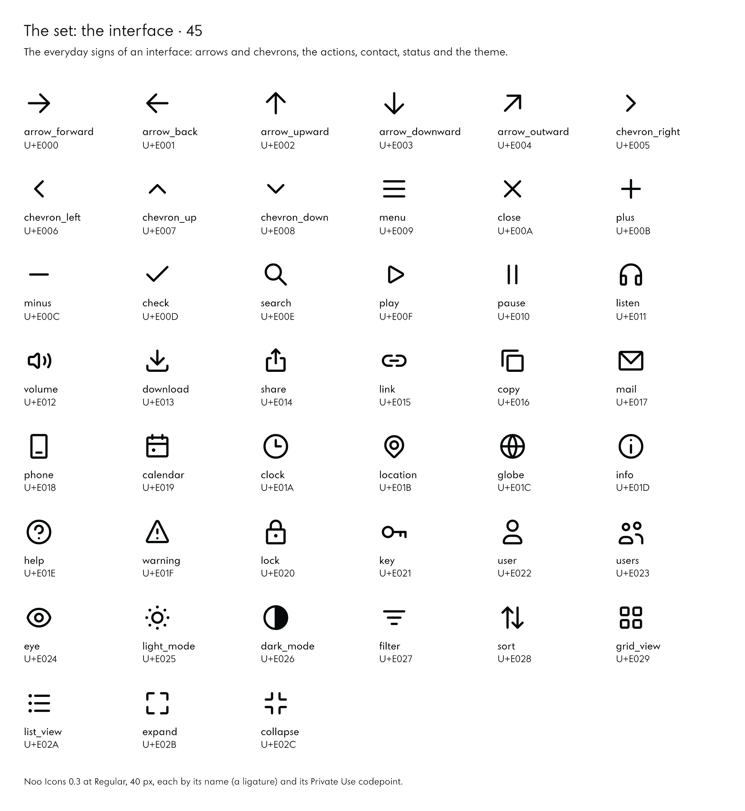
The 45 icons, by name
| Name | Codepoint | Found by |
|---|---|---|
| arrow_forward | U+E000 | arrow, right, next, forward, go |
| arrow_back | U+E001 | arrow, left, back, previous, return |
| arrow_upward | U+E002 | arrow, up, top, rise |
| arrow_downward | U+E003 | arrow, down, bottom, fall |
| arrow_outward (external) | U+E004 | arrow, up, right, external, link, open, new, outward |
| chevron_right | U+E005 | chevron, right, next, more |
| chevron_left | U+E006 | chevron, left, back |
| chevron_up | U+E007 | chevron, up, less, collapse |
| chevron_down | U+E008 | chevron, down, more, expand, open |
| menu | U+E009 | menu, navigation, lines, hamburger |
| close | U+E00A | close, cancel, clear, x, dismiss |
| plus (add) | U+E00B | add, plus, new, create |
| minus (remove) | U+E00C | remove, minus, subtract, less |
| check | U+E00D | done, tick, ok, confirm, yes |
| search | U+E00E | find, magnifier, look, lens |
| play | U+E00F | play, start, video, media, run |
| pause | U+E010 | pause, stop, hold, media |
| listen | U+E011 | listen, audio, read, aloud, headphones, article |
| volume | U+E012 | volume, sound, speaker, audio, loud |
| download | U+E013 | download, save, get, arrow, tray |
| share | U+E014 | share, send, export, out |
| link | U+E015 | link, chain, url, connect |
| copy | U+E016 | copy, duplicate, clone, sheets |
| U+E017 | email, envelope, message, letter, inbox | |
| phone | U+E018 | phone, mobile, call, device, telephone |
| calendar | U+E019 | calendar, date, day, event, month |
| clock | U+E01A | clock, time, hour, watch |
| location | U+E01B | location, place, pin, map, address, where |
| globe (globe_language) | U+E01C | globe, world, international, web, language |
| info | U+E01D | info, information, about, details |
| help | U+E01E | help, question, support, faq |
| warning | U+E01F | warning, alert, caution, attention, error |
| lock | U+E020 | lock, secure, private, closed, protected |
| key | U+E021 | key, login, access, password, credentials |
| user | U+E022 | user, person, account, profile |
| users | U+E023 | users, people, group, team |
| eye (visibility) | U+E024 | eye, view, visibility, show, see, preview |
| light_mode (sun) | U+E025 | light, mode, sun, theme, day, bright |
| dark_mode (contrast) | U+E026 | dark, mode, theme, contrast, appearance, night |
| filter | U+E027 | filter, narrow, refine, funnel |
| sort | U+E028 | sort, order, ascending, descending, arrange |
| grid_view | U+E029 | grid, view, tiles, cards, layout |
| list_view | U+E02A | list, view, rows, lines |
| expand (fullscreen) | U+E02B | expand, fullscreen, enlarge, open, maximise |
| collapse (fullscreen_exit) | U+E02C | collapse, exit, fullscreen, shrink, minimise |
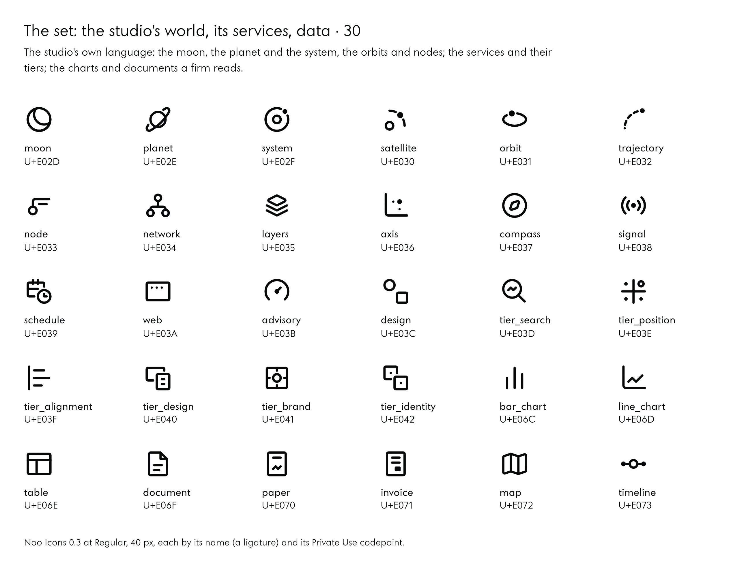
The 30 icons, by name
| Name | Codepoint | Found by |
|---|---|---|
| moon | U+E02D | moon, one, site, complete, tier, body, phase |
| planet | U+E02E | planet, ring, saturn, catalogue, languages, tier |
| system | U+E02F | system, main, site, satellites, orbit, tier |
| satellite | U+E030 | satellite, one, body, on, its, orbit, satellite, site |
| orbit | U+E031 | orbit, path, ellipse, revolve, body |
| trajectory | U+E032 | trajectory, path, dashed, launch, course |
| node | U+E033 | node, point, vertex, label, instrument, reading |
| network | U+E034 | network, nodes, graph, connected, tree, links |
| layers | U+E035 | layers, stack, plates, levels |
| axis | U+E036 | axis, axes, measure, coordinates, point, reading |
| compass | U+E037 | compass, direction, bearing, explore, north |
| signal | U+E038 | signal, broadcast, waves, source, ai, signals |
| schedule | U+E039 | schedule, date, time, calendar, clock, cadence |
| web | U+E03A | web, sites, family, window, browser |
| advisory | U+E03B | advisory, family, measure, read, align, instrument, dial |
| design | U+E03C | design, family, geometry, circle, square, shapes |
| tier_search (measure) | U+E03D | search, tier, measure, record, instruments, analytics |
| tier_position (position) | U+E03E | position, tier, read, field, place, nobody, holds, axes |
| tier_alignment (alignment) | U+E03F | alignment, tier, align, one, line, brand, pages, search |
| tier_design | U+E040 | design, tier, piece, slide, sheet, grid |
| tier_brand (brand, mark) | U+E041 | brand, tier, mark, construction, rules, logo |
| tier_identity (identity) | U+E042 | identity, tier, one, mark, every, surface |
| bar_chart | U+E06C | bar, chart, bars, statistics |
| line_chart | U+E06D | line, chart, trend, graph |
| table | U+E06E | table, rows, columns, cells |
| document | U+E06F | document, page, file, text |
| paper | U+E070 | paper, research, study, findings, chart |
| invoice | U+E071 | invoice, bill, total, payment |
| map | U+E072 | map, territory, folded, area |
| timeline | U+E073 | timeline, steps, milestones, history, now |
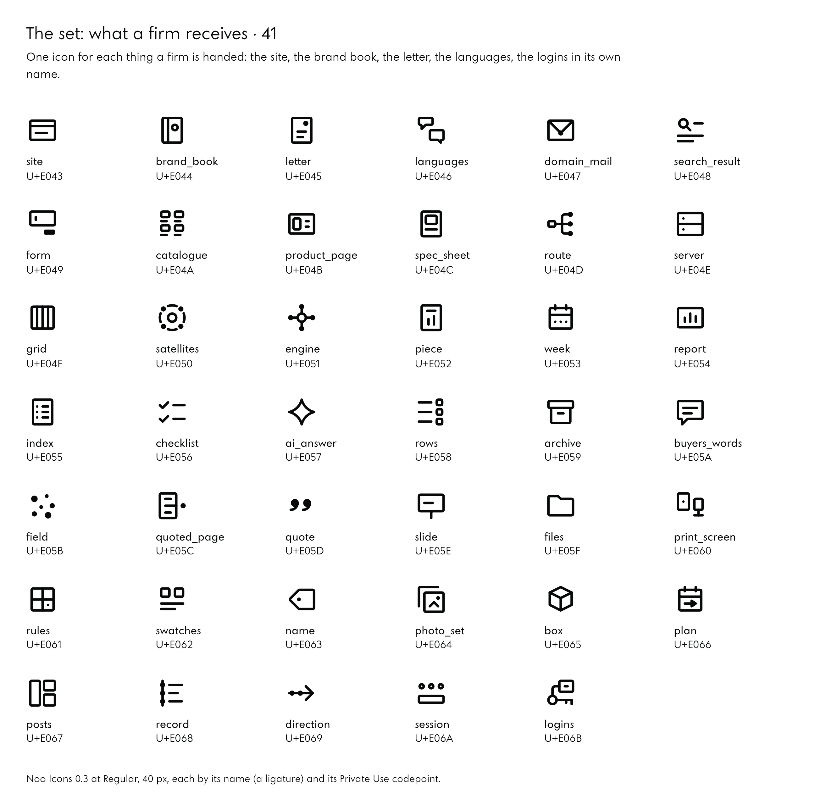
The 41 icons, by name
| Name | Codepoint | Found by |
|---|---|---|
| site | U+E043 | site, website, page, home |
| brand_book | U+E044 | brand, book, guidelines, rules, book |
| letter | U+E045 | letter, letterhead, correspondence, printed |
| languages | U+E046 | languages, translation, versions, conversation |
| domain_mail | U+E047 | mail, own, domain, email, address, firm, seal |
| search_result | U+E048 | search, result, results, page, listing |
| form | U+E049 | form, field, input, send, enquiry |
| catalogue | U+E04A | catalogue, products, range, collection |
| product_page | U+E04B | product, page, picture, facts, request |
| spec_sheet | U+E04C | spec, sheet, specification, datasheet, facts, figure |
| route | U+E04D | route, request, routing, answer, people |
| server | U+E04E | server, hosting, own, name, infrastructure, rack |
| grid | U+E04F | grid, columns, layout, system, page, rows |
| satellites | U+E050 | satellites, main, site, linked, sites, orbit |
| engine | U+E051 | engine, platform, sites, one, engine, hub |
| piece | U+E052 | piece, article, chart, story |
| week | U+E053 | week, calendar, posts, schedule, days |
| report | U+E054 | report, monthly, figures, bars, results |
| index | U+E055 | index, entries, list, contents |
| checklist | U+E056 | checklist, tasks, done, list |
| ai_answer | U+E057 | ai, answer, generated, assistant, sparkle, star |
| rows | U+E058 | rows, questions, pages, owner, mapping |
| archive | U+E059 | archive, record, kept, storage, box |
| buyers_words | U+E05A | buyers, words, voice, quotes, speech, customers |
| field | U+E05B | field, competitors, who, else, answers, others |
| quoted_page | U+E05C | quoted, page, citation, source, line |
| quote | U+E05D | quote, quotation, sentence, words |
| slide | U+E05E | slide, deck, presentation, screen |
| files | U+E05F | files, sources, folder, documents |
| print_screen | U+E060 | print, screen, paper, display, both |
| rules | U+E061 | rules, grid, system, what, sits, on, it |
| swatches | U+E062 | swatches, colours, type, palette |
| name | U+E063 | name, label, tag, naming |
| photo_set | U+E064 | photo, set, images, pictures, gallery |
| box | U+E065 | box, packaging, package, product |
| plan | U+E066 | plan, weeks, ahead, roadmap, calendar, next |
| posts | U+E067 | posts, social, short, video, picture |
| record | U+E068 | record, log, history, entries, evidence |
| direction | U+E069 | direction, strategy, way, forward, path |
| session | U+E06A | session, meeting, table, people, decide, workshop |
| logins | U+E06B | logins, key, name, firm, credentials, access |
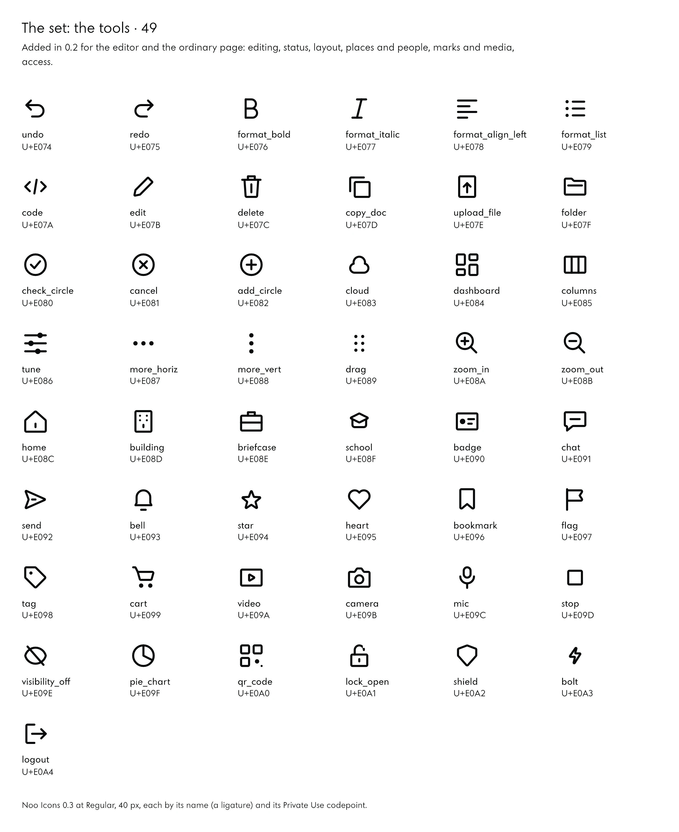
The 49 icons, by name
| Name | Codepoint | Found by |
|---|---|---|
| undo | U+E074 | undo, back, revert, history |
| redo | U+E075 | redo, forward, again, history |
| format_bold | U+E076 | bold, strong, weight, text, format |
| format_italic | U+E077 | italic, slant, emphasis, text, format |
| format_align_left | U+E078 | align, left, text, paragraph, lines |
| format_list | U+E079 | list, bullets, items, points |
| code | U+E07A | code, markup, html, developer, source |
| edit (pencil) | U+E07B | edit, pencil, write, change |
| delete | U+E07C | delete, bin, trash, remove, discard |
| copy_doc | U+E07D | duplicate, copy, sheets |
| upload_file | U+E07E | upload, file, send, document, arrow |
| folder | U+E07F | folder, directory, files, collection |
| check_circle (verified) | U+E080 | done, verified, confirmed, complete, ok |
| cancel | U+E081 | cancel, close, circle, stop, dismiss |
| add_circle | U+E082 | add, new, circle, plus, create |
| cloud (cloud_done) | U+E083 | cloud, online, storage, hosted, backup |
| dashboard | U+E084 | dashboard, overview, tiles, panels |
| columns | U+E085 | columns, layout, three, view |
| tune | U+E086 | tune, adjust, settings, sliders, controls |
| more_horiz | U+E087 | more, options, menu, dots, horizontal |
| more_vert | U+E088 | more, options, menu, dots, vertical |
| drag | U+E089 | drag, handle, move, reorder, grip |
| zoom_in | U+E08A | zoom, in, magnify, enlarge, plus |
| zoom_out | U+E08B | zoom, out, reduce, minus |
| home | U+E08C | home, house, start, main |
| building | U+E08D | building, office, company, firm, headquarters |
| briefcase | U+E08E | work, briefcase, job, business, case |
| school | U+E08F | school, learning, training, course, graduate |
| badge | U+E090 | badge, id, card, person, identity |
| chat | U+E091 | chat, message, conversation, talk, comment |
| send | U+E092 | send, message, submit, paper, plane |
| bell | U+E093 | notification, bell, alert, reminder |
| star | U+E094 | star, favourite, rating, best |
| heart | U+E095 | heart, like, love, favourite |
| bookmark | U+E096 | bookmark, save, keep, later |
| flag | U+E097 | flag, mark, report, milestone |
| tag | U+E098 | tag, label, price, category |
| cart | U+E099 | cart, shop, basket, buy, order |
| video | U+E09A | video, film, play, recording |
| camera | U+E09B | camera, photograph, shoot, picture |
| mic | U+E09C | microphone, voice, record, speak |
| stop | U+E09D | stop, end, halt, square |
| visibility_off | U+E09E | hide, hidden, invisible, eye, off |
| pie_chart | U+E09F | pie, chart, share, portion, part |
| qr_code | U+E0A0 | qr, code, scan, link |
| lock_open | U+E0A1 | unlock, open, access, unlocked |
| shield | U+E0A2 | shield, security, protection, safe |
| bolt | U+E0A3 | bolt, fast, speed, power, energy |
| logout | U+E0A4 | log, out, sign, out, exit, leave |
The whole set also fits on one A4 page, every icon named, ready to print: the map of Noo Icons 0.4 as a PDF.
16What Is Still Open
A set is finished when what is left is written down. These are open in Noo Icons 0.3:
- The four choices. Moon, the brand tier, the identity tier and languages wait for the founder; option A stands until then.
- The smallest size. The densest icons need hinting or their own drawing at 16 px; Thin and ExtraLight stay display weights.
- Other browsers. The font is tested in Chrome, by name, by codepoint and against its SVGs pixel by pixel; Safari and Firefox are not tested yet, nor is the font run through a sanitizer.
- Two icons not drawn. A refresh arrow, whose head would not keep its unit of air, and a paperclip, whose three strokes need more than 24 units, are left out until they can be drawn properly.
- Mixed frames. A few containers, the mail, the map, the clock among them, mix ink and cut between half and full fill; each could get a counter per detail, so every detail moves on its own.
- A grade axis and a second tone. Every part already carries a role, so a two-tone mode can be added without redrawing.
17Download
Noo Icons 0.4, released on 5 October 2026 with the motion axis, is free to download: the variable font for the web and for desktop applications, its CSS, its manifest, every icon as SVG and the printable map.
- Noo Icons 0.4, the full set (ZIP, 2.2 MB): the font as WOFF2 (182 KB) and TTF (610 KB) with its four axes, the CSS, the manifest, 2,475 SVG files, the map and a README.
- The map, on one A4 page (PDF, 266 KB): all 165 icons, named, with their codepoints.
The font is © 2026 Noo–Studio, all rights reserved, as its own file states: free to download and to try; to use it or its drawings in published work, write to us. The version is in every file’s name, and the codepoints stay as they are from one version to the next.
18Method and Sources
- The brief and the prompts: the icon project’s brief of 3 October 2026 and the prompts sent to the designer and the judge that day, quoted as sent, without file paths, port numbers or shell settings. Times are Poland time, read from the agents’ own records.
- The review: the judge’s report of 3 October 2026 and its test scripts, which rerun every check it describes.
- The measurements: the areas of the keylines from their sizes; the ink of the icons measured for this paper on each font’s outlines at Regular, unfilled, optical size 24, the overlapping parts merged. Round one is the copy of version 0.1 that the review tested, taken from the review’s own files; version 0.3 is the file the site serves.
- The figures: drawn by the studio’s own script from the icon build’s geometry and the two fonts; the screenshots of noo-studio.com taken on 5 October 2026 at 1,440 px wide.
- Not claimed: that the icons were tested with readers; that the font works in Safari or Firefox; that the four choices are made.